Formatting Templates
Freeform offers the most flexible and customizable options for handling the formatting templates for forms. You can simply choose from one of our popular framework examples and add your own CSS to style them further, or you can create your very own formatting templates. If you wish to create your own (and we certainly encourage that), feel free to use an existing sample one as a starting point.
 Overview
  Sample Templates
  Custom Templates
  Template Overrides
  Examples
 Creating a Custom Formatting Template Popular! Shows how you can quickly get started with customizing your own formatting templates.
Overview
Forms can be generated inside your front end templates one of 3 different ways:
- Formatting Template with Form RenderRecommended
- Code Your Form Directly in the Template
- Headless using GraphQL and/or a Javascript framework
Formatting Template with Form RenderRecommended
The most common and hastle-free approach is to use the formatting template assigned to the form and load a Form query using the render method in your template. In templates that you want your forms to show up in, you simply just insert one line of code:
{{ freeform.form("myFormHandle").render() }}
- Your form formatting code is stored in a separate template and can be reused across as many of your forms as you wish (just like an include).
- Formatting templates are Twig template files and are stored in a separate directory inside your Craft Templates directory, so they can still work nicely with version control.
- Freeform includes several formatting template examples for you to use or user as a starting point for creating your own.
- This approach is especially handy when rendering forms that have been attached/related forms to entries or other element types.
- You can have as many formatting templates as you wish. Just specify in the form builder which formatting template the form should use. You won't need to even adjust the page template the form is placed into. If you wish to override the formatting template for the form at template level, you can also specify the
formattingTemplateparameter:{{ freeform.form("myFormHandle", {formattingTemplate: 'template-name.twig'}).render() }} - You can override most of the template attributes and values with the available template overrides:
{{ freeform.form("myFormHandle", {attributes: {novalidate: true,row: {class: "row",},},fields: {"@global": {attributes: {input: { class: "input-class" },label: { class: "label-class" },},},"@dropdown": {attributes: {input: { "+class": "select fullwidth" },},},"@checkboxes, @multiple-select": {instructions: "Select all that apply.",},":required": {attributes: {label: { "+class": "form-required" },},},},}).render() }}
Code Your Form Directly in the Template
If you absolutely prefer to do so, you can use a Form query with the renderTag to code your form directly inside the template you need it to load in. This can definitely work against you if you intend on placing the form in more than one page.
- Your form formatting code is contained directly within the template that you want the form to appear in.
- No matter what formatting template your form may have assigned to it in the form builder, the form always conforms to the template formatting used in this template.
- For ultimate control, forms can be manually built and even include a mix of render helpers as well.
- With Helpers
- Manual with Helpers
Below is a basic example of how to automate the rendering of your form directly inside a template:
{% set form = freeform.form("myFormHandle", {
  attributes: { class: "my-form-class" }
}) %}

{{ form.renderTag }}

{% if form.hasErrors %}
  <div class="freeform-form-errors">
    {{ "Error! Please review the form and try submitting again."|t('freeform') }}
  </div>
{% endif %}

{% for row in form %}
  <div class="field-row">
    {% for field in row %}
      <div class="field-container">
        {{ field.render() }}
      </div>
    {% endfor %}
  </div>
{% endfor %}

{{ form.renderClosingTag }}
For ultimate control, forms can be manually built and even include a mix of render helpers:
{% set form = freeform.form("myFormHandle") %}

{{ form.renderTag({
  returnUrl: "contact/success",
  disable: ["submitButtons"]
}) }}

  {% if form.hasErrors %}
    <div class="freeform-form-errors">
      {{ "There was an error submitting this form"|t }}
    </div>
  {% endif %}

  {% set fullName = form.get("fullName") %}
  {% set company = form.get("company") %}
  {% set myDropdown = form.get("myDropdown") %}

  <label>{{ fullName.label }}</label>
  <input name="{{ fullName.handle }}" value="{{ fullName.value }}" />
  {{ fullName.renderErrors() }}

  {{ company.renderLabel() }}
  {{ company.renderInput() }}
  {{ company.renderErrors() }}

  <label>Email Address</label>
  <input name="email" />
  {{ form.get("email").renderErrors() }}

  <label>My Dropdown Field</label>
  <select name="{{ myDropdown.handle }}">
  {% for option in myDropdown.options %}
    <option value="{{ option.value }}" {{ option.value == field.value ? "selected" }}>{{ option.label }}</option>
  {% endfor %}
  </select>

  {# Manual submit buttons #}
  {% set button = form.currentPage.buttons %}

  <button {{ button.submitRenderProps({ 'data-optional': 'attributes here' }) }}>
    Submit
  </button>
  {% if button.back %}
    <button {{ button.backRenderProps }}>
      Back
    </button>
  {% endif %}
  {% if button.save %}
    <button {{ button.saveRenderProps }}>
      Save
    </button>
  {% endif %}

{{ form.renderClosingTag }}
Headless using GraphQL and/or a Javascript framework
Freeform supports headless website architecture making it easy to use JavaScript-based front-end frameworks such as Vue.js, Next.js, React JS and more! Freeform also supports querying form layouts and using mutations to create submissions via GraphQL. Click on any of the links below to learn more:
 GraphQL
  Vue.js
  React JS
  Next.js
 Sample Templates
Freeform offers a wide variety of sample formatting templates. You can use them as-is, modify them to fit your needs, or create your own from scratch.
| Template Name | Type | Description |
|---|---|---|
| Plug-and-play | A neatly styled basic light mode formatting template. | |
| Plug-and-play | A neatly styled basic dark mode formatting template. | |
| Plug-and-play | A neatly styled basic formatting template that displays labels in the center of the inputs and shrinks them to the top-left when clicked and/or contains a value. | |
| Plug-and-play | A neatly styled basic formatting template that displays one field at a time and smoothly scrolls down to the next question until complete. Similar to how Typeform displays forms. Also a great choice for survey forms. | |
| Plug-and-play | A neatly styled basic formatting template that displays ALL fields for a multipage form for the purpose of reviewing/previewing fields on other pages. | |
| Unstyled | A very basic starter template that requires additional CSS to style it. | |
| Unstyled | A very basic starter template that requires additional CSS to style it. | |
| Framework | An implementation of the Bootstrap 5 framework that uses the light theme. | |
| Framework | An implementation of the Bootstrap 5 framework that uses the dark theme. | |
| Framework | An implementation of the Bootstrap 5 framework that uses the floating labels feature. | |
| Framework | An implementation of the Tailwind CSS 4 framework that uses a light theme. | |
| Framework | An implementation of the Tailwind CSS 4 framework that uses a dark theme. | |
| Framework | An implementation of the Tailwind CSS 3 framework that uses a light theme. | |
| Framework | An implementation of the Tailwind CSS 3 framework that uses a dark theme. | |
| Framework | An implementation of the Foundation 6 framework. |
Plug-and-play: Neatly styled basic formatting templates that don't require any frameworks or toolkits, etc.
Unstyled: Barebones starter templates that require additional CSS to complete the styling.
Framework: Formatting templates that are set up to automatically work well with popular frameworks.
Template OverridesNew in 5.0+, Improved in 5.10+
The form and each field have the ability to control attributes, values and more at the template level. Each one of them is entirely optional. There are several namespaces:
attributes- whatever you specify here will be set as an attribute on the form.buttons- controls the output of the Submit button(s).fields- controls the output of all Fields.captchas- add attributes to the main Captcha wrapper automatically inserted by Freeform when using reCAPTCHA or hCaptcha.tag- a special attribute that allows you to change the default HTML tag for fields and form markup. See examplesNew in 5.10+
Here's a breakdown:
- Form Attributes
- Buttons
- Fields
- Captchas
attributes- control attributes for the form tag, field rows and success/error banners."foo": "bar"- unknown attributes - applied directly to the<form>tag.class: "my-form-class"- known attributes - applied directly to the corresponding attribute on the<form>tag.row- applied directly to form<div>rows.column- applied directly to form<div>columns.success- applied directly to Success banner wrapperdiv.errors- applied directly to Error banner wrapperdiv.
buttons- control overrides for submit buttonsattributes- applied to submit button container.containercolumnbuttonWrappersubmit- applied to the Submit button.back- applied to the Back button.save- applied to the Save button.
submitLabel- override the label of the Submit button.backLabel- override the label of the Back button.saveLabel- override the label of the Save button.
fields- control overrides for fields."@global"- apply to all fields.attributes- applied to all fields.container- applied to field wrapper<div>for all fields.input- applied to<input>(and<select>, etc) for all fields.label- applied to<label>for all fields.instructions- applied to instructions<div>for all fields.errors- applied to errors<div>for all fields.
":required"- applied to all fields that are set to be required.":errors"- applied to all fields that trigger an error upon submit of the form (non-AJAX only)."@fieldtypename"- applied to all fields of this type. Use the field type name prefixed with an@symbol. Specify multiples with a comma, e.g."@checkboxes, @radios".attributescontainer- applied to field wrapper<div>for all fields of this type.input- applied to<input>(and<select>, etc) for all fields of this type.label- applied to the field's<label>for all fields of this type.optionLabel- applied to<label>for all options in Checkboxes, Radios, Rating and Opinion Scale fields.New in 5.10+option- applied to<option>for all options in Dropdown and Multi-Select fields.New in 5.10+instructions- applied to instructions<div>for all fields of this type.errors- applied to errors<div>for all fields of this type.
value- override the default value for the specified field type(s).label- override the field label for the specified field type(s).instructions- override the field instructions for the specified field type(s).
"myFieldHandle"applied to a specific field. Use the field handle name.Field types and field handles can be mixed together to receive shared attributes. Just specify them like:
"@fieldtypename, @anotherfieldtypename, myFieldHandle".attributescontainer- applied to field wrapper<div>for this specific field handle.input- applied to<input>(and<select>, etc) for this specific field handle.label- applied to<label>for this specific field handle.optionLabel- applied to<label>for this specific field's options (applies to Checkboxes, Radios, Rating and Opinion Scale fields).New in 5.10+option- applied to<option>for this specific field's options (applies to Dropdown and Multi-Select fields).New in 5.10+instructions- applied to instructions<div>for this specific field handle.errors- applied to errors<div>for this specific field handle.
value- override the default value for the specified field.label- override the field label for the specified field.instructions- override the field instructions for the specified field type.
captchas- add attributes to the main Captcha wrapper automatically inserted by Freeform when using reCAPTCHA or hCaptcha.New in 5.1+"foo": "bar"- unknown attributes - applied directly to the<div data-freeform-recaptcha-container>tag.class: "my-form-class"- known attributes - applied directly to the corresponding attribute on the<div data-freeform-recaptcha-container>tag.
Behavior Syntax
You can control the behavior of attributes by specifying a +, -, or = symbol before the attribute name and wrap it in quotes, e.g. "=class". If no behavior symbol is set, e.g. class: "my-class", the + behavior will apply.
This works for unknown attributes as well, e.g. "my-attribute": "whatever" can be written as "=my-attribute": "something else".
- The
+prefix will add the specified values to existing values for the same attribute set elsewhere. - The
-prefix will remove the specified values from any existing values for the same attribute set elsewhere. - The
=prefix will replace all existing values of the same attribute set elsewhere with the ones set here.
- Example
- Output
In the below example:
- All field inputs will be given the classes:
form-input form-text. - Dropdown input fields will remove the
form-textclass and addform-select, resulting in it having the classes:form-input form-select. - The Checkbox input fields will replace the classes:
form-input form-textentirely with justform-check. - All fields that are set to be required inside the form builder will have the additional class of
form-requiredas well asform-label.
{{ form.render({
  fields: {
    "@global": {
      attributes: {
        input: { class: "form-input form-text" },
        label: { class: "form-label" },
      },
    },
    ":required": {
      attributes: {
        label: { "+class": "form-required" },
      },
    },
    "@dropdown": {
      attributes: {
        input: {
          "-class": "form-text",
          "+class": "form-select",
        },
      },
    },
    "@checkbox" : {
      attributes: {
        input: {
          "=class": "form-check",
        },
      },
    },
  }
}) }}
The resulting code might look something like this:
// Each field input would render as:
<label class="form-label" ...>
  <input class="form-input form-text" ... />
</label>

// Required fields would render with the additional "form-required" class:
<label class="form-label form-required" ... >
  <input class="form-input form-text" ... />
</label>

// Dropdown fields would render with the "form-text" class removed and the
"form-select" class added:
<label class="form-label" ...>
  <select class="form-input form-select" ... >
</label>

// Checkbox fields would render with both "form-text" and "form-select"
classes replaced with "form-check":
<label class="form-label" ... >
  <input class="form-check" ... />
</label>
Full Example
The example below shows the hierarchy and behavior of each option.
{{ form.render({
  attributes: {
    novalidate: true,
    "data-form": true,
    id: "my-form-id",
    class: "my-form-class",
    row: {
      tag: 'ul',
      "data-row": true,
      class: "form-row",
    },
    success: {
      class: "form-success",
    },
    errors: {
      class: "form-error",
    },
  },
  buttons: {
    attributes: {
      container: { ... },
      column: { ... },
      buttonWrapper: { ... },
      submit: { class: "form-field-button blue" },
      back: { class: "form-field-button gray" },
      save: { class: "form-field-button blue" },
    },
    submitLabel: "Send",
    backLabel: "Previous",
    saveLabel: "Save",
  },
  fields: {
    "@global": {
      attributes: {
        container: {
          "data-container": true,
          class: "form-field-wrapper",
        },
        input: {
          "data-field": true,
          class: "form-field-input",
        },
        label: {
          class: "form-field-label",
        },
        instructions: {
          class: "form-field-instructions",
        },
      },
    },
    ":required": {
      attributes: {
        label: { "+class": "form-field-required" },
      },
    },
    ":errors": {
      attributes: {
        input: { "+class": "form-field-is-invalid" },
      },
    },
    ":options": { ... },
    ":fileUpload": { ... },
    ":multiValue": { ... },
    ":noStorage": { ... },
    ":placeholder": { ... },
    "@dropdown": {
      attributes: {
        container: {
          "data-select-container": true,
        },
        input: {
          "+class": "form-field-select fullwidth",
        },
        option: {
          "data-option": true,
        },
      },
    },
    "@checkbox" : {
      attributes: {
        input: {
          "=class": "form-field-check-input",
        },
        label: {
          "=class": "form-field-check-label",
        },
      },
    },
    "@signature": {
      attributes: {
        input: {
          "-class": "form-field-input",
          "+class": "form-field-button",
        },
      },
    }
    "@checkboxes, @radios" : {
      attributes: {
        input: {
          "+class": "form-field-options",
        },
        optionLabel: {
          tag: "div",
          class: "checkbox-option-label",
        },
      },
    },
    "myFieldHandle": {
      value: "John Doe",
      label: "First Name",
      instructions: "This is a test",
      attributes: {
        container: {
          "data-my-input-container": true,
        },
        input: {
          id: "my-special-id",
          "+class": "my-special-class",
        },
      },
    },
    "@website, @regex, myFieldHandle" : {
      attributes: {
        input: {
          "+class": "my-special-class",
        },
      },
    },
  },
  captchas: {
    class: ["custom-class", "another-class"],
    "data-test": true,
  }
}) }}
← Applied directly to the <form> tag.


← Applied directly to each row in the form render.
← Changes the default `div` tag to something else.


← Apply attributes to the success and error
  banners (will not affect AJAX forms).


← Overrides for submit buttons.


← Override submit button labels.


← Overrides for fields.
← Overrides applied globally to all fields.


← Apply attributes to required fields.


← Apply attributes to fields when an error
  is triggered for them. (affects non-AJAX forms).


← Target fields by interfaces they implement:
    ← Uses options, e.g. Dropdown, Checkboxes, etc.
    ← Uploads files, e.g. File, File Drag & Drop.
    ← Contains multiple values, e.g. Checkboxes, Multi-select.
    ← Does not store data in database, e.g. HTML, Rich Text, Password.
    ← Contains a placeholder, e.g. Text, Phone, etc.
← Applied globally to this field type.
  Use the field type name prefixed with "@".

← Unknown attributes should be wrapped in quotes.


← The "+" prefix adds the specified values to
  existing values for same attribute set elsewhere.
← Apply attributes to the `<option>` tags for the field options.


← The "=" prefix replaces all existing values of the
  same attribute set elsewhere with the ones set here.


← The "-" prefix removes the specified values from any
  existing values for the same attribute set elsewhere.


← Apply overrides to multiple field types by
  separating with a comma.


← Apply attributes to the `<label>` tags for the field options.
← Changes the default `label` tag to something else.


← Overrides applied to a specific field. Use the field handle.
    ← Override a field's value
    ← Override a field's label
    ← Override a field's instructions
    ← Override a field's attributes


← Apply overrides to a mix of multiple field
  types and field handles.


← Applied directly to the Captcha <div> wrapper.
Submit Button Customization
Submit buttons are automatically inserted at the end of the form by default. However, you can control their appearance in one of the following ways:
- Template Overrides
- Render Helper
- Render Properties Helper
{{ form.render({
  buttons: {
    attributes: {
      container: { ... },
      column: { ... },
      buttonWrapper: { ... },
      submit: { class: "form-field-button blue" },
      back: { class: "form-field-button gray" },
      save: { class: "form-field-button blue" },
    },
    submitLabel: "Send",
    backLabel: "Previous",
    saveLabel: "Save",
  }
}) }}
If the override approach is not enough for your needs, you can use a more manual approach. First, you need to disable the automatic insertion of Submit buttons by applying the disable: ["submitButtons"] parameter to your form. Then, you can use the button render approach.
The following are available:
renderSubmit- render a complete Submit buttonrenderBack- render a complete Back buttonrenderSave- render a complete Save button
{{ form.renderTag({
  returnUrl: "contact/success",
  disable: ["submitButtons"]
}) }}

  {# Your fields #}

  {% set button = form.currentPage.buttons %}

  {{ button.renderSubmit({ 'data-optional': 'attributes here' }) }}
  {% if button.back %}
    {{ button.renderBack }}
  {% endif %}
  {% if button.save %}
    {{ button.renderSave }}
  {% endif %}

{{ form.renderClosingTag }}
For maximum control, you can use a property attributes render instead. The following are available:
renderSubmitProps- render the property attributes to attach to your Submit button.submitLabel- render the label defined for the Submit button inside the builder.
renderBackProps- render the property attributes to attach to your Back button.backLabel- render the label defined for the Back button inside the builder.
renderSaveProps- render the property attributes to attach to your Save button.saveLabel- render the label defined for the Save button inside the builder.
{{ form.renderTag({
  returnUrl: "contact/success",
  disable: ["submitButtons"]
}) }}

  {# Your fields #}

  {% set button = form.currentPage.buttons %}

  <button {{ button.submitRenderProps({ 'data-optional': 'attributes here' }) }}>
    {{ button.submitLabel }}
  </button>
  {% if button.back %}
    <button {{ button.backRenderProps }}>
      {{ button.backLabel }}
    </button>
  {% endif %}
  {% if button.save %}
    <button {{ button.saveRenderProps }}>
      {{ button.saveLabel }}
    </button>
  {% endif %}

{{ form.renderClosingTag }}
If you need to parse HTML on your button labels, add the |raw filter to submitLabel, etc. E.g. {{ button.submitLabel|raw }}.
Captcha PlacementNew in 5.7+
When using visible captchas such as reCAPTCHA v2 Checkbox or Cloudflare Turnstile, Freeform will automatically insert them at the end of the form before the submit buttons. However, if you are manually rendering your form, this could become an issue, as Freeform will likely place the captcha at the end, below the submit buttons.
To workaround this issue, you can place {{ form.renderCaptchas }} wherever you would like the captcha to be shown in the form.
Your template code might look something like this:
{% set button = form.currentPage.buttons %}
{% set firstName = form.get("firstName") %}
{% set lastName = form.get("lastName") %}

<label>{{ firstName.label }}</label>
<input name="{{ firstName.handle }}" value="{{ firstName.value }}" />
{{ firstName.renderErrors() }}

<label>{{ lastName.label }}</label>
<input name="{{ lastName.handle }}" value="{{ lastName.value }}" />
{{ lastName.renderErrors() }}

{{ form.renderCaptchas }}

{{ button.renderSubmit({ 'data-optional': 'attributes here' }) }}

{{ form.renderClosingTag }}
Overriding HTML TagsNew in 5.10+
If you need to override any of Freeform's default HTML tags, you can use the reserved tag attribute.
The tag attribute override is available within:
attributesrow
fields"@global","@fieldtypename","myFieldHandle"attributescontainer,label,optionLabel,instructions
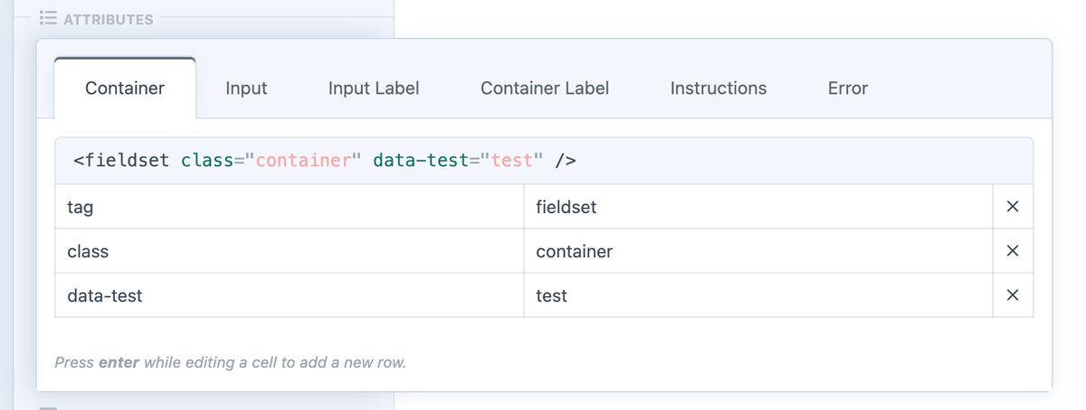
You can also override the default HTML tags from inside of the Field Attribute Editor for the field inside the form builder:
It is not possible to override the input tag at this time.
- General Example
- Accessible Checkboxes & Radios
- Fields as a List
In the below example:
- All fields of the Checkboxes and Radios type will have their:
- Field wrapper switched from the default tag of
divtofieldsetand a class ofcontainer. - Field label switched from the default tag of
labeltolegendand a class oflabel. - Field options' labels given a tag of
labeland a class ofoption-label.
- Field wrapper switched from the default tag of
- All fields of the HTML type will have their:
- Field wrapper switched from the default tag of
divtop.
- Field wrapper switched from the default tag of
{{ form.render({
  fields: {
    "@checkboxes, @radios": {
      attributes: {
        container: {
          tag: "fieldset",
          class: "container",
        },
        label: {
          tag: "legend",
          class: "label",
        },
        optionLabel: {
          tag: "label",
          class: "option-label",
        },
      }
    },
    "@html": {
      attributes: {
        container: {
          tag: "p",
        },
      }
    },
  },
}) }}
If you want your Checkboxes and Radios fields to follow best practices for accessibility, you can implement the following overrides:
The result will be that their:
- Field wrapper switched from the default tag of
divtofieldset. - Field label switched from the default tag of
labeltolegend. - Field options' labels given a tag of
labeland a class ofoption-label.
{{ form.render({
  fields: {
    "@checkboxes, @radios": {
      attributes: {
        container: {
          tag: "fieldset",
        },
        label: {
          tag: "legend",
        },
        optionLabel: {
          tag: "label",
          class: "option-label",
        },
      }
    },
  },
}) }}
- After Overrides
- Default (Before)
<fieldset>
  <legend>Favorite Food</legend>
  <label for="form-input-favoriteFood-0">
    <input type="checkbox" id="form-input-favoriteFood-0" name="favoriteFood[]" value="Peanuts" />
    Peanuts
  </label>
  <label for="form-input-favoriteFood-1">
    <input type="checkbox" id="form-input-favoriteFood-1" name="favoriteFood[]" value="Crackers" />
    Crackers
  </label>
  <label for="form-input-favoriteFood-2">
    <input type="checkbox" id="form-input-favoriteFood-2" name="favoriteFood[]" value="Cheese" />
    Cheese
  </label>
</fieldset>
<div>
  <label>Favorite Food</label>
  <label for="form-input-favoriteFood-0">
    <input type="checkbox" id="form-input-favoriteFood-0" name="favoriteFood[]" value="Peanuts" />
    Peanuts
  </label>
  <label for="form-input-favoriteFood-1">
    <input type="checkbox" id="form-input-favoriteFood-1" name="favoriteFood[]" value="Crackers" />
    Crackers
  </label>
  <label for="form-input-favoriteFood-2">
    <input type="checkbox" id="form-input-favoriteFood-2" name="favoriteFood[]" value="Cheese" />
    Cheese
  </label>
</div>
If you'd like to display your form and its fields as a list (ul/li), you can do that with the following example:
- All rows in the form will be switched from the default tag of
divtoul. - All field columns (wrappers) will be switched from the default tag of
divtoli.
{{ form.render({
  attributes: {
    row: {
      tag: 'ul',
    },
  },
  fields: {
    "@global": {
      attributes: {
        container: {
          tag: "li",
        },
      },
    },
  },
}) }}
How to Set Attributes
These parameters can be passed to any of the render functions, or done separately before.
- At Form Level
- At Field Level
- Anywhere
Set parameters during rendering of the form:
{{ form.render({
  attributes: { ... }
}) }}
Set parameters during rendering of specific elements:
{{ field.renderInput({
  attributes: { ... }
}) }}
Set the parameters like this at any time:
{% do field.setParameters({
  attributes: { ... }
}) %}
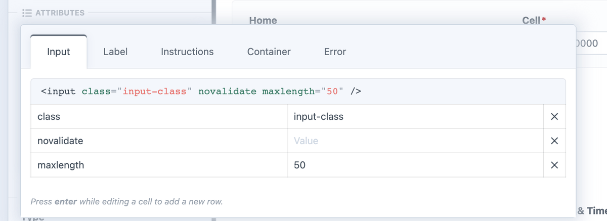
Field Attributes Editor
Freeform allows you to also specify attributes for each field inside the form builder. These can be mixed in with the attributes parameter in your form or field render.
If you were to set up your formatting template to include the following:
{{ form.render({
  fields: {
    attributes: {
      input: {
        class: "field",
      }
    }
  }
}) }}
All fields will be given a class with a value of field on the input when rendered.
If you were to also apply a class with a value of input-class on the input in the form builder, the resulting code might look something like this:
// Each field input would render as:
<input class="field" ... />

<input class="field" ... />

// With the exception of that one field where you added "input-class" in the
builder. That would render as:
<input class="field input-class" ... />

<input class="field" ... />
Accessing Attribute Properties
In most cases, attributes will automatically be applied in the right spots by Freeform. However, if you ever need to manually access these properties, you can do as follows...
// Access the complete attribute
{{ form.attributes.whatever|raw }}

// Access a specific attribute set
{{ field.attributes.whatever.get("class") }}
Further reading...
Imagine you have this in your regular template where you're loading the form:
{{ form.renderTag({
  attributes: {
    row: { class: "freeform-row" },
    success: { class: "freeform-form-success" },
  }
}) }}
- Example 1
- Example 2
- Example 3
- Example 4
Placing the following in your formatting template:
{{ form.attributes.success|raw }}
Will render as:
class="freeform-form-success"
A more complete example might be:
<div{{ form.attributes.success|raw }}>
  <p>{{ form.successMessage | t('freeform') }}</p>
</div>
Which renders as:
<div class="freeform-form-success">
  <p>Thank you!</p>
</div>
You could also approach it differently by accessing the class attribute value directly:
{{ form.attributes.success.get("class") }}
Which will render only as:
freeform-form-success
A more complete example might be:
<div class="form-banner {{ form.attributes.success.get("class") }}">
  <p>{{ form.successMessage | t('freeform') }}</p>
</div>
Which renders as:
<div class="form-banner freeform-form-success">
  <p>Thank you!</p>
</div>
Examples
Check out the examples below to see how the template code will render in your page.
On Form tag and Rows
- Template Code
- Output
{{ form.render({
  attributes: {
    novalidate: true,
    "data-my-form": true,
    class: "my-form-class",

    // You can set default attributes for all rows here
    row: {
      class: "row",
      "data-row": true,
    },
  }
}) }}
<form novalidate data-my-form class="my-form-class">
  <div class="row" data-row>
    // ... Fields render here
  </div>
  <div class="row" data-row>
    // ... Fields render here
  </div>
  <div class="row" data-row>
    // ... Fields render here
  </div>
</form>
On All Fields
You can also pass down attributes to all fields, or specific field types or fields by their handle. To do that you have to use the @fields attribute.
- Template Code
- Output
{{ form.render({
  attributes: {
    novalidate: true,
    row: {
      class: "row",
    },
  },
  fields: {
    "@global": {
      attributes: {
        input: {
          class: "input-class",
        },
        container: {
          "data-container": true,
        },
        label: {
          class: "label-class",
        },
      },
    },
    "@dropdown": {
      attributes: {
        input: {
          class: "select fullwidth",
        },
        container: {
          "data-select-container": true,
        },
      },
    },
    "@text": { ... },
    "@checkboxes, @multiple-select": {
      instructions: "Select all that apply.",
    },
    "myFieldHandle": {
      label: "My Field Label Override",
      instructions: "My field instructions override.",
      value: "my field value override",
      attributes: {
        container: {
          "data-my-input-container": true,
        },
        input: {
          id: "my-field",
          class: "big-text",
        },
      },
    },
    ":options": { ... },
    ":required": { ... },
    ":errors": { ... },
    ":required, @dropdown, @text, myFieldHandle2": { ... }
  },
}) }}
// Output (assuming we have a form with two text fields and a dropdown field).
<form novalidate>
  // all rows have the class "row" set
  <div class="row">
    // This particular container gets the default "data-container" attribute set for all containers as well as the "data-my-input-container" set only for this particular field.
    <div data-container data-my-input-container>
      <label class="label-class">My Field</label>
      <input name="myField" class="input-class big-text" id="my-field" value="" />
    </div>
  </div>

  <div class="row">
    <div data-container>
      <label class="label-class">Second Text Field</label>
      <input name="secondTextField" class="input-class" value="" />
    </div>
  </div>

  <div class="row">
    // This container receives the "data-select-container" class becuse it is of type "dropdown".
    <div data-container data-select-container>
      <label class="label-class">My Select Box</label>

      // Since the attributes are appended by default, this <select> element also receives the default "input-class" as well as the specific attributes for this field type.
      <select class="input-class select fullwidth">
        <option ...>
        <option ...>
      </select>
    </div>
  </div>
</form>
On Field Containers
If you would like to add a certain class and a data-container attribute to the Container HTML element of the field, you would pass them as follows:
- Template Code
- Output
{{ field.render({
  attributes: {
    container: {
      tag: "fieldset",
      class: "certain-class",
      "data-container": true,
    },
  },
}) }}
// Output would generate that class on the container element
<fieldset class="certain-class" data-container>
  <label>
  <input />
</fieldset>
On All Parts of the Fields
You can pass any amount of attributes to the specific element this way:
- Template Code
- Output
{{ field.render({
  label: "My Field Label Override",
  instructions: "My field instructions override.",
  value: "my field value override",
  attributes: {
    container: {
      class: "container",
    },
    input: {
      "data-field": true,
      class: "input-element",
    },
    label: {
      class: "label",
    },
    instructions: {
      class: "instructions",
    },
    error: {
      class: "error-block",
    },
  }
}) }}
// Output (assuming it has an error)
<div class="container">
  <label class="label">My Field Label Override</label>
  <div class="instructions">My field instructions override.</div>
  <input type="text" name="myField" class="input-element" value="my field value override" />

  <ul class="error-block">
    <li>This field is required</li>
  </ul>
</div>
On Submit Buttons
You can also edit submit, back and save button attributes and values:
For further customization of the submit buttons, please see the options and instructions for manual implementation.
- Template Code
- Output
{{ form.render({
  buttons: {
    attributes: {
      container: {
        style: "border: 1px solid red;",
      },
      column: {
        style: "background: #ccc;",
      },
      buttonWrapper: {
        style: "padding: 0 5px;",
      },
      submit: {
        class: "btn btn-primary",
      },
      back: {
        class: "btn btn-secondary",
      },
      save: {
        class: "btn btn-secondary",
      }
    },
    submitLabel: "Send",
    backLabel: "Previous",
    saveLabel: "Save",
  },
}) }}
// Output (assuming you are on page 2 of a multipage form with the Back button enabled)
<form>
  <div data-freeform-controls style="border: 1px solid red;">
    <div style="background: #ccc;">
      <div style="padding: 0 5px;">
        <button data-freeform-action="back" name="form_previous_page_button" type="submit" class="btn btn-secondary">Previous</button>
      </div>
    </div>
    <div style="background: #ccc;">
      <div style="padding: 0 5px;">
        <button data-freeform-action="submit" name="form_page_submit" type="submit" class="btn btn-primary">Send</button>
      </div>
    </div>
  </div>
</form>
On Captcha WrapperNew in 5.1+
You can add attributes to the main Captcha wrapper automatically inserted by Freeform when using reCAPTCHA or hCaptcha.
- Template Code
- Output
{{ form.render({
  captchas: {
    class: ["custom-class", "another-class"],
    "data-test": true,
  }
}) }}
// Output (truncated for example) ...
<div
  class="custom-class another-class"
  data-test
  data-freeform-recaptcha-container
>
  <div class="g-recaptcha">...</div>
</div>
If you need full control over the placement of a visible captcha, please see the Captcha Placement guide.
Override Field ValuesChanged in 5.0+
You can override the value inside text fields, or pre-select a default option for multi-option field types (specify option values in this case).
// Grab the title from the Craft entry slug in the second segment of URL.
// Used just for the "entryTitle" example below.
{% set entry = craft.entries.slug(craft.app.request.getSegment(2)).one() %}

{{ form.renderTag({
  fields: {
    "entryTitle": {
      value: entry.title
    },
    "stateSelect": {
      value: "AZ"
    },
    "availability": {
      value: ["tue", "thu"]
    },
    "firstName": {
      value: currentUser.name
    },
  }
}) }}
Array Values & Conditionals
You can supply an array of strings to the attribute as well, which can make the code appear cleaner. You can also use conditionals to add attributes conditionally in the array. Any empty, false or null values will not be rendered.
- Template Code
- Output
{{ field.render({
  attributes: {
    label: {
      id: "label-for-" ~ field.handle,
      class: [
        "form-control-label",
        field.hasErrors ? "is-invalid has-validation",
        field.required ? "required",
        field.type == "checkbox" ? "checkbox" : "non-checkbox",
      ],
    },
  },
}) }}
// Assuming the field (handle "myField") is a checkbox, doesn't have errors, //
but is required, the rendered label tag would look like this:
<label
  id="label-for-myField"
  class="form-control-label required checkbox"
></label>
Boolean Values
You can pass boolean values to attributes and it will render the standalone attribute if the value is true or null. If explicitly set to false, it won't render at all.
- Template Code
- Output
{{ field.render({
  attributes: {
    label: {
      "data-required": false,
      "data-is-blue": true,
      "data-is-some-data": null,
    }
  }
}) }}
<label data-is-blue data-is-some-data></label>
Automated Formatting Template
The following is a basic example of what your formatting template can look like to generate form display. A starting template like this (along with CSS) can be generated for you by visiting the Formatting Templates section in Freeform Settings.
{# Render the opening form tag #}
{{ form.renderTag({
  attributes: {
    row: { class: "freeform-row" },
    success: { class: "freeform-form-success" },
    errors: { class: "freeform-form-errors" },
    novalidate: true,
  },
  buttons: {
    attributes: {
      container: { class: "freeform-button-container" },
      column: { class: "freeform-button-column" },
      buttonWrapper: { class: "freeform-button-wrapper" },
      submit: { class: "freeform-button-submit" },
      back: { class: "freeform-button-back" },
      save: { class: "freeform-button-save" },
    },
  },
  fields: {
    "@global": {
      attributes: {
        container: { class: "freeform-column" },
        input: {
          class: "freeform-input",
        },
        label: { class: "freeform-label" },
        instructions: { class: "freeform-instructions" },
        error: { class: "freeform-errors" },
      },
    },
    ":required": {
      attributes: {
        label: { "+class": "freeform-required" },
      },
    },
    ":errors": {
      attributes: {
        input: { "+class": "is-invalid has-validation" },
      },
    },
    "@group": {
      attributes: {
        label: { "+class": "group-label" },
      },
    },
    "@signature": {
      attributes: {
        input: { "-class": "freeform-input" },
      },
    }
  },
}) }}

{# Success and error message handling for non-AJAX forms #}
{% if not form.settings.ajax %}
  {% if form.submittedSuccessfully %}
    <div{{ form.attributes.success|raw }}>
      <p>{{ form.successMessage | t('freeform') }}</p>
    </div>
  {% endif %}
  {% if form.hasErrors %}
    <div{{ form.attributes.errors|raw }}>
      <p>{{ form.errorMessage | t('freeform') }}</p>

      {% if form.errors|length %}
        <ul>
          {% for error in form.errors %}
            <li>{{ error }}</li>
          {% endfor %}
        </ul>
      {% endif %}
    </div>
  {% endif %}
{% endif %}

{# Render page tabs if multi-page #}
{% if form.pages|length > 1 %}
  <ul class="freeform-pages">
    {% for page in form.pages %}
      <li {% if form.currentPage.index == page.index %}class="active"{% endif %}>
        {% if form.currentPage.index == page.index %}
          <b>{{ page.label }}</b>
        {% else %}
          {{ page.label }}
        {% endif %}
      </li>
    {% endfor %}
  </ul>
{% endif %}

{# Build form rows and fields #}
{% macro renderRows(form, rows) %}
  {% for row in rows %}
    {% set width = (12 / (row|length)) %}
    <div{{ form.attributes.row|raw }}>
      {% for field in row %}
        {% do field.setParameters({
          attributes: {
            container: { class: [
              "freeform-column-" ~ width,
              "freeform-fieldtype-" ~ field.type,
            ]},
          },
        }) %}
        {% if field.type == "group" %}
          <div class="freeform-group">
            <label{{ field.attributes.label }}>
              {{ field.label }}
            </label>
            <div>
              {{ _self.renderRows(form, field.layout) }}
            </div>
          </div>
        {% else %}
          {{ field.render }}
        {% endif %}
      {% endfor %}
    </div>
  {% endfor %}
{% endmacro %}

{# Display form field rows and columns #}
{{ _self.renderRows(form, form.rows) }}

{# Render the closing form tag #}
{{ form.renderClosingTag }}
Manual Formatting Template
Form formatting can also be extremely manual, if that is something you prefer. Here's an example of different levels of manual you can use:
{% set form = freeform.form("myForm") %}

{{ form.renderTag({
  returnUrl: "contact/success",
  disable: ["submitButtons"]
}) }}

  {% if form.hasErrors %}
    <div class="freeform-form-has-errors">
      {{ "Error! Please review the form and try submitting again."|t('freeform') }}
    </div>
  {% endif %}

  {% set firstName = form.get("firstName") %}
  {% set lastName = form.get("lastName") %}
  {% set company = form.get("company") %}
  {% set state = form.get("state") %}

  <label>{{ firstName.label }}</label>
  <input name="{{ firstName.handle }}" value="{{ firstName.value }}" />
  {{ firstName.renderErrors() }}

  <label>{{ lastName.label }}</label>
  <input name="{{ lastName.handle }}" value="{{ lastName.value }}" />
  {{ lastName.renderErrors() }}

  {{ company.renderLabel() }}
  {{ company.renderInput() }}
  {{ company.renderErrors() }}

  <label>Email Address</label>
  <input name="email" />
  {{ form.get("email").renderErrors() }}

  <label>Phone</label>
  <input name="phone" />
  {% if form.get("phone").hasErrors %}
    This field is required!
  {% endif %}

  <label>State</label>
  <select name="state">
    {# You may also manually hardcode each option as well, as long as these options exist inside the form builder #}
    {% for option in state.options %}
      <option value="{{ option.value }}" {{ option.value in state.value ? "selected" }}>{{ option.label }}</option>
    {% endfor %}
  </select>

  {# Manual submit buttons #}
  {% set button = form.currentPage.buttons %}

  <button {{ button.submitRenderProps({ 'data-optional': 'attributes here' }) }}>
    Submit
  </button>
  {% if button.back %}
    <button {{ button.backRenderProps }}>
      Back
    </button>
  {% endif %}
  {% if button.save %}
    <button {{ button.saveRenderProps }}>
      Save
    </button>
  {% endif %}

{{ form.renderClosingTag }}
Populate Freeform Field Data
If you'd like to populate a Freeform field with data from another element such as Craft Entries, you might introduce a conditional with code that looks something like this:
Freeform explicitly requires that all options exist for the field in the form builder work with field types like Dropdown, Checkboxes, etc. To work around this, you can create the field as a regular Text field instead, and then modify the formatting template to account for it and include your own Twig code to pull in dynamic options.
{% elseif field.handle == "myFieldHandle") %}

  <select name="{{ field.handle }}">
  {% for entry in craft.entries.section('news').limit(10) %}
    <option value="{{ entry.handle }}"{% if field.value == entry.handle %} selected{% endif %}>
      {{ entry.title }}
    </option>
  {% endfor %}
  </select>

{% else %}