Field objectRevised in 5.0+
Each field object contains the metadata specified in the form builder. It can automatically render its container, label, input field, instructions and errors.
CustomizationImproved in 5.0+
Fields can now be controlled in a variety of ways using the new Template Overrides feature.
This replaces the old custom attributes approach (e.g. class, labelClass, inputAttributes, etc).
At Form level
The advantage of this approach is that you can set overrides that apply to all fields as well as target specific types of fields so you don't need to repeat yourself.
Please see the Template Overrides documentation for detailed instructions.
{{ freeform.form("myFormHandle", {
  attributes: {
    novalidate: true,
    row: {
      class: "row",
    },
  },
  fields: {
    "@global": {
      attributes: {
        input: { class: "input-class" },
        label: { class: "label-class" },
      },
    },
    "@dropdown": {
      attributes: {
        input: { "+class": "select fullwidth" },
      },
    },
    "@checkboxes, @multiple-select": {
      instructions: "Select all that apply.",
    },
    ":required": {
      attributes: {
        label: { "+class": "form-required" },
      },
    },
  },
}).render() }}
At Field level
The advantage of this approach is that you can fine-tune overrides that apply to a specific field or types of fields.
Please see the Template Overrides documentation for detailed instructions.
{{ field.render({
  label: "My Field Label Override",
  instructions: "My field instructions override.",
  value: "my field value override",
  attributes: {
    container: {
      class: "container",
    },
    input: {
      "data-field": true,
      class: "input-element",
    },
    label: {
      class: "label",
    },
    instructions: {
      class: "instructions",
    },
    error: {
      class: "error-block",
    },
  }
}) }}
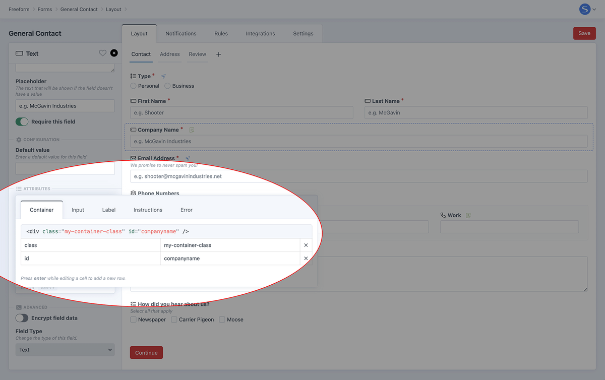
Inside Form Builder
Inside the form builder, there is an attributes editor for each field in the form layout. This is a handy place for one-off things that need to be set for a specific field. Simply click on the field to open the property editor, and then click on the Attributes area to get started. You can then add any attributes for the field and its container here, e.g. novalidate, data-my-attribute, id, etc.
Anything you add here should automatically work as long as you're using Freeform's built-in render helpers, e.g. form.render, field.render, field.renderInput, etc.
Properties
id
The ID of the field.
handle
The handle of the field.
label
The label for the field.
instructions
The instructions for the field, if specified in form builder.
required
A boolean value. true if the field has been set to required in the form builder.
errors
An array of error message strings if any are present after submitting the form.
pageIndex
A number representing the page index this field resides on.
value
The default or posted value of the field. Can be a string, number or array.
valueAsString
The value value rendered as a string. Array values get joined via a , separator.
labelsNew in 5.0+
The default or posted option label of the field. Can be a string, number or array. For use with option-based fields such as Dropdowns, Radios and Checkboxes.
labelsAsStringNew in 5.0+
The labels value rendered as a string. Array values get joined via a , separator. For use with option-based fields such as Dropdowns, Radios and Checkboxes.
type
The type of the field, e.g. textarea, dropdown, rating, etc.
Template OverridesNew in 5.0+
The form and each field have the ability to control attributes, values and more at the template level. Each one of them is entirely optional. There are several namespaces:
attributes- whatever you specify here will be set as an attribute on the form.buttons- controls the output of the Submit button(s).fields- controls the output of all Fields.captchas- add attributes to the main Captcha wrapper automatically inserted by Freeform when using reCAPTCHA or hCaptcha.tag- a special attribute that allows you to change the default HTML tag for fields and form markup. Learn more...New in 5.10+
Please see the Template Overrides documentation for detailed instructions.
Field Specific Properties
Each field type has their own specific properties available to them. Some are more complex than others. To see all available properties, check out the Fields documentation.
Methods
render()
Renders the complete field block containing its container, label, input field, instructions and list of errors. To customize this, please see the Template Overrides for fields.
renderLabel()
Renders only the field's label inside <label> HTML.
renderInput()
Renders only the field's <input> HTML.
The single Checkbox field type has an additional renderSingleInput() method to render the checkbox input without an additional hidden input. However, this is available as a workaround for special use cases and could have negative consequences for most regular setups and flows.
renderInstructions()
If instructions are present for the field, this renders only the field's instructions inside HTML.
renderErrors()
If errors are present for the field, this renders only the field's error message block inside HTML.
isValid()
Returns a boolean value of true if the form has been posted and this field doesn't contain any errors.
translateOptionLabel()New in 5.10.11+
While render() and renderInput() will automatically display the translated option labels when using Freeform's form builder translation feature, in cases where you are manually accessing the field's option.label you will need to use the translateOptionLabel function instead.
{{ field.renderContainerOpeningTag }}

  {{ field.renderLabel }}
  {{ field.renderInstructions }}
  <div class="mt-1 space-y-1{% if field.oneLine %} sm:flex sm:items-center sm:space-y-0 sm:space-x-5{% endif %}">
  {% for index, option in field.options %}
    <div class="flex items-center">
      <input type="radio"
        name="{{ field.handle }}"
        value="{{ option.value }}"
        id="{{ field.idAttribute }}-{{ index }}"
        class="{{ field.attributes.input.get("class") }}{{ field.hasErrors ? ' outline-1 -outline-offset-1 outline-red-600' }}"
        {{ option.value == field.value ? "checked" }}
      />
      <label for="{{ field.idAttribute }}-{{ index }}" class="{{ field.attributes.optionLabel.get("class") }}{{ field.hasErrors ? ' text-red-600' }}">
        {{ field.translateOptionLabel(option) }}
      </label>
    </div>
  {% endfor %}
  {{ field.renderErrors }}

{{ field.renderContainerClosingTag }}
Usage in Templates
Simple Render
Render the whole field (container, label, input field, instructions and errors) with a single line:
{{ field.render() }}
Render Each Part Separately
Render each part of the field separately:
{{ field.renderLabel() }}
{{ field.renderInstructions() }}
{{ field.renderInput() }}
{{ field.renderErrors() }}
Customize Output
Fully customize the output of your field:
<label data-label class="label">
  {{ field.label }}
  {% if field.instructions %}
    <span class="instructions">{{ field.instructions }}</span>
  {% endif %}
</label>

<input type="text" name="{{ field.handle }}" value="{{ field.valueAsString }}" data-some-value="my_custom_value_here" />

{% if field.errors %}
  {% for errorString in field.errors %}
    <div class="error">{{ errorString }}</div>
  {% endfor %}
{% endif %}
Override Classes & Values
Render the whole field but override any part of it:
{{ field.render({
  label: "My Field Label Override",
  instructions: "My field instructions override.",
  value: "my field value override",
  attributes: {
    container: {
      class: "container",
    },
    input: {
      "data-field": true,
      class: "input-element",
    },
    label: {
      class: "label",
    },
    instructions: {
      class: "instructions",
    },
    error: {
      class: "error-block",
    },
  }
}) }}