Freeform features its own set of robust field types. The form builder displays a list of available field types which can then be added to forms indefinitely. Fields are specific to each form, but can also be saved as favorites or searched upon to be reused in other forms.
Field Types
Freeform contains a rich set of field types to handle just about every possible scenario you might get yourself into.
Fields can be changed to other field types at any point, but be aware that data loss could occur when switching incompatible field types.
| Name | field.type | Description | Express | Lite | Pro |
|---|
| AINew in 5.12+ | ai | Have AI analyze the submission data and output a response using an AI integration. | ✕ | ✕ | ✓ |
| CalculationNew in 5.1+ | calculation | Perform dynamic calculations based on user-input values within forms. | ✕ | ✕ | ✓ |
| CardsNew in 5.12+ | cards | Option field with images, descriptions and other metadata. | ✕ | ✕ | ✓ |
| CheckboxImproved in 5.10+ | checkbox | A single checkbox field. | ✓ | ✓ | ✓ |
| CheckboxesImproved in 5.10+ | checkboxes | A group of checkboxes. | ✓ | ✓ | ✓ |
| Confirm | confirm | A text input field that targets another similar field and ensures the values match. | ✕ | ✕ | ✓ |
| Date & Time | datetime | A complex date and/or time field. | ✕ | ✕ | ✓ |
| Dropdown | dropdown | A select dropdown menu field. | ✓ | ✓ | ✓ |
| Email | email | A text input field that includes additional email validation and possibility for attaching an email notification to it. | ✓ | ✓ | ✓ |
| File Upload | file | A regular file upload field. | ✓ | ✓ | ✓ |
| File Upload Drag & Drop | file-dnd | An advanced javascript-based file uploading field. | ✕ | ✕ | ✓ |
| GroupNew in 5.0+ | group | A field that contains other fields within it. | ✕ | ✕ | ✓ |
| Hidden | N/A | A hidden input field. | ✓ | ✓ | ✓ |
| HTML | html | A block that allows you to insert HTML into areas of your form. | ✓ | ✓ | ✓ |
| ImageNew in 5.13+ | image | Allows you to add Asset images into your form layout. | ✕ | ✕ | ✓ |
| Invisible | N/A | A field that allows you to collect hidden data in form submissions without a hidden field being present in the template source code. | ✕ | ✕ | ✓ |
| Multiple Select | multiple-select | A multiple-select field. | ✓ | ✓ | ✓ |
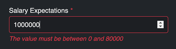
| Number | number | A number type input field that is validated to contain certain numbers only. | ✓ | ✓ | ✓ |
| Opinion Scale | opinion-scale | A special field that allows for flexible opinion scoring. | ✕ | ✕ | ✓ |
| Password | password | A text input field that collects sensitive passwords but does not store them. | ✕ | ✕ | ✓ |
| Phone | phone | A tel type input field that is validated to contain phone numbers only, based on a configured pattern. | ✕ | ✕ | ✓ |
| Radios | radios | A group of radio options. | ✓ | ✓ | ✓ |
| Rating | rating | A special field that allows for star ratings. | ✕ | ✕ | ✓ |
| Regex | regex | An input field that is validated based on the specified regex pattern (e.g. /^[a-zA-Z0-9]*$/). | ✕ | ✕ | ✓ |
| Rich TextImproved in 5.10+ | rich-text | A block that allows you to insert rich text into areas of your form (headings, descriptions, etc). | ✕ | ✕ | ✓ |
| Signature | signature | A field that allows users to handwrite signatures inside your form. | ✕ | ✕ | ✓ |
| Stripe PaymentImproved in 5.0+ | stripe | A set of input fields to allow the validation of credit cards and other payment options for Stripe Payment implementations. | ✕ | ✕ | ✓ |
| Submit buttons | N/A | Handles the submit button(s), including Save option for the form. | ✓ | ✓ | ✓ |
| TableImproved in 5.8, 5.14.12+ | table | A field that allows you to collect and handle repeating data. | ✕ | ✕ | ✓ |
| Text | text | A single-line text input field. | ✓ | ✓ | ✓ |
| Textarea | textarea | A multi-line text input field. | ✓ | ✓ | ✓ |
| Website | website | A url type input field that checks to see if the URL specified has valid syntax. | ✕ | ✕ | ✓ |
Favorite Fields
Any field can be a favorite field! If you have a number of fields that are commonly used across more than one form, such as Name, Email, etc, you can easily save them to your Favorite Fields list. If you need to edit or remove that field, you can always do that later in the manager area.
- Favorite fields are a snapshot of that field at the time it was saved.
- Any customizations of a Favorite field or using a field from another form are specific only to the form they're adjusted in.
Standard Settings
There is a standard number of settings available to all forms (with some exceptions). Every form field has the ability for you to do the following:
| Setting | Template Usage | Description |
|---|
| Label | label | The label for the field. This can be changed per form if you wish. |
| Handle | handle | How the field may be called in templates, if necessary. You may also override this value per form if you wish. |
| Required | required | Toggle if the field requires a value to submit the form successfully. |
| Custom Validation ErrorNew in 5.7+ | | Visible when Required is toggled on. If this field is left empty upon submit, show this error message. |
| Instructions | instructions | Specify intructions for the field if you wish. |
| Default Value | defaultValue | For applicable fields, you can set a default value or selected option for the field. |
| Placeholder | placeholder | Specify placeholder text for the field, if applicable. |
| Maximum Length | maxlength | The maximum number of characters for the field's value. Applicable to the following Field types |
| Attribute Editor | | Apply any kind of attribute on the input, label, error, instruction in Freeform's automated rendering of the form. |
| Options | options | Specify the option labels and values for applicable field types. Applicable to the following Field types |
All field types conveniently include the ability to set attributes for their labels, inputs, errors and instructions directly inside the form builder property editor.
- This allows you to keep your hands clean of being inside formatting templates and specify one-off exceptions for fields such as
readonly and autocomplete="off", etc.
- To use single attributes like
novalidate, just enter the attribute in the Attribute column and leave the Value column empty.
- You can use anything inside the Form and Field objects as well, e.g.:
field.id to access Field ID.form.handle to access form handle.
Field EncryptionProNew in 5.0+
Each field includes the ability to optionally encrypt its submission data. Simply toggle the Encrypt field data setting inside the form builder for any field you wish to have encrypted. Freeform will take care of the rest.
For each field that is encrypted and contains submission data, the database row column will contain a prefix of encrypted: and then the encryption string. Freeform will decrypt the submission data for exports, email notifications, integrations, and viewing submission data inside the control panel and front end (if you have templates set up to show it).
Field encryption uses the Craft Security Key (usually CRAFT_SECURITY_KEY in your .env file), so be sure to use the same key across multiple environments.
CRAFT_SECURITY_KEY=zVtC4j25ADUxf5H14xiIAzqKoCJtyLu7
If you wish to use a different security key for Freeform specifically, you can specify a custom key in the Secret Key setting under the Form Sessions area of the Form Behavior settings page (CP → Freeform → Settings → Form Behavior).
Encryption is not retroactive. Each submission will need to be resaved to update older submissions.
Populating Field Options
LitePro
Improved in 5.0+
All multi-option field types (such as Dropdown, Checkboxes, etc) can have their option labels and values automatically populated with Craft Elements or Pre-defined list options. This allows you to quickly build forms by having fields auto-generated.
Applicable Field Types
The following field types can be auto-populated:
Available Options
LitePro
The following Freeform Predefined Options and Craft Elements can be fed to the above field types:
- Dates & Timezones
- Ranges
- Regions
- Languages
- Craft Elements
Months
- All 12 months of the year.
- Option Label and Option Value choices:
- Full, e.g.
September
- Full (translated), e.g.
SeptembreNew in 5.14.12+
- Abbreviated (Capitalized 3 letters), e.g.
Sep
- Single Number, e.g.
9
- 2-digit Number, e.g.
09
Days
- List of days
1 to 31.
- Option Label and Option Value choices:
- Single Number, e.g.
3
- 2-digit Number, e.g.
03
Days of Week
- List of all days of week.
- Option Label and Option Value choices:
- Full, e.g.
Thursday
- Full (translated), e.g.
DonderdagNew in 5.14.12+
- Abbreviated (Capitalized 3 letters), e.g.
Thu
- Single Number, e.g.
4
TimezonesNew in 5.15.17+
- All world timezones
- Option Label and Option Value choices:
- UTC Label, e.g.
(UTC-04:00) New York
- Identifier, e.g.
America/New_York
Numbers (range)
- A custom range of numbers
- Range Start and Range End
- E.g.
60 - 65 would return list: 60, 61, 62, 63, 64, 65
Years (range)
- A custom range of years
- Range Start - number of years in PAST from current year
- Range End - number of years in FUTURE from current year
- E.g.
5 (start) - 0 (end) would return list: 2018, 2017, 2016, 2015, 2014, 2013
- Sort Direction:
States
- Official USA states
- Option Label and Option Value choices:
- Full, e.g.
California
- Full (translated), e.g.
CaliforniëNew in 5.14.12+
- Abbreviated (upper case 2 letters)
States & Territories
- Official USA states and territories
- Option Label and Option Value choices:
- Full, e.g.
California
- Full (translated), e.g.
CaliforniëNew in 5.14.12+
- Abbreviated (upper case 2 letters)
Canadian Provinces
- Official Canadian provinces and territories
- Provinces - English
- Canadian Provinces and territories in English
- Provinces - French
- Canadian Provinces and territories in French
- Provinces - Bilingual
- Bilingual list of Canadian Provinces and territories
- Option Label and Option Value choices:
- Full, e.g.
British Columbia
- Full (translated), e.g.
Colombie-BritanniqueNew in 5.14.12+
- Abbreviated (upper case 2 letters)
Countries
- All world countries
- Option Label and Option Value choices:
- Full, e.g.
France
- Full (translated), e.g.
FrankrijkNew in 5.14.12+
- Abbreviated (upper case 2 letters)
World Languages
- All world languages
- Option Label and Option Value choices:
- Full, e.g.
Spanish
- Full (translated), e.g.
EspañolNew in 5.14.12+
- Abbreviated (lower case 2 letters)
- Filter down by:
- Site ID
- Section
- StatusNew in 5.12+
- Option Label and Option Value choices:
- ID, Title, Slug, URI, Fields (simple values)
- Filter down by:
- Option Label and Option Value choices:
- ID, Username, Email, First Name, Last Name, Full Name, Fields (simple values)
- Filter down by:
- Site ID
- Group
- StatusNew in 5.12+
- Option Label and Option Value choices:
- ID, Title, Slug, URI, Fields (simple values)
- Filter down by:
- Site ID
- Group
- StatusNew in 5.12+
- Option Label and Option Value choices:
- ID, Title, Slug, URI, Fields (simple values)
- Filter down by:
- Option Label and Option Value choices:
- Filename, ID, Fields (simple values)
- Filter down by:
- Site ID
- Product Type
- StatusNew in 5.12+
- Option Label and Option Value choices:
- ID, Title, Slug, URI, SKU, Price, Fields (simple values)
Convert to Custom OptionsNew in 5.0+
Sometimes you need a little more control over the populated data generated by the Element or Predefined options. You can click the Convert to Custom Options button at any time to have the generated option data converted to Custom options that can then have its options edited, removed, added, renamed, and reordered.
There are potentially negative implications with using this feature:
- Your options data can become out of sync when new elements (e.g. Entries) are added after the fact.
- If you apply this when there are already existing submissions, renaming option values will orphan submissions relying on the old value name.
- Be very careful if you attempt to redo this process (e.g. changing back to Element source and grabbing a fresh list of Craft Entries, then converting back to Custom). If any existing submissions are relying on old or modified option values, they can become orphaned in the process.
AIProNew in 5.12+
Once you enable and configure an AI integration, the AI field becomes available in your forms. Use it to provide a system prompt with instructions for how the model should process submission data (e.g., categorization, summarization, sentiment analysis, content generation). Specify the exact output format you need.
This field is invisible to the user on the front end.
Some examples of how to use this field:
If you'd like to have AI categorize the submission, which you can then set conditional notifications on, etc, you might specify something like this:
Analyze the specified fields and categorize this submission into one of these categories: Pre-sales Questions, Support Issue, Account Help. Respond with only the category name.
If the submission seemed like it was an issue about getting help with their account, it would label it as Account Help. You might then want to use Conditional Notifications to send these requests to a different email address.
If you'd like to have AI provide a summary of the overall submission data, you might specify something like this:
Analyze the specified fields and provide a 2-3 sentence summary of the submission data.
This will generate a summary of the submission that gives you the gist of what is being requested or said. This can be helpful if you have long forms or fields that may contain long messages. You could then have this field's summary placed at the top of an email notification so the recipient can get the gist of the submission contents.
Settings
The following additional settings are available to this field type:
- System Prompt
- Instructions for the AI on how to process the form data. You can use this for categorization, summarization, sentiment analysis, content generation, or any other AI task. Be specific about the desired output format.
- Fields to Process
- Select which form fields to send to the AI for processing. Use the dropdown or type
@ to search for fields.
- Include Field Labels
- When enabled, field labels will be included in the content sent to AI (e.g.,
Name: John Doe instead of just John Doe).
- Max Tokens Override
- Leave empty to use integration settings. Override only if you need different Max Tokens for this field.
- Temperature Override
- Leave empty to use integration settings. Override only if you need different temperature for this field. Enter a value between
0.0 and 1.0.
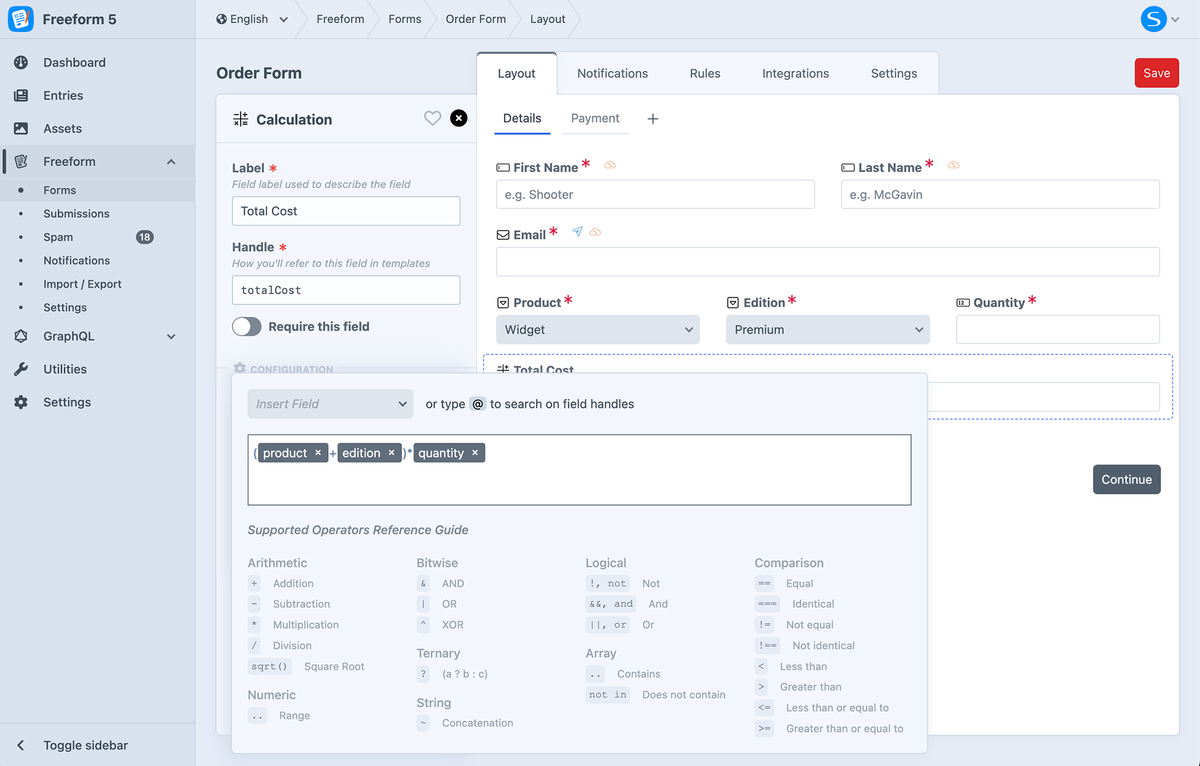
CalculationProNew in 5.1+
The Calculation field type lets you perform dynamic calculations based on user-input values in your forms. It also supports a wide variety of operators.
For the Calculation field to work as a dynamic amount with the Stripe Payments integration, the Input Type setting should be set to Regular Text Input or Plain Text. If set to Hidden, the Calculation field should be within a multipage setup where it is on a page before the page with the Stripe Payment Element field.
Settings
The following additional settings are available to this field type:
Decimal CountNew in 5.6+
The Decimal Count setting allows you to set the maximum number of decimal places the calculated result should have. Leave blank if you don't want to limit the decimal places. If you'd like to have no decimals (whole numbers only), enter a value of 0.
Supported Field Types
The following fields can be accessed within field calculation formulas:
Supported Operators
Utilizing Symfony Expression Syntax, the Calculation field type empowers users to create sophisticated calculations effortlessly. From fundamental arithmetic to complex logical operations, users can employ an array of operators and functions to achieve desired outcomes.
Click on the tabs below to learn more about each operator:
- Arithmetic
- Comparison
- Logical
- String
- Array
- Numeric
- Ternary
| Operator | Description |
|---|
+ | Addition |
- | Subtraction |
* | Multiplication |
/ | Division |
sqrt() | Square RootNew in 5.9.3+ |
Example
(field1 - field2) + field3
| Operator | Description |
|---|
== | Equal |
=== | Identical |
!= | Not equal |
!== | Not identical |
< | Less than |
> | Greater than |
<= | Less than or equal to |
>= | Greater than or equal to |
matches | Regex match |
Example
| Operator | Description |
|---|
! or not | Not |
&& or and | And |
|| or or | Or |
Example
field1 > field2 || field1 < field3
| Operator | Description |
|---|
~ | Concatenation |
Example 1
'Hello ' ~ firstName ~ ', ' ~ 'Welcome!'
'Hello ' ~ 'Bob' ~ ', ' ~ 'Welcome!'
Example 2
nameTitle ~ ' ' ~ firstName ~ ' ' ~ lastName
'Dr.' ~ ' ' ~ 'Sarah' ~ ' ' ~ 'Connor'
| Operator | Description |
|---|
in | Contains |
not in | Does not contain |
Example
field1 in ['apple', 'orange', 'banana']
'banana' in ['apple', 'orange', 'banana']
| Operator | Description |
|---|
.. | Range |
Example
| Operator | Description |
|---|
? | Operator that takes three operands |
Example
field1 == 5 ? 'yes' : 'no'
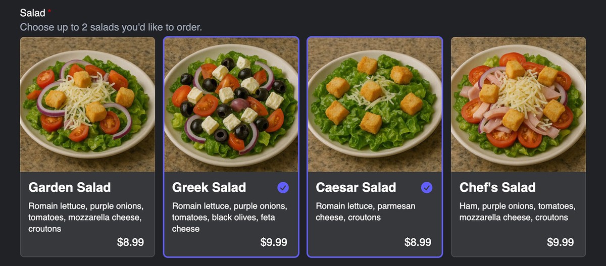
CardsProNew in 5.12+
The Cards field type works like a radios or checkboxes field, but allows you to create a more complex visual display where you can include images or icons, descriptions and unlimited custom metadata.
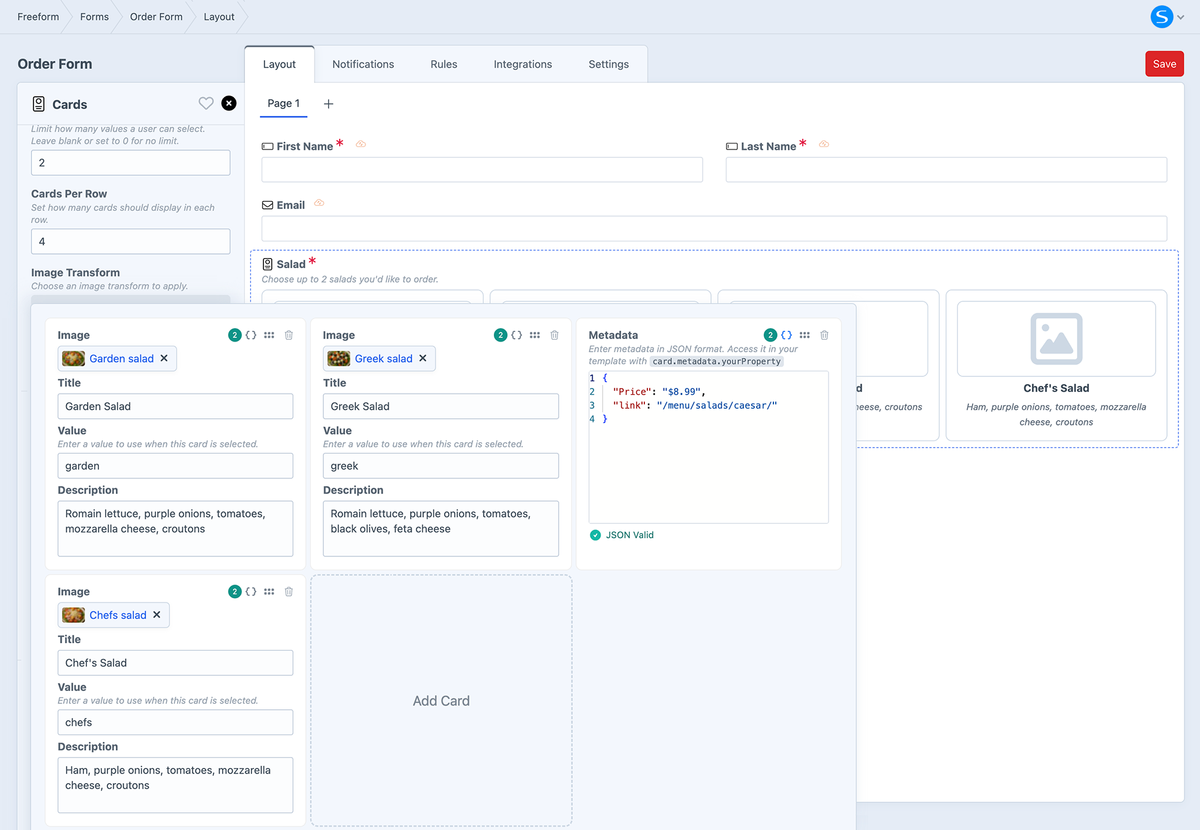
Settings
The following additional settings are available to this field type:
- Max Selected Values
- Limit how many values a user can select. Leave blank or set to
0 for no limit.
- Cards Per Row
- Set how many cards should display in each row.
- Image Transform
- Choose an Asset image transform to apply to any images added to the cards.
- Srcset Sizes
- Enter a comma separated list of image size numbers for
srcset attribute generation, e.g. 480, 768, 1024
Cards Layout
Configure the content and layout of your cards. This opens up into an editor that allows you to add and configure each card.
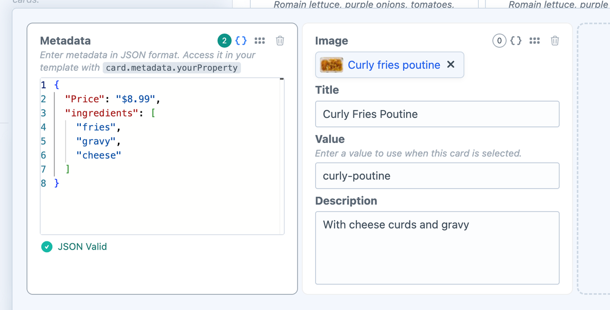
If you want to include additional custom data for each option, you can enter this metadata in JSON format. In your formatting template, you can access it with card.metadata.yourProperty.
Templating
The following additional properties and Template Overrides parameters are available for use in your formatting templates:
Properties
field.cardAttributes
cardimagecontentcardLabelcardDescriptioncardMetadata
field.layout
valuelabelassetIddescriptionmetadata
field.transform
Parameters
cardAttributes
cardcardimagecontentcardLabelcardDescriptioncardMetadata
- At Form-level
- At Field-level
{{ form.renderTag({
  attributes: {
    form: { class: "freeform-form", "data-freeform-tailwind": true },
    row: { class: "flex gap-x-2 -mx-2 mb-4" },
    novalidate: true,
  },
  fields: {
    "@cards": {
      attributes: {
        optionLabel: { "=class": "relative flex flex-col gap-1 h-full items-left justify-start cursor-pointer bg-white/10 pb-3 rounded-md text-base text-white text-sm outline-1 -outline-offset-1 outline-white/10 rounded-md peer-checked:outline-2 peer-checked:outline-indigo-500 hover:bg-white/5" },
        input: { "-class": "appearance-none block w-full" },
      },
      cardAttributes: {
        card: { class: "group min-w-0 mb-2 sm:mb-0" },
        image: { class: "mb-1 rounded-t-md" },
        content: { class: "flex items-center justify-between px-3" },
        cardLabel: { "=class": "text-lg font-bold" },
        cardDescription: { class: "text-xs px-3" },
        cardMetadata: { class: "list-disc list-outside text-xs pl-6 pr-3" },
      }
    },
  },
}) }}
{{ field.render({
  cardAttributes: {
    card: { class: "group min-w-0 mb-2 sm:mb-0" },
    image: { class: "mb-1 rounded-t-md" },
    content: { class: "flex items-center justify-between px-3" },
    cardLabel: { "=class": "text-lg font-bold" },
    cardDescription: { class: "text-xs px-3" },
    cardMetadata: { class: "list-disc list-outside text-xs pl-6 pr-3" },
  }
}) }}
Customizing the Appearance
Below are some examples of how you can customize the appearance of Cards fields in your formatting template:
- Basic
- Controlling Cards Per Row
- Metadata
- Metadata Macro
Below is an example using Tailwind CSS and without controlling cards per row or including any custom metadata:
{{ field.renderContainerOpeningTag }}

  {{ field.renderLabel }}
  {{ field.renderInstructions }}

  <div class="grid gap-3 grid-cols-1">
    {% for card in field.layout %}
      <div {{ field.cardAttributes.card }}>
        <input type="checkbox" name="{{ field.handle }}[]" value="{{ card.value }}" id="{{ field.idAttribute }}-{{ loop.index }}" {{ field.value == card.value ? "checked" }} class="hidden peer" />
        <label for="{{ field.idAttribute }}-{{ loop.index }}" class="{{ field.attributes.optionLabel.get("class") }}">
          {% set asset = craft.assets.id(card.assetId).one %}
          {% if asset %}
            <img src="{{ asset.getUrl(field.transform) }}" alt="{{ card.label }}" {{ field.cardAttributes.image }} />
          {% endif %}
          <div {{ field.cardAttributes.content }}>
            <h5 {{ field.cardAttributes.cardLabel }}>{{ card.label }}</h5>
            <svg class="size-5 text-indigo-500 opacity-0 group-has-checked:opacity-100" viewBox="0 0 20 20" fill="currentColor" aria-hidden="true">
              <path fill-rule="evenodd" d="M10 18a8 8 0 1 0 0-16 8 8 0 0 0 0 16Zm3.857-9.809a.75.75 0 0 0-1.214-.882l-3.483 4.79-1.88-1.88a.75.75 0 1 0-1.06 1.061l2.5 2.5a.75.75 0 0 0 1.137-.089l4-5.5Z" clip-rule="evenodd"></path>
            </svg>
          </div>
          <span {{ field.cardAttributes.cardDescription }}>{{ card.description }}</span>
        </label>
      </div>
    {% endfor %}
  </div>

  {{ field.renderErrors }}

{{ field.renderContainerClosingTag }}
Below is an example using Tailwind CSS with control on the number of cards per row, without including any custom metadata:
{% set perRow = 4 %}
{% if field.cardsPerRow is defined and field.cardsPerRow is not null and field.cardsPerRow is numeric %}
  {% set perRow = field.cardsPerRow + 0 %}
{% endif %}
{% if perRow < 1 %}{% set perRow = 1 %}{% endif %}
{% if perRow > 6 %}{% set perRow = 6 %}{% endif %}

{% set colsClass =
  perRow == 1 ? 'sm:grid-cols-1' :
  perRow == 2 ? 'sm:grid-cols-2' :
  perRow == 3 ? 'sm:grid-cols-3' :
  perRow == 4 ? 'sm:grid-cols-4' :
  perRow == 5 ? 'sm:grid-cols-5' : 'sm:grid-cols-6'
%}

{{ field.renderContainerOpeningTag }}

  {{ field.renderLabel }}
  {{ field.renderInstructions }}

  <div class="grid gap-3 grid-cols-1 {{ colsClass }}">
    {% for card in field.layout %}
      <div {{ field.cardAttributes.card }}>
        <input type="checkbox" name="{{ field.handle }}[]" value="{{ card.value }}" id="{{ field.idAttribute }}-{{ loop.index }}" {{ field.value == card.value ? "checked" }} class="hidden peer" />
        <label for="{{ field.idAttribute }}-{{ loop.index }}" class="{{ field.attributes.optionLabel.get("class") }}">
          {% set asset = craft.assets.id(card.assetId).one %}
          {% if asset %}
            <img src="{{ asset.getUrl(field.transform) }}" alt="{{ card.label }}" {{ field.cardAttributes.image }} />
          {% endif %}
          <div {{ field.cardAttributes.content }}>
            <h5 {{ field.cardAttributes.cardLabel }}>{{ card.label }}</h5>
            <svg class="size-5 text-indigo-500 opacity-0 group-has-checked:opacity-100" viewBox="0 0 20 20" fill="currentColor" aria-hidden="true">
              <path fill-rule="evenodd" d="M10 18a8 8 0 1 0 0-16 8 8 0 0 0 0 16Zm3.857-9.809a.75.75 0 0 0-1.214-.882l-3.483 4.79-1.88-1.88a.75.75 0 1 0-1.06 1.061l2.5 2.5a.75.75 0 0 0 1.137-.089l4-5.5Z" clip-rule="evenodd"></path>
            </svg>
          </div>
          <span {{ field.cardAttributes.cardDescription }}>{{ card.description }}</span>
        </label>
      </div>
    {% endfor %}
  </div>

  {{ field.renderErrors }}

{{ field.renderContainerClosingTag }}
Below is an example using Tailwind CSS with custom metadata.
For the purpose of this example, we're going to assume that you have custom meta data that looks like this:
{
  "price": "8.99",
  "ingredients": [
    "fries",
    "gravy",
    "cheese"
  ]
}
These properties are accessible in your template with card.metadata.yourProperty:
card.metadata.pricecard.metadata.ingredients
{{ field.renderContainerOpeningTag }}

  {{ field.renderLabel }}
  {{ field.renderInstructions }}

  <div class="grid gap-3 grid-cols-1">
    {% for card in field.layout %}
      <div {{ field.cardAttributes.card }}>
        <input type="checkbox" name="{{ field.handle }}[]" value="{{ card.value }}" id="{{ field.idAttribute }}-{{ loop.index }}" {{ field.value == card.value ? "checked" }} class="hidden peer" />
        <label for="{{ field.idAttribute }}-{{ loop.index }}" class="{{ field.attributes.optionLabel.get("class") }}">
          {% set asset = craft.assets.id(card.assetId).one %}
          {% if asset %}
            <img src="{{ asset.getUrl(field.transform) }}" alt="{{ card.label }}" {{ field.cardAttributes.image }} />
          {% endif %}
          <div {{ field.cardAttributes.content }}>
            <h5 {{ field.cardAttributes.cardLabel }}>{{ card.label }}</h5>
            <svg class="size-5 text-indigo-500 opacity-0 group-has-checked:opacity-100" viewBox="0 0 20 20" fill="currentColor" aria-hidden="true">
              <path fill-rule="evenodd" d="M10 18a8 8 0 1 0 0-16 8 8 0 0 0 0 16Zm3.857-9.809a.75.75 0 0 0-1.214-.882l-3.483 4.79-1.88-1.88a.75.75 0 1 0-1.06 1.061l2.5 2.5a.75.75 0 0 0 1.137-.089l4-5.5Z" clip-rule="evenodd"></path>
            </svg>
          </div>
          <span {{ field.cardAttributes.cardDescription }}>{{ card.description }}</span>
          <span>${{ card.metadata.price }}</span>
          <span>
            Ingredients:
            <ul>
            {% for ingredient in card.metadata.ingredients %}
              <li>{{ ingredient }}</li>
            {% endfor %}
            </ul>
          </span>
        </label>
      </div>
    {% endfor %}
  </div>

  {{ field.renderErrors }}

{{ field.renderContainerClosingTag }}
Below is an example using Tailwind CSS and including a macro to handle any custom metadata:
{% macro renderMeta(value, key = null) %}
{% if value is empty %}
{% elseif value is iterable %}
{% set keys = value|keys %}
{% set isList = (keys|length > 0) and (keys|first == 0) and (keys|last == value|length - 1) %}
{% if isList %}
{% set cleaned = value|filter(v => v is not empty) %}
{% if cleaned|length %}
{% set hasNested = cleaned|filter(v => v is iterable)|length > 0 %}
{% if not hasNested %}
<li>{% if key is not null %}{{ key }}: {% endif %}{{ cleaned|join(', ') }}</li>
{% else %}
{% for v in cleaned %}
{{ _self.renderMeta(v, key) }}
{% endfor %}
{% endif %}
{% endif %}
{% else %}
{% for k, v in value %}
{{ _self.renderMeta(v, k) }}
{% endfor %}
{% endif %}
{% else %}
<li>{% if key is not null %}{{ key }}: {% endif %}{{ value }}</li>
{% endif %}
{% endmacro %}
{% import _self as meta %}
{% set perRow = 4 %}
{% if field.cardsPerRow is defined and field.cardsPerRow is not null and field.cardsPerRow is numeric %}
{% set perRow = field.cardsPerRow + 0 %}
{% endif %}
{% if perRow < 1 %}{% set perRow = 1 %}{% endif %}
{% if perRow > 6 %}{% set perRow = 6 %}{% endif %}
{% set colsClass =
perRow == 1 ? 'sm:grid-cols-1' :
perRow == 2 ? 'sm:grid-cols-2' :
perRow == 3 ? 'sm:grid-cols-3' :
perRow == 4 ? 'sm:grid-cols-4' :
perRow == 5 ? 'sm:grid-cols-5' : 'sm:grid-cols-6'
%}
{{ field.renderContainerOpeningTag }}
{{ field.renderLabel }}
{{ field.renderInstructions }}
<div class="grid gap-3 grid-cols-1 {{ colsClass }}">
{% for card in field.layout %}
<div {{ field.cardAttributes.card }}>
<input type="checkbox" name="{{ field.handle }}[]" value="{{ card.value }}" id="{{ field.idAttribute }}-{{ loop.index }}" {{ field.value == card.value ? "checked" }} class="hidden peer" />
<label for="{{ field.idAttribute }}-{{ loop.index }}" class="{{ field.attributes.optionLabel.get("class") }}">
{% set asset = craft.assets.id(card.assetId).one %}
{% if asset %}
<img src="{{ asset.getUrl(field.transform) }}" alt="{{ card.label }}" {{ field.cardAttributes.image }} />
{% endif %}
<div {{ field.cardAttributes.content }}>
<h5 {{ field.cardAttributes.cardLabel }}>{{ card.label }}</h5>
<svg class="size-5 text-indigo-500 opacity-0 group-has-checked:opacity-100" viewBox="0 0 20 20" fill="currentColor" aria-hidden="true">
<path fill-rule="evenodd" d="M10 18a8 8 0 1 0 0-16 8 8 0 0 0 0 16Zm3.857-9.809a.75.75 0 0 0-1.214-.882l-3.483 4.79-1.88-1.88a.75.75 0 1 0-1.06 1.061l2.5 2.5a.75.75 0 0 0 1.137-.089l4-5.5Z" clip-rule="evenodd"></path>
</svg>
</div>
<span {{ field.cardAttributes.cardDescription }}>{{ card.description }}</span>
{% set metaValue = card.metadata is defined ? card.metadata : null %}
{% set rendered %}
{{ meta.renderMeta(metaValue) }}
{% endset %}
{% if rendered|trim %}
<ul {{ field.cardAttributes.cardMetadata }}>
{{ rendered|raw }}
</ul>
{% endif %}
</label>
</div>
{% endfor %}
</div>
{{ field.renderErrors }}
{{ field.renderContainerClosingTag }}
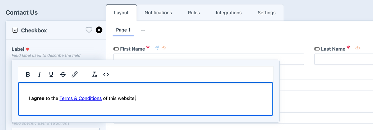
CheckboxImproved in 5.10+
A single checkbox field. The field.type property value is checkbox (for conditionals).
Settings
- The Label setting allows rich text to be added. New in 5.10+
- This allows you to easily bold and italicize options or even add links (perfect for agreeing to terms and conditions).
- Specify a value (e.g.
y or yes, etc).
- Has a default value of Yes, which can be overwritten with any value you want. No matter what value is set manually on the front end, Freeform will interpret it as checked and record the value specified in the form builder.
- May be checked by default.
- Can be used as a User Select email notification.
Templating
checkedByDefault (e.g. 1)
CheckboxesRenamed in 5.0+, Improved in 5.10+
A group of checkboxes. The field.type property value is checkboxes (for conditionals).
Settings
- Can specify labels (with values assumed) or labels and values (that differ).
- Can be automatically populated with select Craft Elements or Pre-defined list options.
- Can be used as a User Select email notification.
- Can set limits on the number of options a user must select, including a minimum, maximum, exact number, or range.New in 5.10+
- Can be rendered vertically or horizontally.
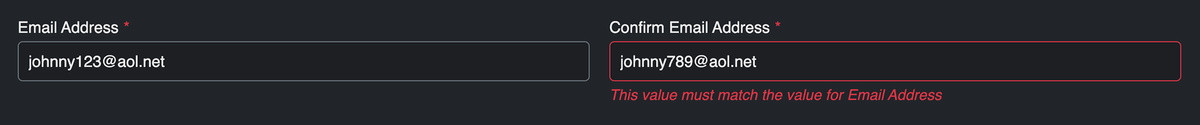
ConfirmProImproved in 5.0+
A field that allows you to force a user to re-enter a matching value for another text input field, including Password fields (e.g. "Confirm Email Address", "Confirm Password"). It runs through additional validation to make sure field values match. If not, it'll show an error. This field stores the data as well, in case that is important for your site's needs. The field.type property value is confirm (for conditionals).
Settings
- Choose a target field to validate against, e.g. Email field.
- Available fields must be of text input type, but don't necessarily need to be of the Text field type - you can use with Email fields, Password special fields, Phone fields, etc.
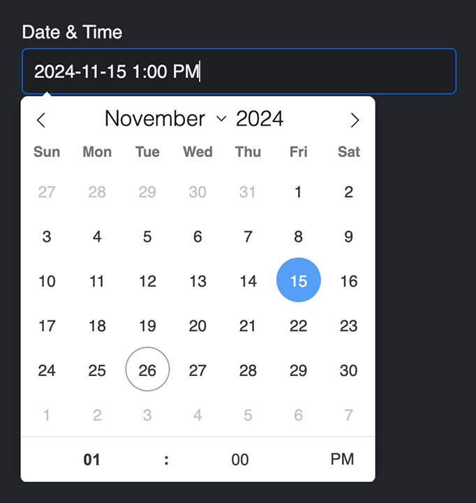
Date & TimePro
A complex date and/or time field. Can be used as Date only, Time only, or both. Many configuration and validation options available as well. The field.type property value is datetime (for conditionals).
Settings
- May contain a default date value.
- You may use
now, today, 5 days ago, 2017-01-01 20:00:00, etc, which will format the default value according to the chosen format as a localized value.
- The default Freeform datepicker can be disabled and you can load your own manually in the template if you wish.
- Freeform will automatically insert javascript in the footer/inside form (depending on settings) of the page for this fieldtype.
- Choose to have your own placeholder or have Freeform generate a placeholder based on the settings below.
- Set the date order formatting you'd like:
year month day, month day year, day month year
- Select if the year should be displayed/validated as 4 digits.
- Select if the day and month numbers should have a leading
0 for single digit values (e.g. August will display as 08 instead of 8).
- Choose the date separator character used between each year, month, day value:
- Select if time and datepicker should use 24 hour clock.
- Choose the clock separator character used to separate hours and minutes:
- Choose if placeholder should separate AM/PM with a space (for 12hr clock).
- Select the Min and Max dates for the date picker and validation (optional). Use static dates (e.g.
2018-11-01, 2018-11-30) or relative date strings (e.g. -10 days, +3 months).
Templating
initialValuedateTimeType (e.g. both)generatePlaceholder (e.g. true)dateOrder (e.g. ymd)date4DigitYear (e.g. true)dateLeadingZero (e.g. true)dateSeparator (e.g. /)clock24h (e.g. false)clockSeparator (e.g. :)clockAMPMSeparate (e.g. true)useDatepicker (e.g. true)minDate (e.g. five weeks ago)maxDate (e.g. 2024-12-31)
View Important Notes...
For localization reference:
- The Flatpickr date picker will automatically localize according to the locale set for your site. Locales available are only 2-letter codes like
fr, de, etc. In the event you're using a locale like fr-CA or es-US, etc, Freeform will just look at the first 2 letters and use that as the locale.
- To translate the formatting syntax error message, be sure to translate the following strings:
"{value}" does not conform to "{format}" format.- To translate the
{format} rendered value to match the current locale, be sure to also translate whatever the rendered string is in the error message. For example, if you're using fr locale, and wish to have the default English DD/MM/YYYY show up as JJ/MM/AAAA, create a static translation for this manually.
To customize the date picker appearance and behavior, please see Date Picker Events documentation.
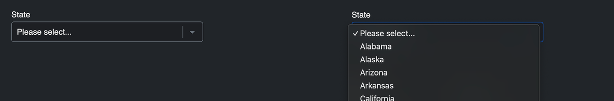
DropdownRenamed in 5.0+
A select dropdown menu field. The field.type property value is dropdown (for conditionals).
Settings
- Can specify labels (with values assumed) or labels and values (that differ).
- To make the first option empty, use labels and values approach with the first option having something like Please select... for the label, and leave option blank.
- Supports
<optgroup>'s. To use this, enable the toggle under the Optgroup column for the applicable row.New in 5.13+
- Can be automatically populated with select Craft Elements or Pre-defined list options.
- Can be used as a User Select email notification.
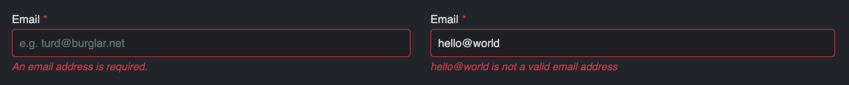
EmailRevised in 5.0+
A single-line text input field that includes additional validation to expect a valid email address as well as the possibility of attaching an email notification to it. Pair this with the Confirm special field type if you wish to have the user enter their email address twice. The field.type property value is email (for conditionals).
It is required to use the Email field type if you wish for your users to receive an email notification when submitting the form and/or you're using an Email Marketing API integration.
Settings
- Optionally choose an email notification template (see Email Notifications documentation) to be used to send to the submitter of the form (or the email address entered in this field).
- Users/groups need to have permissions for Notifications to create new formatting templates inside the form builder.
Templating
notificationId (the ID of the assigned email notification template)
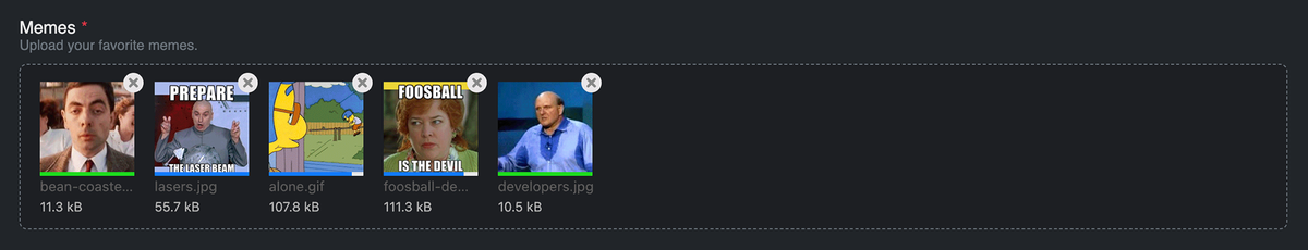
File Upload
A regular file upload field, using Craft Assets. The field.type property value is file (for conditionals).
Settings
- Must have a Craft Asset Source location where the file will be uploaded to.
- Does NOT work with Image Transforms.
- Upload Location Subfolder (optional) - the subfolder path that files should be uploaded to. May contain
form.handle or form.id variables or something like currentUser.id for folders based on user ID's or "now"|date("Y/m") to dynamically generate folders based on dates as well.
- Define maximum file size (in KB). Default is 2048 KB (2MB). Is subject to:
- Can allow a single file or multiple files to be uploaded.
- Specify a number larger than
1 in the File Count setting to allow multiple files to be uploaded at the same time.
- When collecting multiple files, a single input is still displayed, but allows multiple files to be uploaded (applies
multiple attribute to the single file upload input).
- Select which file types can be uploaded.
- Leaving all options unchecked will allow ALL file types.
Templating
fileKinds (an array of allowed file kinds, e.g. image, document, audio, etc.)maxFileSizeKB (the numeric representation of the upload limit in kilobytes.)fileCount (the maximum number of allowed files to be uploaded.)
- A number larger than
1 will allow multiple files to be uploaded at the same time.
View Important Notes...
- In multi-page forms, if an earlier page contains file upload field(s), files will actually be uploaded before the form is officially submitted.
- If the form is never completed, incomplete submissions are stored for 3hrs, and then are removed (along with the files) after that.
- If you're handling sensitive files, you may wish to choose an Asset volume without public URL's (Assets in this volume have public URLs toggle is off).
File Upload Drag & DropPro
An advanced premium javascript-based file uploading field, using Craft Assets. The field.type property value is file-dnd (for conditionals).
Settings
- Can control the placeholder wording, e.g.
Drag and drop files here, or click to upload.
- Can control the wording of the confirmation to remove a file, e.g.
Are you sure you want to remove this file?.New in 5.11.8+
- Choose a default style/theme, e.g.
Light or Dark.
- Choose an accent color (this affects the default color for the field border and delete button).
- Must have a Craft Asset Source location where the file will be uploaded to.
- Does NOT work with Image Transforms.
- Upload Location Subfolder (optional) - the subfolder path that files should be uploaded to. May contain
form.handle or form.id variables or something like currentUser.id for folders based on user ID's or "now"|date("Y/m") to dynamically generate folders based on dates as well.
- Specify the number of files allowed to upload.
- Define maximum file size per file (in KB). Default is 2048 KB (2MB). Is subject to:
- Select which file types can be uploaded.
- Leaving all options unchecked will allow ALL file types.
- Can use your own custom dialog element.New in 5.11.8+
Templating
fileKinds (an array of allowed file kinds, e.g. image, document, audio, etc.)maxFileSizeKB (the numeric representation of the upload limit in kilobytes.)fileCount (the maximum number of allowed files to be uploaded.)
- A number larger than
1 will allow multiple files to be uploaded at the same time.
Customizing the Appearance
The form builder includes some options for controlling basic styling, but you can also customize the appearance of the Drag and Drop File Upload field by using your own CSS. To avoid name collision and have maximum flexibility, the CSS class names use BEM methodology. You will also likely need to specify !important for each override to ensure it takes effect.
- Class Names
- SCSS Example
- CSS Example
Below is a list of all class names listed in SCSS: Renamed in 5.0+
.freeform-file-dnd__input {
  &__placeholder {
  }
  &__messages {
  }
  &__preview-zone {
    &__file-preview {
      &__filename {
      }
      &__filesize {
      }
      &__thumbnail {
        &__extension-label {
        }
        &__remove-button {
        }
        &__errors {
        }
        &__progress {
        }
      }
    }
  }
}
Below is an example with SCSS:
.freeform-file-dnd__input {
  background: blue;

  &__preview-zone {
    &__file-preview {
      border: 3px solid grey;

      &__thumbnail {
        border: 1px solid black;
        padding: 5px;

        &__remove-button {
          border-radius: 0;
        }
      }
    }
  }
}
Below is an example with regular CSS:
.freeform-file-dnd__input {
  background: blue !important;
  border: 1px solid red !important;
}
.freeform-file-dnd__placeholder {
  font-size: 12px !important;
}
.freeform-file-dnd__preview-zone__file-preview__thumbnail {
  border: 3px solid yellow !important;
}
.freeform-file-dnd__preview-zone__file-preview__thumbnail__remove-button {
  border-radius: 0 !important;
}
View Important Notes...
- Unlike the regular File Upload field, the File Upload Drag & Drop field will remember files that have been uploaded to it regardless of the context: errors upon submission, multi-page forms, returning to edit the submission later.
- If the form is never completed, incomplete submissions are stored for 3hrs, and then are removed (along with the files) after that.
- While files are uploading, Freeform will disable the Submit button so that the form has time to finish uploading the files. If the form is submitted while files are still uploading, any that are incomplete will not be saved.
- If you're handling sensitive files, you may wish to choose an Asset volume without public URL's (Assets in this volume have public URLs toggle is off). However, please note that image file thumbnails will only be present directly after initial upload. Afterward (error when submitting, multi-page forms, returning to edit) the image thumbnails will no longer be accessible to Freeform.
GroupProNew in 5.0+
A field that contains other fields within it. To use, add a Group field into your form's layout, then add/drag other fields into that Group inside the form builder. This becomes especially powerful when using with Conditional Rules, as you'll be able create a single rule to show/hide an entire group of fields at once.
Settings
This field type only contains instructions and attributes for settings inside the builder.
Hidden
A hidden input field.
Freeform will load fields of this type at the beginning of the form, regardless of where they are placed in the form builder layout.
Settings
- Can only include text strings at this time (no variables allowed).
- If you need you pass a value to your hidden field dynamically, you can do so with the
values parameter. E.g. values: { myFieldName: "myvalue" }
To access hidden fields in GraphQL queries you have to loop through the form > fields as they are not added to form > pages > rows > fields.
HTML
A special field type that allows you include HTML and Twig inside your form layout in the form builder. The field.type property value is html (for conditionals).
View Important Notes...
- The Property Editor will load an HTML area for you to type or paste your code into.
- The Layout column in the form builder will live parse your HTML (Twig will not be parse inside the form builder).
- All HTML is allowed here.
- To enable Twig inside this field, turn on the Allow Twig to be Enabled for each HTML block? setting (and decide if you need to enable to the Render HTML block Twig in isolated mode? setting as well). Then, you will see an Allow Twig checkbox in the property editor column. Check that to allow this HTML block to parse Twig code.
Display Submission Data from Previous Pages
If you'd like to display submission data from previous pages, you can do this by using an HTML block field with Twig code that might look something like this:
<ul>
    <li>Name: {{ form.get('firstName').value }} {{ form.get('lastName').value }}</li>
    <li>Email: {{ form.get('email').valueAsString }}</li>
    <li>Home Phone: {{ form.get('homePhone').value }}</li>
    <li>My Radio Field: {{ form.get('myRadioField').value }}</li>
</ul>
ImageProNew in 5.13+
A field that allows you to select or upload image assets into form layouts.
Settings
The following additional settings are available to this field type:
- Image Transform
- Choose an Asset image transform to apply to any images added to the image.
- Srcset Sizes
- Enter a comma separated list of image size numbers for
srcset attribute generation, e.g. 480, 768, 1024
- Image
- Select an image asset for this field.
InvisiblePro
A field that allows you to collect hidden data in form submissions without a hidden field being present in the template source code.
Settings
- Can only include text strings at this time (no variables allowed).
- If you need you pass a value to your hidden field dynamically, you can do so with the
values parameter. E.g. values: { myFieldName: "myvalue" }
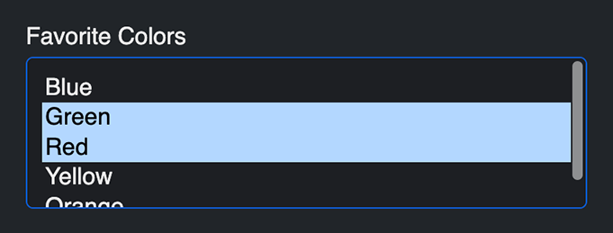
Multiple Select
A multiple-select field. The field.type property value is multiple-select (for conditionals).
Settings
- Can specify labels (with values assumed) or labels and values (that differ).
- Supports
<optgroup>'s. To use this, enable the toggle under the Optgroup column for the applicable row.New in 5.13+
- Can be automatically populated with select Craft Elements or Pre-defined list options.
- Can be used as a User Select email notification.
Number
A single-line number type input field that is validated to contain certain numbers only. The field.type property value is number (for conditionals).
Settings
- Choose if validation should allow negative numbers.
- Optionally set Min/Max values.
- You can set both, just one or neither.
- Optionally set Min/Max character length.
- You can set both, just one or neither.
- Optionally set the number of decimals allowed.
- Set the
step number to set default increments when a user uses the browser up/down arrows to increase/decrease the value.
Templating
minLengthmaxLengthminValuemaxValuedecimalCountallowNegative (e.g. false)step
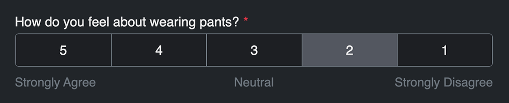
Opinion ScaleProRevised in 5.0+
A special field that allows for flexible opinion scoring using Freeform's built in CSS. The field.type property value is opinion-scale (for conditionals). This field type is included automatically with the Pro edition of Freeform.
Settings
- Set the field's option values and optional corresponding labels.
- Optionally add legends to correspond to with choice options (e.g. Less Satisfied, More Satisfied).
Templating
Customizing the Appearance
To manually render an Opinion Scale field to use your own styles, your code might look something like this:
{% set field = form.get("opinionScale") %}

<ul style="border: 1px dashed gray; padding: 5px;">
    {% for scale in field.scales %}
        <li>
            <input type="radio" name="{{ field.handle }}"
                value="{{ scale.value }}"
                id="{{ field.idAttribute }}-{{ loop.index }}"
                {{ field.value == scale.value ? "checked" }}
                class="hidden"
            />
            <label for="{{ field.idAttribute }}-{{ loop.index }}">
                {{ scale.label ?: scale.value }}
            </label>
        </li>
    {% endfor %}
</ul>

{% if field.legends %}
    <ul>
        {% for legend in field.legends %}
            <li>{{ legend }}</li>
        {% endfor %}
    </ul>
{% endif %}
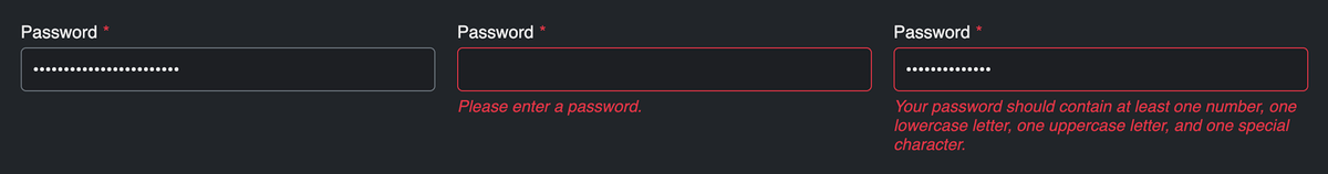
PasswordPro
A special field type that allows you to securely collect a password from a submitter but NOT store the value in the Freeform database (typically used for User Registration forms with the Elements integration). Pair this with the Confirm special field type if you wish to have the user enter their password twice. The field.type property value is password (for conditionals).
SettingsNew in 5.2+
- Min Length - the minimum number of characters the password should be.
- Max Length - the maximum number of characters the password should be.
- Character Variability - the password should contain at least one number, one lowercase letter, one uppercase letter, and one special character.
View Important Notes...
- Collected data is not stored in Freeform anywhere, nor is it included in the Submission object or
allFields variable in email notifications.
- When using with the Users Element integration, the password will be passed off to Craft's Users member account feature.
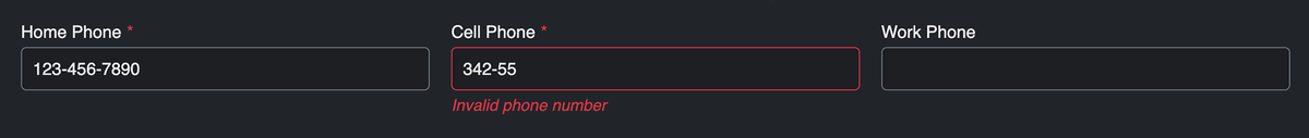
PhonePro
A tel type input field that is validated to contain phone numbers only, based on a configured pattern. The field.type property value is phone (for conditionals).
Settings
- Set pattern to desired format, where
0 is a digit between 0 and 9.
- E.g.
(000) 000-0000 or +0 0000 000000, etc.
- Toggle the Use JS validation setting to have Freeform include JS in the form that validates the format and auto-inserts the extra characters like
(, -, + etc).
Templating
RadiosRenamed in 5.0+
A group of radio options. The field.type property value is radios (for conditionals).
Settings
RatingPro
A special field that allows for star ratings using Freeform's built-in CSS. The field.type property value is rating (for conditionals).
This field type is included automatically with the Pro edition of Freeform.
Settings
- Set the field's number of stars (
3-10).
- Style the color of the stars for the unselected, hover and selected states.
Templating
colorIdle (e.g. #ddd)colorHover (e.g. gold)colorSelected (e.g. #f70)maxValue (e.g. 5)
Customizing the Appearance
To manually render a Rating field using your own styles, your code might look something like this:
{% for i in 1..field.maxValue %}
    <label for="rating-{{ i }}">whatever {{ i }}</label>
    <input type="radio" id="rating-{{ i }}" value="{{ i }}" name="{{ field.handle }}">
{% endfor %}
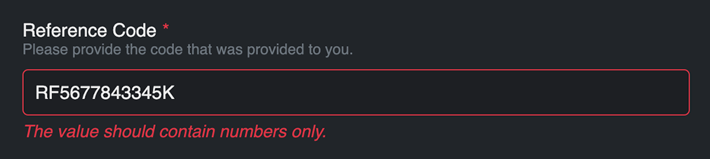
RegexPro
An input field that is validated based on the specified regex pattern (e.g. /^[a-zA-Z0-9]*$/). The field.type property value is regex (for conditionals).
Settings
- Specify a required pattern for values to match, e.g.
/^[a-zA-Z0-9]*$/.
- When needing to use
{} for attributes in Regex fields (such as pattern), you will need to specify them differently, as Freeform is built to allow Twig rendering and it'll choke. So for example, if you need to use [0-9]{4,5}, change it to:
[0-9]{{ '{' }}4,5{{ '}' }}
- Set the error message a user will see if an incorrect value is supplied.
- Any occurrences of
{pattern} will be replaced with specified regex pattern inside the error message, if any are found.
Templating
Rich TextProImproved in 5.10+
A special field type that allows you include rich text inside your form layout in the form builder. The field.type property value is rich-text (for conditionals).
You may also customize which components appear in the Rich Text editor toolbar and in what order. Only core native TinyMCE components are supported. See the Rich Text Field Toolbar Configuration setting under the Form Builder settings.
View Important Notes...
- The Property Editor will load a Rich Text area for you to type into and style as necessary.
- The Layout column in the form builder will live parse your content.
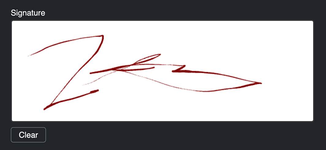
SignaturePro
A field that allows users to handwrite signatures with their mouse inside your form. The field.type property value is signature (for conditionals).
Settings
- Set the dimensions of the field writing/drawing area.
- Set the border and background colors.
- Set the pen dot size (in pixels) and the color.
- To include ability for a user to click a button to erase their signature and start over, check off the Show 'Clear' button? checkbox.
View Important Notes...
- Signatures are stored as an image datapoint value.
- Signatures can be downloaded as JPG or PNG files (from control panel).
- Signatures are excluded from regular exports and the
allFields loop in email notification templates (since it would just hold an image datapoint value string).
- Signatures can be edited when the form is in edit mode.
- The Clear button can be styled inside the form builder with Input attributes area inside the property editor.
- The Signature field, due to it's complexness, cannot easily be manually generated in a form, and is best done with render helpers, e.g.
field.render.
- There's currently no way to make the signature pad area "responsive" (like setting it to 100% width), as this would be quite difficult to account for with the need to display the signature image in various places, etc.
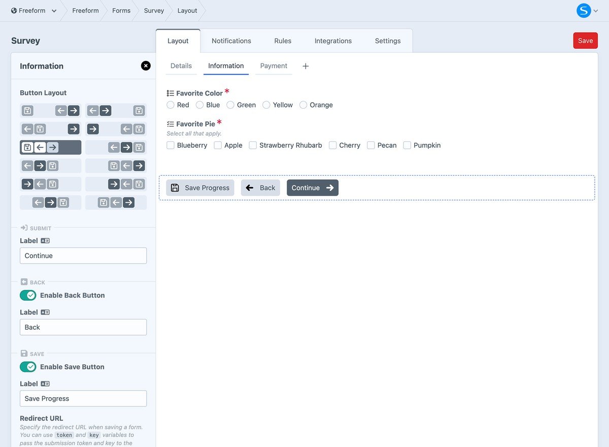
Submit buttons are handled automatically by Freeform. They are automatically inserted at the end of your form in the form builder. This includes the Submit/Continue, Previous (where applicable), and Save & Continue Later buttons (where available).
Settings
The Submit button settings let you edit button labels, adjust placement, and add icons.
- When using with multi-page forms, Freeform will detect when you're on a page after first page, and provide you with the option to toggle a Back button.
- When using with the Pro edition, Freeform will provide you with the option to toggle a Save button.
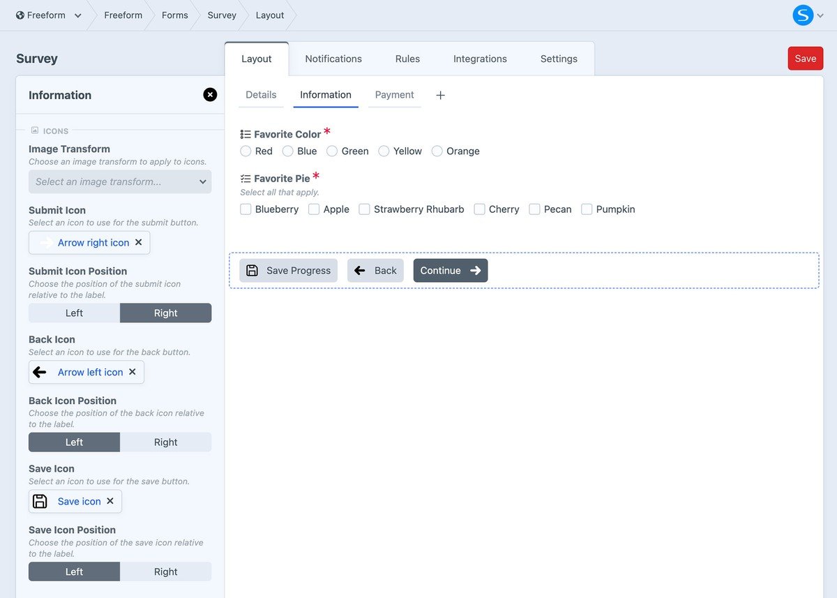
IconsNew in 5.12+
Optionally add icons to submit buttons. Choose an existing asset or upload a new one. Freeform will automatically handle placement and styling.
How it may look on the front end:
Templating
TemplatingRevised in 5.0+
Controlling the format for submit buttons is now done through the new buttons namespace available in the Template Overrides feature or render helpers for more extensive customization.
Check out the 3 different approaches available below:
- Template Overrides
- Render Helper
- Render Properties Helper
{{ form.render({
    buttons: {
        attributes: {
            container: { ... },
            column: { ... },
            buttonWrapper: { ... },
            submit: { class: "form-field-button blue" },
            back: { class: "form-field-button gray" },
            save: { class: "form-field-button blue" },
        },
        submitLabel: "Send",
        backLabel: "Previous",
        saveLabel: "Save",
    }
}) }}
If the override approach is not enough for your needs, you can use a more manual approach. First, you need to disable the automatic insertion of Submit buttons by applying the disable: ["submitButtons"] parameter to your form. Then, you can use the button render approach.
The following are available:
renderSubmit - render a complete Submit buttonrenderBack - render a complete Back buttonrenderSave - render a complete Save button
{{ form.renderTag({
returnUrl: "contact/success",
disable: ["submitButtons"]
}) }}
{% set button = form.currentPage.buttons %}
{{ button.renderSubmit({ 'data-optional': 'attributes here' }) }}
{% if button.back %}
{{ button.renderBack }}
{% endif %}
{% if button.save %}
{{ button.renderSave }}
{% endif %}
{{ form.renderClosingTag }}
For maximum control, you can use a property attributes render instead. The following are available:
renderSubmitProps - render the property attributes to attach to your Submit button.
submitLabel - render the label defined for the Submit button inside the builder.
renderBackProps - render the property attributes to attach to your Back button.
backLabel - render the label defined for the Back button inside the builder.
renderSaveProps - render the property attributes to attach to your Save button.
saveLabel - render the label defined for the Save button inside the builder.
{{ form.renderTag({
returnUrl: "contact/success",
disable: ["submitButtons"]
}) }}
{% set button = form.currentPage.buttons %}
<button {{ button.submitRenderProps({ 'data-optional': 'attributes here' }) }}>
{{ button.submitLabel }}
</button>
{% if button.back %}
<button {{ button.backRenderProps }}>
{{ button.backLabel }}
</button>
{% endif %}
{% if button.save %}
<button {{ button.saveRenderProps }}>
{{ button.saveLabel }}
</button>
{% endif %}
{{ form.renderClosingTag }}
If you need to parse HTML on your button labels, add the |raw filter to submitLabel, etc. E.g. {{ button.submitLabel|raw }}.
Save & Continue LaterPro
This feature allows users to save their form progress and continue/complete the form later. For more information about this feature, please see the Save & Continue Later documentation.
Additional Configuration
- A return URL must be configured. This is where the user should be returned to if they click the button.
- Special
token and key variables are available to include in the return path.
- The return URL can be wherever you like, and fully customizable. This is where you'd include instructions to the user including a URL for where to return to complete the form later.
- You may optionally specify that an email notification be sent to the user if they click the Save button.
- Choose a special Freeform email notification template.
- The message of this email notification is completely customizable, but be sure to include instructions to the user including a URL for where to return to complete the form later.
- Requires targeting of an Email field that will contain the user's email address in order to send the email notification.
- If the user hasn't yet filled out an email address, the email notification attempt will be suppressed (as there is no field validation to ensure the Email field is fillout out). A good way around this would be to have the first page include basic info like name and email but no option to save the form until the second page.
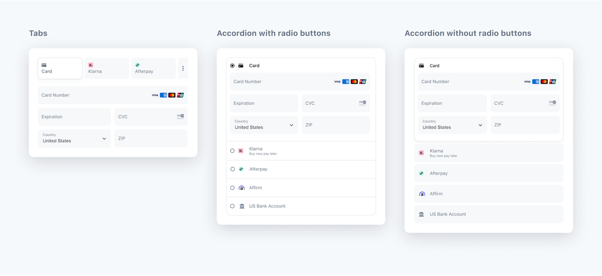
Stripe PaymentProImproved in 5.0+
When the Stripe Payments integration is configured, a Stripe Payments special field type will become available. This field enables your forms to collect (but not store) credit card or other payment information and pass it off to Stripe.
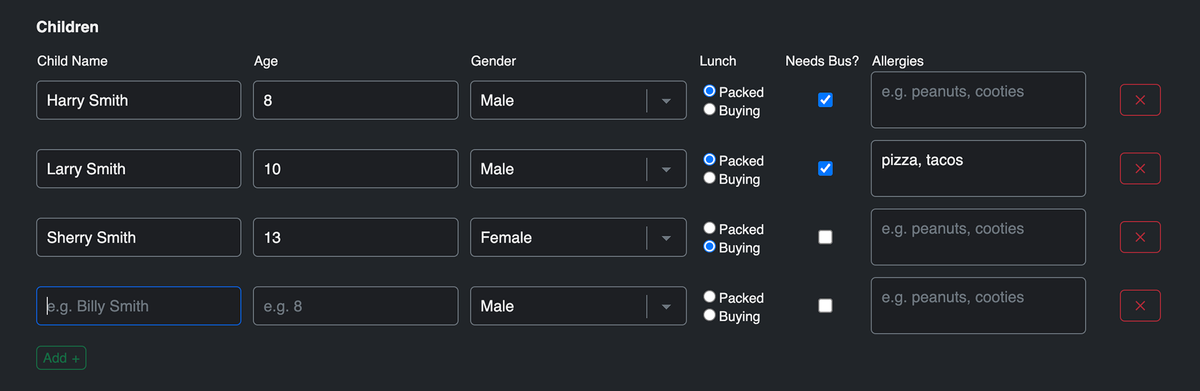
TableProImproved in 5.8+, 5.14+, 5.15+
A field that allows you to collect and handle repeating data. The field.type property value is table (for conditionals).
Settings
- Limit Rows - set limits on the number of rows, including minimum, maximum, exact number, or range.New in 5.14.12+
- Minimum number of rows - set the minimum number of rows. At least this many rows will be shown by default; rows cannot be removed below this count.
- Maximum number of rows - set the maximum number of rows that can be added to the table.
- Exact number of rows - set the exact number of rows. This many rows will be shown with no option to add or remove.
- Use the Table Layout area to create columns for the table. Options are:
- Text
- TextareaNew in 5.8+
- Checkbox
- DropdownImproved in 5.8+
- RadiosNew in 5.8+
- File UploadNew in 5.15+
- Enable the Use built-in javascript for adding and removing rows toggle to have Freeform automatically include JS in the form that validates the format and auto-inserts the extra characters like
(, -, + etc).
Templating
The Table field type includes various parameter options to override labels and finer control of classes and attributes on each part of the Table field.
Here's how you can use field.render for an automated approach to render your Table field inside your formatting templates:
{{ field.render({
    addButtonLabel: "Add +",
    removeButtonLabel: "X",
    tableAttributes: {
        table: { class: "table table-sm table-borderless" },
        input: { class: "form-control" },
        textarea: { class: "form-control" },
        dropdown: { class: "form-control form-select" },
        radios: { class: "form-check-input" },
        checkbox: { class: "form-check-input" },
        fileUpload: { class: "form-control" },
        removeButton: { class: "btn btn-sm btn-danger" },
        addButton: { class: "btn btn-sm btn-success" },
    },
}) }}
{% set tableColumnCount = field.tableLayout|length %}

{{ field.render({
    tableAttributes: {
        table: { class: "table" },
        row: { class: "table-row" },
        column: {
            class: [
                tableColumnCount in [2, 3, 4, 5, 6, 7, 8, 9, 10, 11, 12] ? "w-1/" ~ tableColumnCount,
                tableColumnCount == 1 ? "w-full",
                "table-col pb-1"
            ]
        },
        label: { class: "text-left" },
        input: {
            class: [
                field.attributes.input.get("class"),
                "mr-5 w-11/12 block"
            ]
        },
        textarea: {
            class: [
                field.attributes.input.get("class"),
                "mr-5"
            ]
        },
        dropdown: {
            class: [
                field.attributes.input.get("class"),
                "mr-5 w-11/12 block"
            ]
        },
        radios: {
            class: [
                field.attributes.input.get("class"),
                "w-4 h-4 text-blue-600 bg-slate-100 border-slate-300 rounded mr-2 font-normal text-slate-600",
                "freeform-table-radios"
            ]
        },
        checkbox: {
            class: [
                field.attributes.input.get("class"),
                "w-4 h-4 text-blue-600 bg-slate-100 border-slate-300 rounded"
            ]
        },
        removeButton: { class: "bg-red-500 hover:bg-red-700 text-white font-normal py-1 px-3 rounded" },
        addButton: { class: "bg-green-500 hover:bg-green-700 text-white font-normal py-1 px-3 rounded mt-2" },
    },
}) }}
Customizing the Appearance
For manual rendering of the Table field inside your form for full customizability, your code might look something like this:
<table class="table">
    <thead>
        <tr>
        {% for column in field.tableLayout %}
            <th>{{ column.label }}</th>
        {% endfor %}
        </tr>
    </thead>
    <tbody>
    {% if field.value is empty %}
        <tr>
        {% for index, column in field.tableLayout %}
            {% set colName = field.handle ~ "[0][" ~ index ~ "]" %}
            <td>
            {% switch column.type|default("text") %}
                {% case "dropdown" %}
                    <select name="{{ colName }}">
                    {% for option in column.value|default("")|split(";") %}
                        <option value="{{ option }}">{{ option }}</option>
                    {% endfor %}
                    </select>
                {% case "checkbox" %}
                    <input type="checkbox" name="{{ colName }}" value="{{ column.value|default("Yes") }}" />
                {% default %}
                    <input type="text" name="{{ colName }}" value="{{ column.value|default("") }}" />
            {% endswitch %}
            </td>
        {% endfor %}
        </tr>
    {% else %}
        {% for rowIndex, row in field.value %}
            <tr>
            {% for index, column in field.tableLayout %}
                {% set colName = field.handle ~ "[" ~ rowIndex ~ "][" ~ index ~ "]" %}
                {% set colValue = row[index]|default("") %}
                <td>
                    {% switch column.type|default("text") %}
                    {% case "dropdown" %}
                        <select name="{{ colName }}">
                        {% for option in colValue|default("")|split(";") %}
                            <option value="{{ option }}"{{ option == colValue ? " selected" }}>{{ option }}</option>
                        {% endfor %}
                        </select>
                    {% case "checkbox" %}
                        <input type="checkbox" name="{{ colName }}" value="{{ column.value|default("Yes") }}" {{ colValue ? "checked" }} />
                    {% default %}
                        <input type="text" name="{{ colName }}" value="{{ colValue }}" />
                    {% endswitch %}
                </td>
            {% endfor %}
            </tr>
        {% endfor %}
    {% endif %}
    </tbody>
</table>
Submission Data
- Basic Example
- Complete Example
Here's how to render a Table field's data inside the Submission object:
<table class="table">
    <thead>
        <tr>
        {% for column in field.tableLayout %}
            <th>{{ column.label|default("-") }}</th>
        {% endfor %}
        </tr>
    </thead>
    <tbody>
    {% for row in submission[field.handle].value %}
        <tr>
        {% for index, column in field.tableLayout %}
            <td>
                {% set cell = row[index] ?? null %}
                {% if cell is iterable %}
                    {{ cell|join(', ') }}
                {% else %}
                    {{ cell }}
                {% endif %}
            </td>
        {% endfor %}
        </tr>
    {% endfor %}
    </tbody>
</table>
A complete example might look like:
{% for field in submission %}
    <td>
    {% if field.type == "table" %}
        <table class="table">
            <thead>
                <tr>
                {% for column in field.tableLayout %}
                    <th>{{ column.label|default("-") }}</th>
                {% endfor %}
                </tr>
            </thead>
            <tbody>
            {% for row in submission[field.handle].value %}
                <tr>
                {% for index, column in field.tableLayout %}
                    <td>
                        {% set cell = row[index] ?? null %}
                        {% if cell is iterable %}
                            {{ cell|join(', ') }}
                        {% else %}
                            {{ cell }}
                        {% endif %}
                    </td>
                {% endfor %}
                </tr>
            {% endfor %}
            </tbody>
        </table>
    {% else %}
        {{ submission[field.handle] }}
    {% endif %}
    </td>
{% endfor %}
Email Notification Template
By default, Table field data will be rendered as comma separated values in email notifications, which is not ideal. To account for Table fields in your email notification template, you can use the template code below:
<p>The following submission came in on {{ dateCreated|date('l, F j, Y \\a\\t g:ia') }}.</p>
<p>Here are the details:</p>
<ul>
{% for field in allFields %}
  <li>
    {{ field.label }}:
    {% if field.implements('options') %}
      {{ field.labelsAsString }}
    {% elseif field.type == "table" %}
      <table>
        <thead>
          <tr>
          {% for column in field.tableLayout %}
            <th>{{ column.label|default("-") }}</th>
          {% endfor %}
          </tr>
        </thead>
        <tbody>
        {% for row in field.value %}
          <tr>
          {% for index, column in field.tableLayout %}
            <td>
              {% set cell = row[index] ?? null %}
              {% if cell is iterable %}
                {{ cell|join(', ') }}
              {% else %}
                {{ cell }}
              {% endif %}
            </td>
          {% endfor %}
          </tr>
        {% endfor %}
        </tbody>
      </table>
    {% else %}
      {{ field.valueAsString }}
    {% endif %}
  </li>
{% endfor %}
</ul>
Text
A single-line text input field. The field.type property value is text (for conditionals).
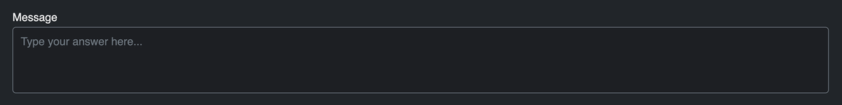
Textarea
A multi-line text input field. The field.type property value is textarea (for conditionals).
Settings
- Can specify the number of rows the textarea should have.
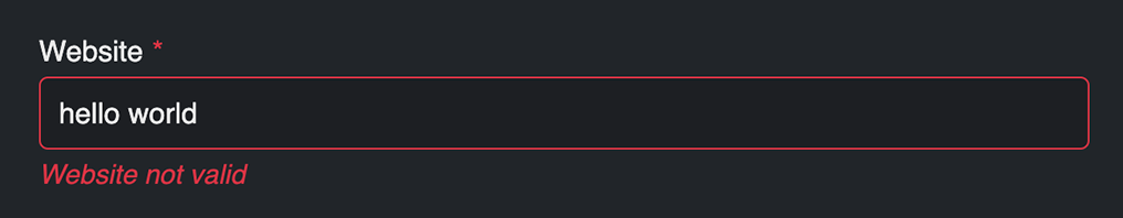
WebsitePro
A url type input field that checks to see if the URL specified has valid syntax (http://, https://, ftp://, etc). The field.type property value is website (for conditionals).
 Field Types
  Favorite Fields New!
 Custom Field Types New!
 Populating Field Options
  Field Encryption New!


