Custom File Delete Confirmation Dialog
It's possible to replace the default confirmation dialog and use your own custom delete confirmation dialog for File Upload Drag & Drop fields.
1
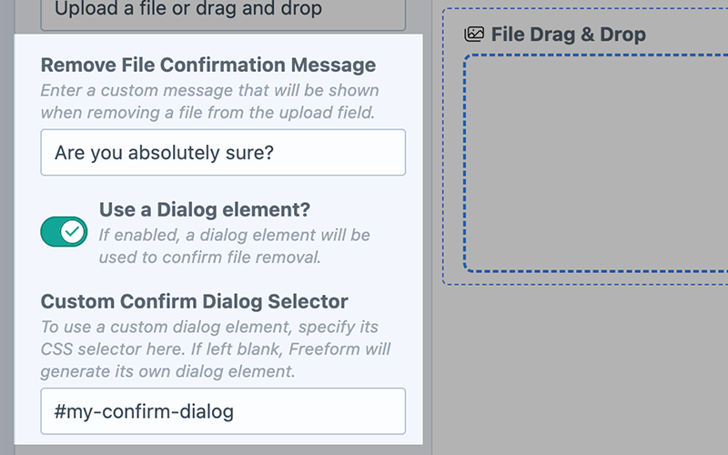
Configure the Field inside the Form Builder
- In the Remove File Confirmation Message setting, enter a custom message value, e.g.
Are you absolutely sure?. - Toggle on the Use a Dialog element? setting.
- In the Custom Confirm Dialog Selector setting, specify the CSS selector for your custom dialog, e.g.
#my-confirm-dialog.
2
Add your own Dialog code to the Template
- Be sure to match the same CSS selector you set for the field inside the form builder.
- Use the
<dialog>HTML tag for the dialog. - Your OK button must have a value of
okfor Freeform to register it correctly.
- Barebones Example
- Tailwind Example
<dialog id="freeform-file-upload-confirm-dialog" open="">
  <form method="dialog">
    <p>{{ form.get("myFieldHandle").removeFileMessage }}</p>
    <menu>
      <button value="cancel">Cancel</button>
      <button value="ok">OK</button>
    </menu>
  </form>
</dialog>
<el-dialog>
<dialog id="confirm-delete" aria-labelledby="dialog-title" class="fixed inset-0 size-auto max-h-none max-w-none overflow-y-auto bg-transparent backdrop:bg-transparent">
<el-dialog-backdrop class="fixed inset-0 bg-gray-500/75 transition-opacity data-closed:opacity-0 data-enter:duration-300 data-enter:ease-out data-leave:duration-200 data-leave:ease-in"></el-dialog-backdrop>
<div tabindex="0" class="flex min-h-full items-end justify-center p-4 text-center focus:outline-none sm:items-center sm:p-0">
<el-dialog-panel class="relative transform overflow-hidden rounded-lg bg-white px-4 pt-5 pb-4 text-left shadow-xl transition-all data-closed:translate-y-4 data-closed:opacity-0 data-enter:duration-300 data-enter:ease-out data-leave:duration-200 data-leave:ease-in sm:my-8 sm:w-full sm:max-w-lg sm:p-6 data-closed:sm:translate-y-0 data-closed:sm:scale-95">
<div class="sm:flex sm:items-start">
<div class="mx-auto flex size-12 shrink-0 items-center justify-center rounded-full bg-red-100 sm:mx-0 sm:size-10">
<svg viewBox="0 0 24 24" fill="none" stroke="currentColor" stroke-width="1.5" data-slot="icon" aria-hidden="true" class="size-6 text-red-600">
<path d="M12 9v3.75m-9.303 3.376c-.866 1.5.217 3.374 1.948 3.374h14.71c1.73 0 2.813-1.874 1.948-3.374L13.949 3.378c-.866-1.5-3.032-1.5-3.898 0L2.697 16.126ZM12 15.75h.007v.008H12v-.008Z" stroke-linecap="round" stroke-linejoin="round" />
</svg>
</div>
<div class="mt-3 text-center sm:mt-0 sm:ml-4 sm:text-left">
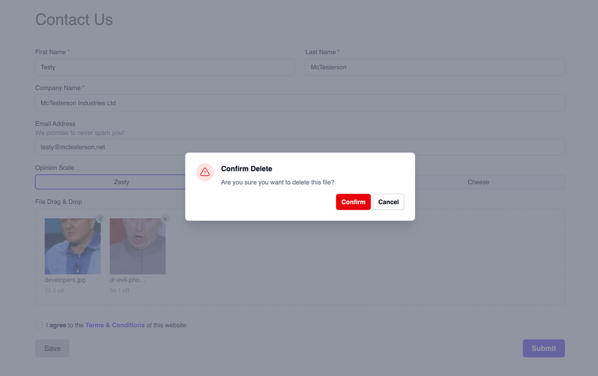
<h3 id="dialog-title" class="text-base font-semibold text-gray-900">Confirm Delete</h3>
<div class="mt-2">
<p class="text-sm text-gray-500">{{ form.get("fileDragDrop").removeFileMessage }}</p>
</div>
</div>
</div>
<div class="mt-5 sm:mt-4 sm:flex sm:flex-row-reverse">
<form method="dialog">
<menu>
<button value="ok" class="inline-flex w-full justify-center rounded-md bg-red-600 px-3 py-2 text-sm font-semibold text-white shadow-xs hover:bg-red-500 sm:ml-3 sm:w-auto">Confirm</button>
<button value="cancel" class="mt-3 inline-flex w-full justify-center rounded-md bg-white px-3 py-2 text-sm font-semibold text-gray-900 shadow-xs ring-1 ring-gray-300 ring-inset hover:bg-gray-50 sm:mt-0 sm:w-auto">Cancel</button>
</menu>
</form>
</div>
</el-dialog-panel>
</div>
</dialog>
</el-dialog>