


This document is for an older version of
Freeform
.
View latest version →
Overview
Form Builder
What makes Freeform different from other form plugins is that it gives you full control to create simple or complex multi-page forms, and everything is at your fingertips in our elegant form builder. It has been expertly designed to minimize mouse movement and clicks. Freeform also features a long list of its own set of robust field types.
Video:
Watch the Building a Simple Form with Freeform Course tutorial on CraftQuest!
Overview
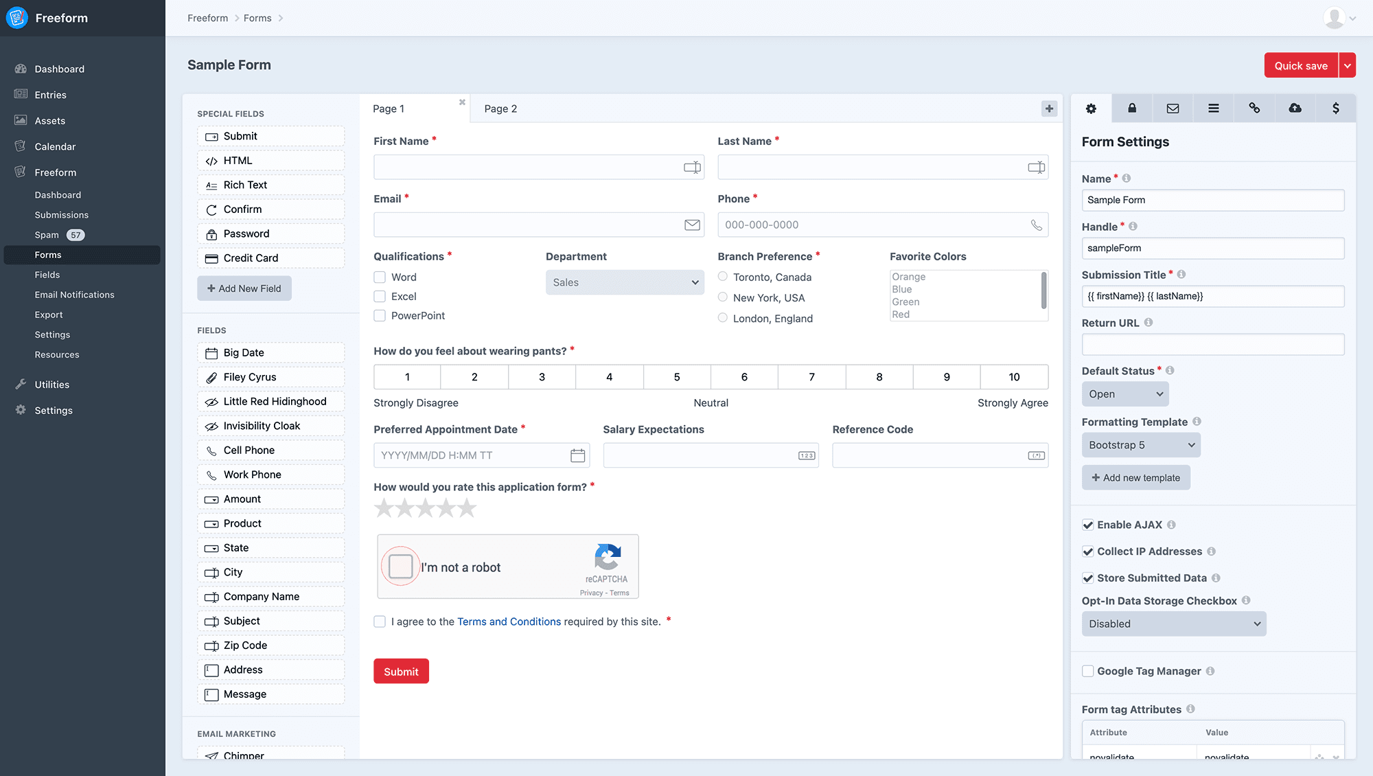
The Freeform form builder is an all-in-one interface that lets you take control of almost every aspect of your forms. Everything is at your fingertips. Before we get started, here's a few notes about the form builder:
- The form builder is divided into 3 columns:
- Fields (left column) contains all of the available fields and special fields you can add to your form.
- New fields can be created in the main field creation area (Freeform > Fields > New Field) as well as directly within the form builder interface by clicking the Add New Field button. Fields created here are available globally as well (they do not just exist for that form).
- If you have configured an Email Marketing integration, you'll see a list for Email Marketing integrations at th bottom left corner. There will be 1 displayed per connection, but you can include the mailing list sign up field as many times as you wish, as long as each uses a different list for that integration.
- Layout (center column) is where you actively see an interactive live preview of what your form will look like.
- You can click or drag any of the fields from the Fields (left column) into the Layout area to add them. Drag them around to move them. Freeform will auto-split rows into columns to fit your fields beside each other, if you wish (to a maximum of 4 columns).
- Clicking anywhere on any field will open up the Property Editor (right column) where you can adjust and configure settings for your field such as label, options, making field required, editing HTML, mapping fields, etc. Changes will apply instantly (not necessary to click save before you do something else).
- To remove a field from the layout, simply click the delete (minus) icon that shows up on top right when you hover over a field.
- Freeform also allows for true multi-page forms (POST submit per page). To add more pages to your form, simply click the plus (+) button at the top of the Layout area next to the page tabs. To edit the name of the page, change the value in the Property Editor (right column). To remove a page, make sure you're on the page you'd like to remove, and then click the delete (minus) icon on the page tab. There is a limit of 100 pages for each form.
- If you wish to rearrange pages, simply drag and drop the tabs. If you need to move a field from one page to another, drag and drop the field onto the page tab you'd like it to be moved to. It will then appear at the top of that page, and you can finish placing it where it should be on that page.
- Property Editor (right column) is where all of the form and field configuration will happen. Clicking on any field, page tab or settings tab inside the form builder layout area will load its configuration options here.
- For all fields, there is a Reset button at the top right of the Property Editor if you wish to have your field options and labels, etc be reset/updated to what is set for the "default" field in Freeform -> Fields area.
- Fields (left column) contains all of the available fields and special fields you can add to your form.
- The form builder applies changes to fields instantly (no need to click save before you move on to adjust the next thing). We've also made the Quick Save (save and continue editing) button and ⌘S option conveniently accessible for you (vs clicking dropdown to find the option).
The form builder's settings tabs (top right of builder):
Settings Tabs
Form Settings
The Form Settings tab (cog icon) handles the overall settings for the form. It will also display and handle editing of settings for fields and multi-page page tabs.
- Name - the name for your form to identify it easier.
- Handle - the unique identifier for the form used in your regular templates calling the form.
- Form Type 3.13+ - the type of form this is. Will only show when other form types add-ons are installed.
- When additional form types are installed, you can choose a different form type that enables special behaviors.
- Submission Title - the variable(s) you place here will establish the title of each form submission to be displayed in the Submissions list.
- May include any Freeform field variables (
fieldName) as well asform.name,form.id,form.handleanddateCreatedas long as they are wrapped in curly braces ({{and}}).
- May include any Freeform field variables (
- Success Behavior 3.13+ - set how you'd like the success return of this form to be handled. Some of these may also conflict with template-level approaches to controlling the form behavior, most typically JS Overrides.
- Options are:
- No Effect - a legacy setting, essentially the same as Reload Form with Success Message, but the default for all existing forms that were created before this setting existed in Freeform 3.13+. We would encourage you to eventually review each form and update to the explicit behavior you actually want for each form (and keep in mind that these can also be overwritten at template level still).
- Return URL - the URL that the form will redirect to after successful submit.
- Reload Form with Success Message - upon successful submit of the form, Freeform will reload the form again and display a success banner above the form.
- If you wish to customize the success message, be sure to visit the Validation tab to specify the Success Message.
- Load Success Template - upon successful submit of the form, Freeform will stay on the same page but replace the form contents with the contents of the Success Template that you specify. Please note that this will not work when manually rendering form formatting directly inside a regular template (not using a Formatting Template).
- Success Template - specify which Success Template you'd like to be used for this form.
- Use Return URL - upon successful submit of the form, Freeform will redirect the user to the URL specified in the Return URL setting.
- Return URL - the URL that the form will redirect to after successful submit.
- May contain:
form.handle- handle of form.submission.token- secure token created for the submission.submission.id- newly created unique submission ID in the URL. This would allow you to use the freeform.submissions template function to display some or all of the users' submission on the success page.
- May contain:
- Return URL - the URL that the form will redirect to after successful submit.
- No Effect - a legacy setting, essentially the same as Reload Form with Success Message, but the default for all existing forms that were created before this setting existed in Freeform 3.13+. We would encourage you to eventually review each form and update to the explicit behavior you actually want for each form (and keep in mind that these can also be overwritten at template level still).
- Options are:
- Default Status - the default status to be used when users submit the form, unless overwritten at template level.
- See Statuses documentation for managing statuses.
- Formatting Template (optional) - if using the render() method, this essentially allows you to "attach" a formatting template to a form so that you don't need to include formatting inside the template(s) you place the form inside.
- Select from an existing sample or custom template, or create a new one.
- If creating a new one, a new template file will automatically be created for you in your Formatting Template Directory containing sample template code that you can adjust later.
- Users/groups need to have permissions access for Settings to create new formatting templates.
- Select from an existing sample or custom template, or create a new one.
- Enable AJAX - enables Freeform's built-in automated AJAX submit support. Once enabled, Freeform will handle the rest (as long as you're using standard template formatting - very custom formatting templates may not work properly).
- Collect IP Addresses - allows you to specify whether or not the form should collect IP addresses from submitters.
- It's important to note that this likely isn't a complete solution for GDPR Compliance if that is why you are using this feature. Please read our official Guide to GDPR Compliance with Freeform for more information.
- Store Submitted Data - allows you to specify whether the submission data for this form should be stored in the database.
- Typical use-cases for not storing submission data on your site would be if you just wanted the email notification and/or wanted the data submitted over to an Email Marketing or CRM integration.
- It's important to note that this likely isn't a complete solution for GDPR Compliance if that is why you are using this feature. Please read our official Guide to GDPR Compliance with Freeform for more information.
- Opt-In Data Storage Checkbox - allows the submitter to choose whether or not they want their submission data stored on your site. In the select dropdown, select a Checkbox fieldtype you want to be the designated opt-in field, or choose Disabled to not use this feature.
- This setting will still send off data to integrations and email notifications.
- It's important to note that this likely isn't a complete solution for GDPR Compliance if that is why you are using this feature. Please read our official Guide to GDPR Compliance with Freeform for more information.
- Google Tag Manager - allows you to enable Google Tag Manager to push successful form submission events to the data layer (when AJAX enabled).
- Event Name - specify a custom event name that you wish to assign to a successful form submission.
- GTM Account ID - add this if you want Google Tag Manager scripts added to your page by Freeform. Leave blank if you are adding your own GTM scripts.
- Form tag Attributes - add any
<form>tag attributes for the form here, e.g.novalidate,data-my-attributeandautocomplete="on". - Form Color - used for features like charts in Freeform dashboard widgets.
- Description - a description for the form to store notes or help identify what it's used for, etc.
- POST Forwarding Pro - if you need to have the POST data of this form submitted to an external API, provide that custom URL here.
- POST Forwarding Error Trigger - provide a keyword or phrase Freeform should check for in the output of the external POST URL to know if and when there's an error to log, e.g.
errororan error occurred. - See POST Forwarding documentation for more information about this feature.
- POST Forwarding Error Trigger - provide a keyword or phrase Freeform should check for in the output of the external POST URL to know if and when there's an error to log, e.g.
Validation
Freeform's Validation tab (lock icon) is where you can configure certain form-specific behaviors such as messages and submit button indicators.
- Success Message 3.9+ - the text to be shown at the top of the form if the submit is successful (AJAX), or load in your template with
form.successMessage. - Error Message 3.9+ - the text to be shown at the top of the form if there are any errors upon submit (AJAX), or load in your template with
form.errorMessage. - Show Loading Indicator on Submit 3.9+ - show a loading indicator on the submit button upon submittal of the form.
- Show Loading Text 3.9+
- Enabling this will change the submit button's label to the text of your choice.
- Loading Text - enter the custom value you'd like to be displayed when the form is processing.
- Limit Form Submission Rate Pro - allows you to limit the number of times a user can submit the form.
- Options are:
- Do not limit
- Logged in Users only (no limit) 3.13+
- Once per Cookie only
- Once per IP/Cookie combo
- Once per logged in Users only 3.13+
- Once per logged in User or Guest Cookie only 3.13+
- Once per logged in User or Guest IP/Cookie combo 3.13+
- Please see Submission Limits documentation for more information about available options, including setting limits for the entire form.
- Options are:
- Stop Submissions After (date) 3.13+ - allows you to prevent new submissions of the form after the set date.
Admin Email Notifications
Freeform allows you to send an email to admins (or other predefined email addresses) 2 different ways:
- With the Dynamic Recipients field type, allowing the user to select from a few different predefined options to direct their email notification to.
- As a hard coded option set for the form.
To use the latter approach, click the Admin Notifications tab (envelope icon) to set up admin email notifications. Select the email notification template (or quickly create a new one - users/groups need to have permissions access for Email Notifications to create new notification templates), and then enter the admin email address(es), each on a new line, you wish to receive an email notification upon users successfully submitting the form.
Additionally, you can use Twig code inside the Admin Recipients textarea field, which allows you to perform conditional checks on fields that would send an email notification to a different email address, etc.
For example, you could use something like this:
{% if myRadioField == "option1" %}
bigbob@acmewidgets.net
{% elseif myRadioField  == "option2" %}
fuzzypants@acmewidgets.net
{% else %}
hotsauce@acmewidgets.net
{% endif %}
2
3
4
5
6
7
OR
{{ firstName == 'Bob' ? 'some@email.com' : 'other@email.com' }}
For more email notification options, please see the Types of Email Notifications documentation.
Conditional Rules Pro
The Conditional Rules tab (lines icon) is where you can configure fields to show or hide based on the contents/selection of other fields, and even skip pages or submit the form based on the contents/selection of fields on a previous page.
Please see the Conditional Rules documentation for more information about this feature.
Element Connections Pro
The Element Connections tab (chain icon) is where you can connect and map Freeform submission data to other Craft Elements such as Craft Entries and Craft Users.
The possibilities are endless when you consider that it essentially allows you to easily create complex user registration forms or accept guest submitted content that maps to Craft entries for further management by site admins for publishing... or whatever else you can dream up!
Please see the Element Connections documentation for more information about this feature.
Video:
Watch the Using Element Connections Course tutorial on CraftQuest!
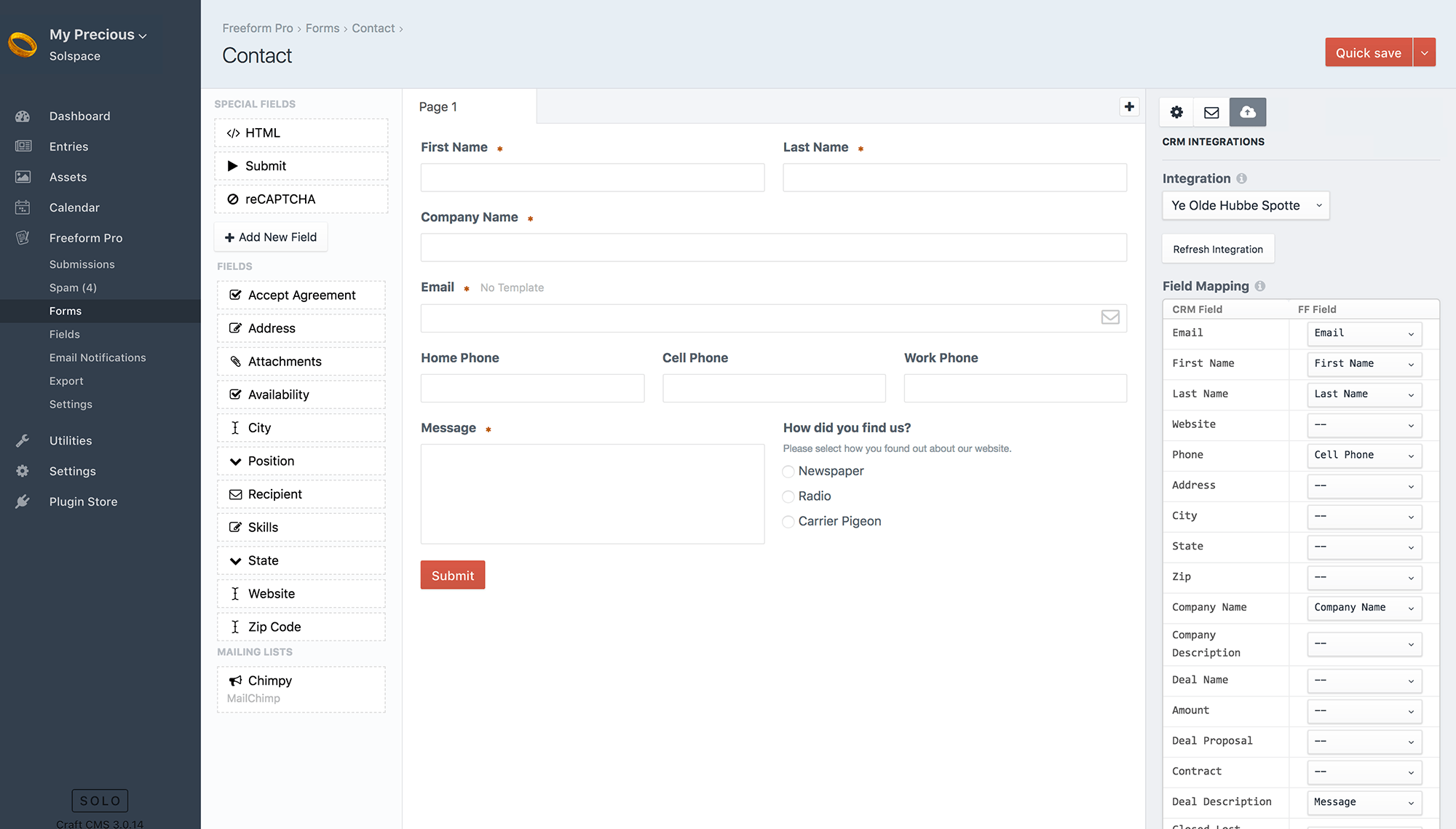
CRM Integrations Pro
The CRM Integrations tab (cloud icon) is where you configure any CRM integrations you may have on a per-form level. Simply choose an integration name and then map out your Freeform fields to your CRM's fields. This tab will only show if you have any CRM integrations configured.
Payments Pro
The Payments tab (dollar sign icon) is where you configure a Stripe Payments integration on a per-form level. Simply choose the Payment integration name and then configure the form and map out your Freeform fields to your Stripe fields. This tab will only show if you have a Payment integration configured. You will also need to add a Credit Card special field to the form layout.