


Range Slider on Number field
It's possible to easily implement range field type styling/handling on regular Text or Number fields.
Instructions
To familiarize yourself with the Range field type, a basic code example looks something like this:
<label>How many pies do you eat per year?</label>
<div class="freeform-range">
    <input type="range" name="myFieldHandle" id="myFieldHandle" min="0" max="100" step="5" value="0" />
</div>
2
3
4
This will output the following (go ahead and play with it!):
How many pies do you eat per year?
What you might like to do is replace Number fields with a range slider. The Number field allows you to configure the Range features from inside the form builder. Your code can then include things like minValue, maxValue, step, and defaultValue:
{{ field.renderLabel() -}}
<div class="freeform-range">
    <input type="range" min="{{ field.minValue }}" max="{{ field.maxValue }}" step="{{ field.step }}" value="{{ field.defaultValue ? field.defaultValue : '0' }}" name="{{ field.handle }}" id="form-input-{{ field.handle }}" />
    <span>{{ field.defaultValue ? field.defaultValue : '0' }}</span>
</div>
2
3
4
5
To add a bit of your own styling to the Range field, you can begin with the following CSS:
.freeform-range {
    display: flex;
    align-items: center;
    max-width: 500px;
    height: 4rem;
    width: 80%;
    padding: 0px 10px;
}
.freeform-range input[type=range] {
    -webkit-appearance: none;
    appearance: none;
    width: 100%;
    height: 6px;
    cursor: pointer;
    outline: none;
    border-radius: 15px;
    padding: 0 !important;
    border: 0 !important;
    background: #d6d6d6;
}
.freeform-range input[type=range]::-webkit-slider-thumb {
    -webkit-appearance: none;
    appearance: none;
    height: 15px;
    width: 15px;
    background-color: #058ffe;
    border-radius: 50%;
    border: none;
    transition: all .25s;
}
.freeform-range input[type=range]::-moz-range-thumb {
    height: 15px;
    width: 15px;
    background-color: #058ffe;
    border-radius: 50%;
    border: none;
    transition: all .25s;
}
.freeform-range input[type=range]::-webkit-slider-thumb:hover,
.freeform-range input[type=range]:active::-webkit-slider-thumb {
    box-shadow: 0 0 0 10px rgba(5,143,254, .15)
}
.freeform-range input[type=range]::-moz-range-thumb:hover,
.freeform-range input[type=range]:active::-moz-range-thumb {
    box-shadow: 0 0 0 10px rgba(5,143,254, .15)
}
.freeform-range span {
    font-size: 20px;
    width: 40px;
    text-align: center;
}
2
3
4
5
6
7
8
9
10
11
12
13
14
15
16
17
18
19
20
21
22
23
24
25
26
27
28
29
30
31
32
33
34
35
36
37
38
39
40
41
42
43
44
45
46
47
48
49
50
51
Then include the following JS in order to handle the output of value selected in the range, and correctly style the progress bar:
const freeformRange = document.querySelector(".freeform-range input[type=range]")
const freeformRangeValue = document.querySelector(".freeform-range span")

freeformRange.addEventListener("input", (event) => {
    const freeformRangeValueProgress = event.target.value;
    freeformRangeValue.textContent = freeformRangeValueProgress;

    const progress = (freeformRangeValueProgress / freeformRange.max) * 100;

    freeformRange.style.background = `linear-gradient(to right, #058ffe ${progress}%, #d6d6d6 ${progress}%)`;
})
2
3
4
5
6
7
8
9
10
11
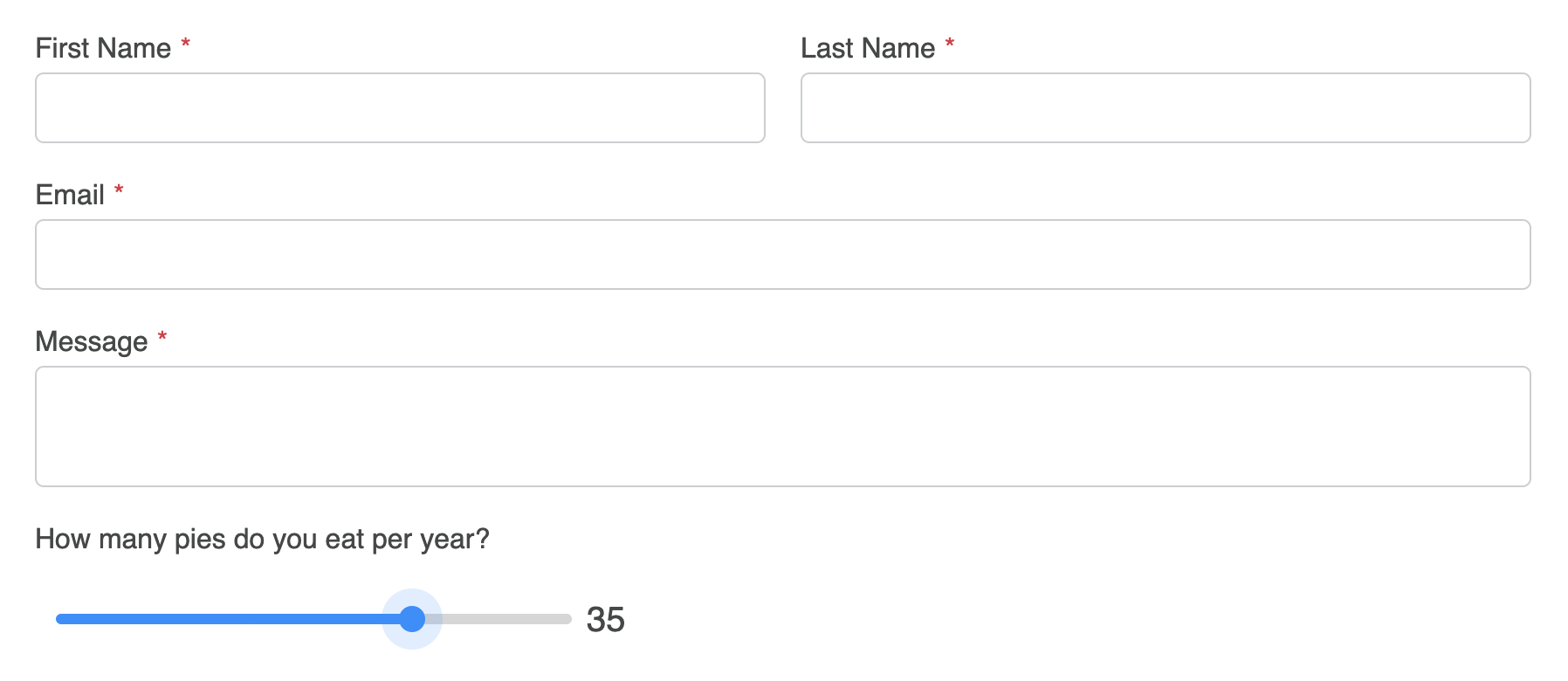
The result should look something like this:

In order for this to automatically happen inside a formatting template, you'll want to create a new one if you haven't already. If you using the Basic Light formatting template as a starting point, your code might look something like this:
{# Shortened for Example #}
...
    <div class="freeform-fieldtype-{{ field.type }}">
        {% if field.type == "number" %}
            {{ field.renderLabel() }}
            {{ field.renderInstructions() }}
            <div class="freeform-range">
                <input type="range" min="{{ field.minValue }}" max="{{ field.maxValue }}" step="{{ field.step }}" value="{{ field.defaultValue ? field.defaultValue : '0' }}" name="{{ field.handle }}" id="form-input-{{ field.handle }}" />
                <span>{{ field.defaultValue ? field.defaultValue : '0' }}</span>
            </div>
            {{ field.renderErrors() }}
        {% else %}
            {{ field.render() }}
...
{# Shortened for Example #}
2
3
4
5
6
7
8
9
10
11
12
13
14
15
TIP
Don't forget to include the custom CSS and JS that was mentioned in Step 3.
The result might look something like this:
TIP
Please see MDN Web Docs for more information about Range input elements.