This document is for an older version of
Freeform
.
View latest version →
Fields & Field Types
Freeform uses its own set of fields and field types. Using a predefined set of fields also gives us the control to more easily account for how each form field should be displayed in Composer's live preview, and provides a smoother experience. The Freeform Express edition has a limit of 15 fields.
WARNING
There is currently a limitation of around 85-125 Freeform fields for each install of ExpressionEngine, due to the MySQL column limit, since all fields are stored in a single table. The limit is different for everyone, due to field types chosen, database encoding, etc. However, Freeform fields can be used across all forms, and even be relabelled for each form.
- Fields Overview
- Field Types
- Pro Field Types
- Special Fields
- Field Specific Properties
- Populating Fields with EE Data & Predefined Options
Fields Overview
Fields are global and available to all forms, but they can also be overwritten per form. This allows you to save time reusing existing fields when making other forms, but also gives you flexibility to make adjustments to them when needed. So to clarify, you can create fields with labels and options that are common to all forms, but also override those on each form. For example, if you have a field named Cell Phone, on the form level, you can rename the field name to Mobile Phone, or if you have a Checkbox Group field with options: Option 1, Option 2, and Option 3, you could override it to just have 2 options with values of Option A and Option B. When the fields are edited at global level (in main Fields area of Freeform control panel), your customizations per form will NOT be lost.
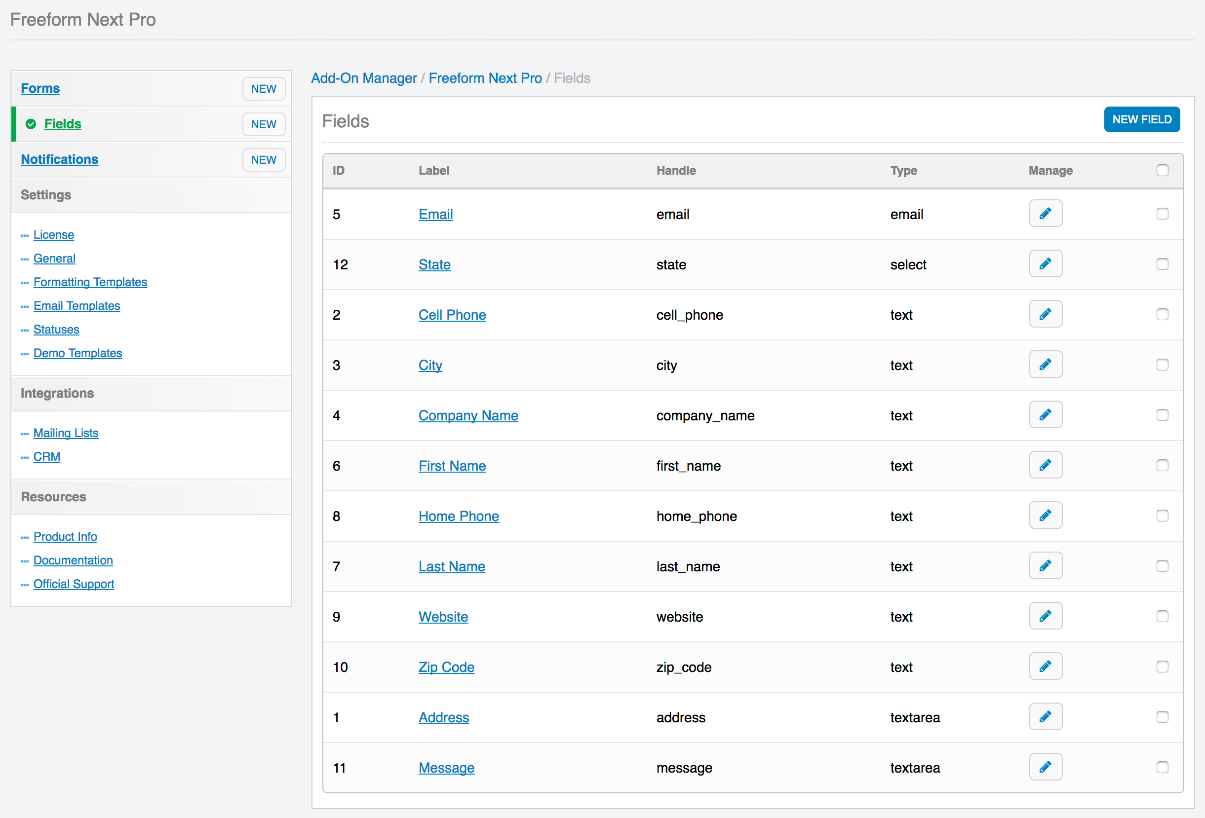
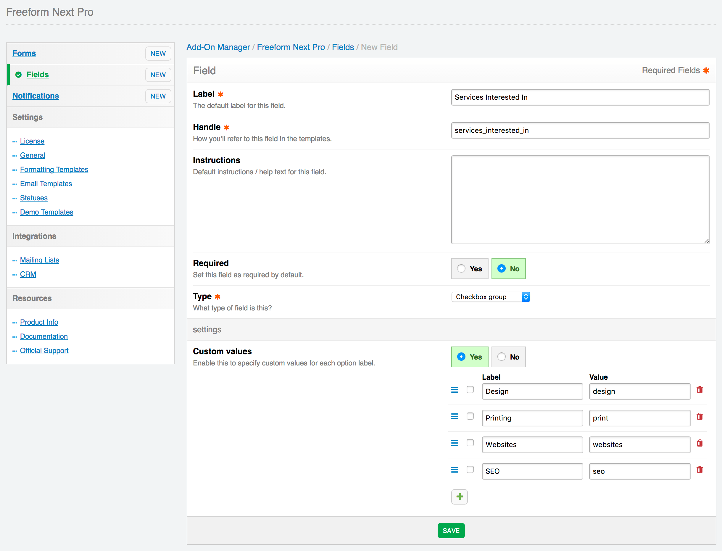
Fields can be created and managed in the main field creation area (Freeform > Fields > New Field) and can also be created directly within the Composer interface as well. Fields created here are available globally as well (they do not just exist for that form).
Some important notes:
- All field properties can be overwritten at form level inside Composer, including the field Handle.
- Once a field is created, you cannot change the field type after.
- Freeform will load fields of Hidden type at the beginning of the form, regardless of where they are placed in Composer layout.
Field Types
The following field types are available (see below for additional Pro Field Types):
- Text (
text) #- A simple input field.
- Can be marked as required.
- Can contain default text and/or placeholder.
- Can set
maxlengthproperty.
- A simple input field.
- Textarea (
textarea) #- A simple multi-line input field.
- Specify the number of rows the textarea should have.
- Can be marked as required.
- Can contain default text and/or placeholder.
- Can set
maxlengthproperty. - Will automatically convert newlines to line breaks when outputting data in templates or email notifications.
- A simple multi-line input field.
- Email (
email) #- An input field that is flagged in Freeform to expect an email address value as well as possibility for receiving email notifications.
- In the Property Editor (right column) in Composer, select a notification template if you want the email entered for this field to receive an email notification.
- To allow sending of email notifications to more than 1 email address (e.g. in the case of a "Tell-a-Friend" type form), you can add multiple input fields, each with the name
email[]. This approach would require that you code this part manually however. - Required field type if you wish for your users to receive an email notification.
- Required field type if you're using with a Mailing List API integration.
- Can be marked as required.
- Can contain default text and/or placeholder.
- An input field that is flagged in Freeform to expect an email address value as well as possibility for receiving email notifications.
- Hidden (
hidden)- A hidden field.
- Can only include text strings at this time (no variables allowed).
- If you need you pass a value to your hidden field dynamically, you can do so with the
override_valuesparameter, e.g.override_values:FIELD_NAME="myvalue"
- If you need you pass a value to your hidden field dynamically, you can do so with the
- Cannot be marked as required.
- Freeform will load fields of this type at the beginning of the form, regardless of where they are placed in Composer layout.
- Can only include text strings at this time (no variables allowed).
- A hidden field.
- Select (
select) #- A select dropdown menu field.
- Can specify labels (with values assumed) or labels and values (that differ).
- To make the first option empty, use labels and values approach with first option having -- or Please select..., etc for the label, and leave option blank.
- Can be automatically populated with select EE Data or Pre-defined list options.
- Can be marked as required.
- Can specify default option to be selected.
- Can specify labels (with values assumed) or labels and values (that differ).
- A select dropdown menu field.
- Multiple Select (
multiple_select) #- A multiple select field.
- Can specify labels (with values assumed) or labels and values (that differ).
- Can be automatically populated with select EE Data or Pre-defined list options.
- Can be marked as required.
- Can specify default option(s) to be selected.
- A multiple select field.
- Checkbox (
checkbox) #- A single checkbox field.
- Has a default value of Yes, which can be overwritten with any value you want. The front end however, will always display the value as
1, but upon submission, the value will be switched to the one you have set. - Can be marked as required, which would essentially require that this checkbox be checked.
- Can be checked by default.
- Has a default value of Yes, which can be overwritten with any value you want. The front end however, will always display the value as
- A single checkbox field.
- Checkbox Group (
checkbox_group) #- A group of checkboxes.
- Can specify labels (with values assumed) or labels and values (that differ).
- Can be automatically populated with select EE Data or Pre-defined list options.
- Can be marked as required.
- Can specify which (if any) options to be checked by default.
- A group of checkboxes.
- Radio Group (
radio_group) #- A group of radio options.
- Can specify labels (with values assumed) or labels and values (that differ).
- Can be automatically populated with select EE Data or Pre-defined list options.
- Can be marked as required.
- Can specify which (if any) option to be selected by default.
- A group of radio options.
- File Upload (
file) #- A file upload field, using EE File Uploads.
- Can allow a single file or multiple files (applies
multipleattribute to the single file upload input) to be uploaded.- Specify a number larger than
1in the File Count setting to allow multiple files to be uploaded at the same time. - Must have an Upload Directory Preference where the file will be uploaded to.
- Be sure that the EE Upload Directory's Allowed file types? preference is set to All file types, even if you're only using images.
- Define maximum file size (in KB). Default is 2048 KB (2MB). Is subject to:
- PHP memory_limit
- PHP post_max_size
- PHP upload_max_filesize
- Select which file types can be uploaded.
- Leaving all options unchecked will allow ALL file types.
- In multi-page forms, if an earlier page contains file upload field(s), files will actually be uploaded before the form is officially submitted.
- If the form is never completed, incomplete submissions are stored for 3hrs, and then are removed (along with the file(s)) after that.
- Can be marked as required.
- Specify a number larger than
- Dynamic Recipients (
dynamic_recipients) #- A select dropdown menu field that contains protected email addresses and labels for each.
- Can be switched to Radio or Checkbox group options at form level inside Composer.
- Specify labels and email address values.
Emails are never parsed in source code (they're replaced with 0, 1, 2, etc).
- NOTE: When parsing this field semi-manually, be sure to use
{field:index}to generate numeric values of options instead of{field:value}.
<select name="{field:department:handle}" type="dynamic_recipients">
	{field:department:options}
		<option value="{option:index}" {if option:checked}selected{/if}>
			{option:label}
		</option>
	{/field:department:options}
</select>
1
2
3
4
5
6
7- NOTE: When parsing this field semi-manually, be sure to use
To make the first option empty, specify
--orPlease select..., etc for the label, and leave option blank.
- In the Property Editor (right column) in Composer, select a notification template you want the selected recipient for this field to receive.
- Users/groups need to have permissions access for Email Notifications to create new formatting templates.
- Can be marked as required.
- Can specify default option(s) to be selected.
- Can specify 1 or more recipient options at a time (when using as Checkboxes).
- Multiple email addresses can be specified for each option, separated by commas.
- Can include more than 1 of this field type in your forms, allowing for multiple sets of recipients to be notified.
- A select dropdown menu field that contains protected email addresses and labels for each.
Pro Field Types
The following extra field types are available with Freeform Pro:
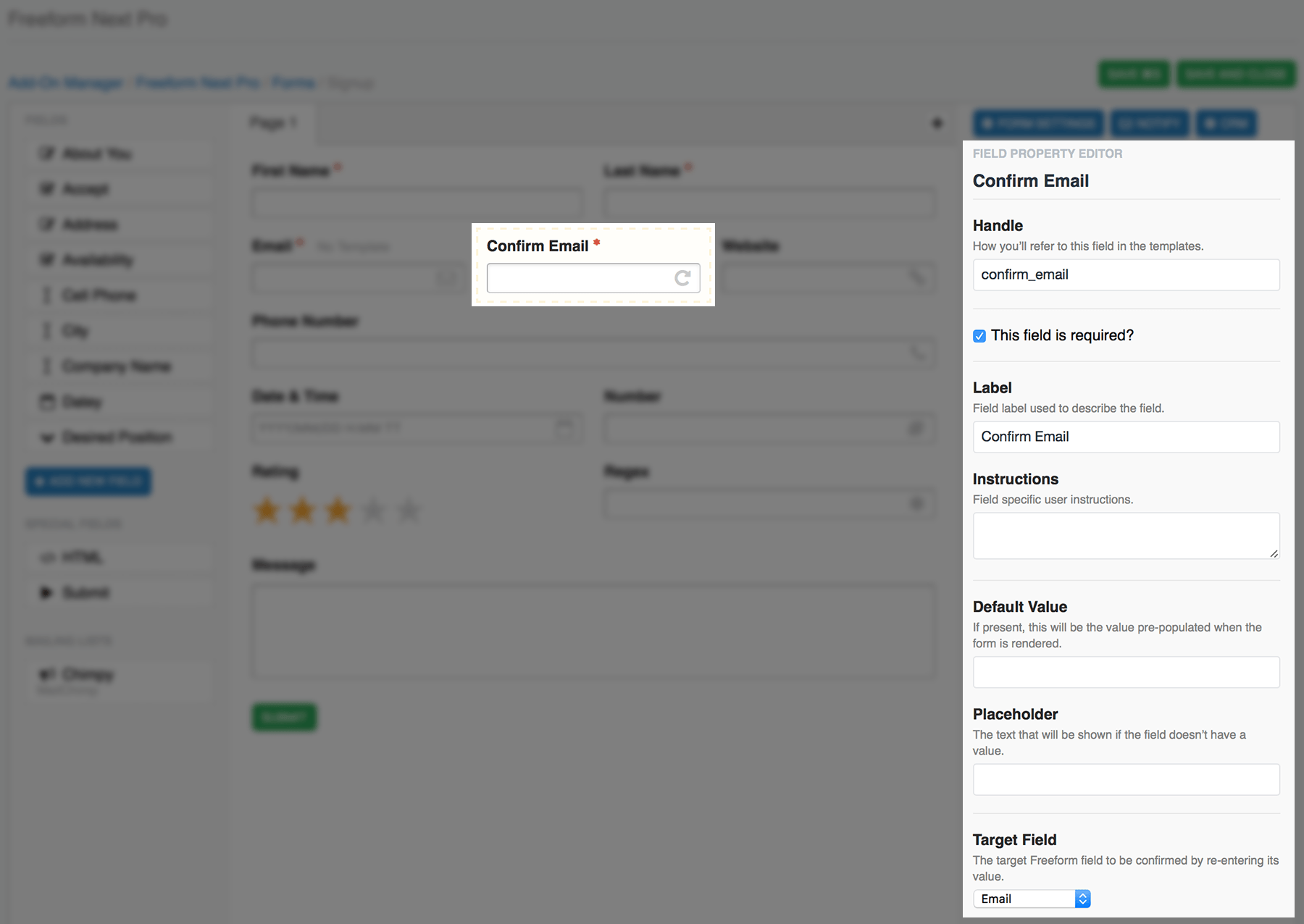
- Confirmation #
- Allows you to force a user to enter a matching value for another field (e.g. "Confirm Email Address").
- Select a target field to compare with.
- Can be marked as required.
- Can contain default text and/or placeholder.
- Allows you to force a user to enter a matching value for another field (e.g. "Confirm Email Address").
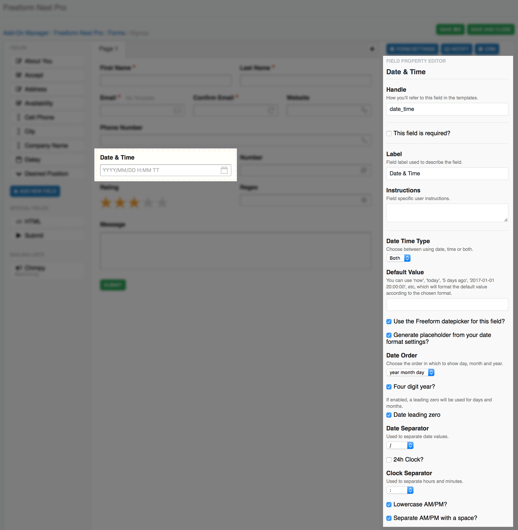
- Date & Time #
- A complex date and/or time field. Can be used as Date only, Time only, or both. Many configuration and validation options available as well:
- Set a default value.
- Can use
now,today,5 days ago,2017-01-01 20:00:00, etc, which will format the default value according to the chosen format as a localized value.
- Can use
- Select if the field should use the default Freeform datepicker.
- Can include your own manually in the template if you wish.
- Generate a placeholder from your date format settings showing the accepted format.
- Can include your own placeholder if you wish.
- Date Order - the formatting order you'd like. Options are:
- Year month day
- Month day year
- Day month year
- Select if the year should be displayed/validated as 4 digits.
- Select if the day and month numbers should have a leading
0for single digit values (e.g. August will display as08instead of8). - Date separator - the character used between each year, month, day value:
- None
- Space (
) /-.
- Select if time and datepicker should use 24 hour clock.
- Clock separator - the character used to separate hours and minutes:
- None
- Space (
) :-.
- Choose if placeholder should display lowercase AM/PM (for 12hr clock).
- Choose if placeholder should separate AM/PM with a space (for 12hr clock).
- Can be marked as required.
- Set a default value.
- A complex date and/or time field. Can be used as Date only, Time only, or both. Many configuration and validation options available as well:
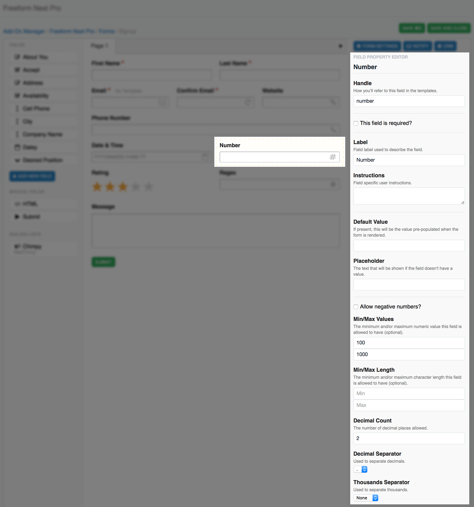
- Number #
- An input field that is validated to contain numbers only, based on several configuration options.
- Choose if validation should allow negative numbers.
- Optionally set Min/Max values.
- Both are optional, you can have both, just one or neither.
- Optionally set Min/Max character length.
- Both are optional, you can have both, just one or neither.
- Set the number of decimals allowed.
- Decimal Separator - the character used to separate decimals:
.,
- Thousands Separator - the character used to separate thousands:
- None
- Space (
) ,.
- Can be marked as required.
- Can contain default text and/or placeholder.
- An input field that is validated to contain numbers only, based on several configuration options.
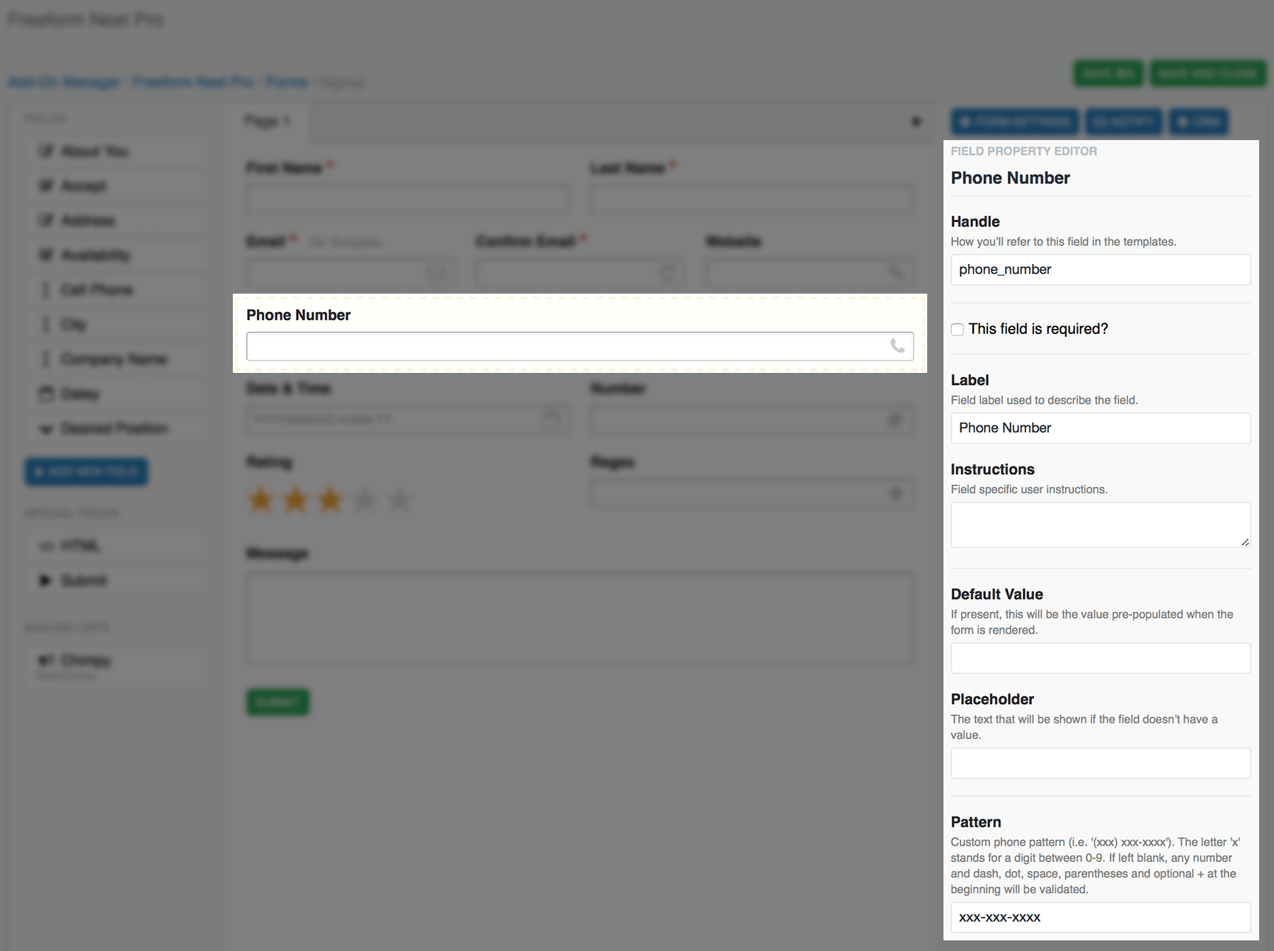
- Phone #
- An input field that is validated to contain phone numbers only, based on pattern configured.
- Set pattern to desired format, where
xis a digit between0and9, e.g:(xxx) xxx xxxxxxx-xxx-xxxx- If no pattern specified, Freeform will default to a universal phone number validation pattern.
- Can be marked as required.
- Can contain default text and/or placeholder.
- Set pattern to desired format, where
- An input field that is validated to contain phone numbers only, based on pattern configured.
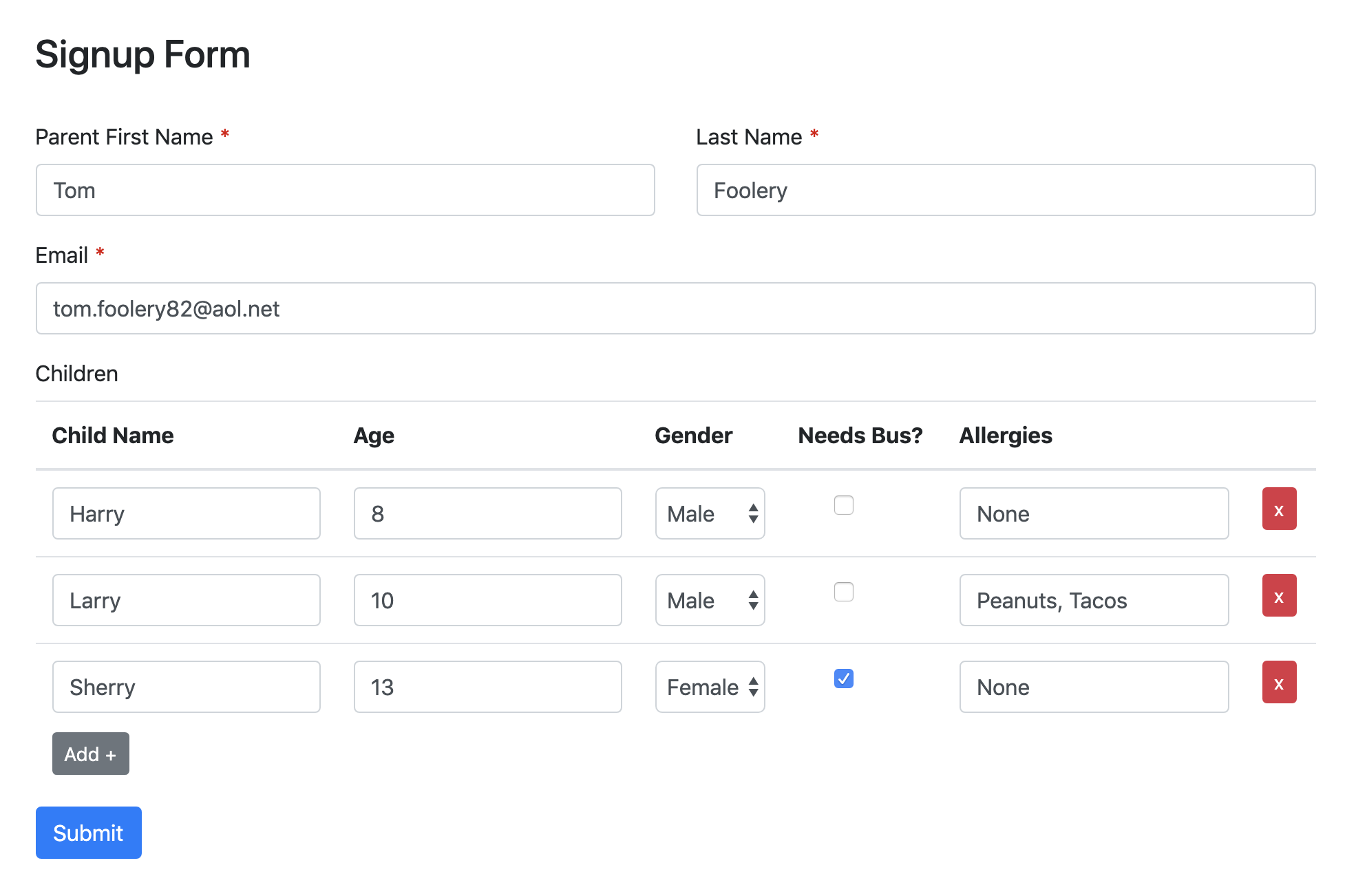
- Table #
- A special field which allows users to enter repeating data rows into predefined columns.
When rendering this fieldtype automatically in a loop iterating over all fields, these additional parameters are available to adjust it:
{field:render_input
    class="table"
	add_button_label="Add +"
	add_button_class="btn btn-small btn-primary"
	remove_button_label="x"
	remove_button_class="btn btn-small btn-danger"
	table_text_input_class="form-control"
	table_select_input_class="form-control"
	table_checkbox_input_class="form-check-input"
}
2
3
4
5
6
7
8
9
10
When manually rendering, the following markup is available:
{field:render_label label_class="{if field:required}required{/if}"}
{field:layout}
<table class="form-table table" id="form-input-{field:handle}">
<thead>
<tr>
{layout:columns}
<th>{column:label}</th>
{/layout:columns}
<th> </th>
</tr>
</thead>
<tbody>
{layout:rows}
<tr>
{row:columns}
<td>
{if column:type == "string"}
<input type="text" class="form-control" name="{field:handle}[{column:row_index}][{column:index}]" value="{column:value}" data-default-value="{column:default_value}" />
{if:elseif column:type == "select"}
<select name="{field:handle}[{column:row_index}][{column:index}]"class="form-control">
{column:options}
<option value="{option:value}"{if column:value == option:value} selected{/if}>{option:value}</option>
{/column:options}
</select>
{if:elseif column:type == "checkbox"}
<input type="checkbox" name="{field:handle}[{column:row_index}][{column:index}]" class="form-check-input" value="{column:default_value}" data-default-value="{column:default_value}"{if column:value} checked{/if} />
{/if}
</td>
{/row:columns}
<td><button class="form-table-remove-row btn btn-small btn-danger" type="button">x</button></td>
</tr>
{/layout:rows}
</tbody>
</table>
<button class="form-table-add-row btn btn-small btn-primary" data-target="form-input-{field:handle}" type="button">Add +</button>
{/field:layout}
2
3
4
5
6
7
8
9
10
11
12
13
14
15
16
17
18
19
20
21
22
23
24
25
26
27
28
29
30
31
32
33
34
35
36
This can also be used inside of the submission:fields variable pair of the Submissions template tag as well.
Here's a breakdown of the available variable pairs and variables for the Table field when rendering manually:
{field:layout}{/field:layout}- variable pair to handle the overall formatting of the Table field.{layout:columns}{/layout:columns}- variable pair that handles formatting of table column labels.{column:label}- outputs the table column labels.
{layout:rows}{/layout:rows}- variable pair that handles the formatting of table rows.{row:index}- the index of each row.{row:columns}{/row:columns}- variable pair that handles formatting of each row column.{column:row_index}and{column:index}help generate the field input names, e.g.name="{field:handle}[{column:row_index}][{column:index}]".{column:type}- displays the type of field for the column, e.g.selectorstring(text).{column:label}- the label for the table column headings.{column:value}- the currently entered/selected value of a field (used for loading the previously submitted date when an error causes form to reload, or when in edit mode).{column:default_value}- the default value for the given field.{column:input}- generates an input for regular text inputs.{column:options}{/column:options}- variable pair used to handle formatting of Select field type options.{option:value}- displays the option value for each select option.
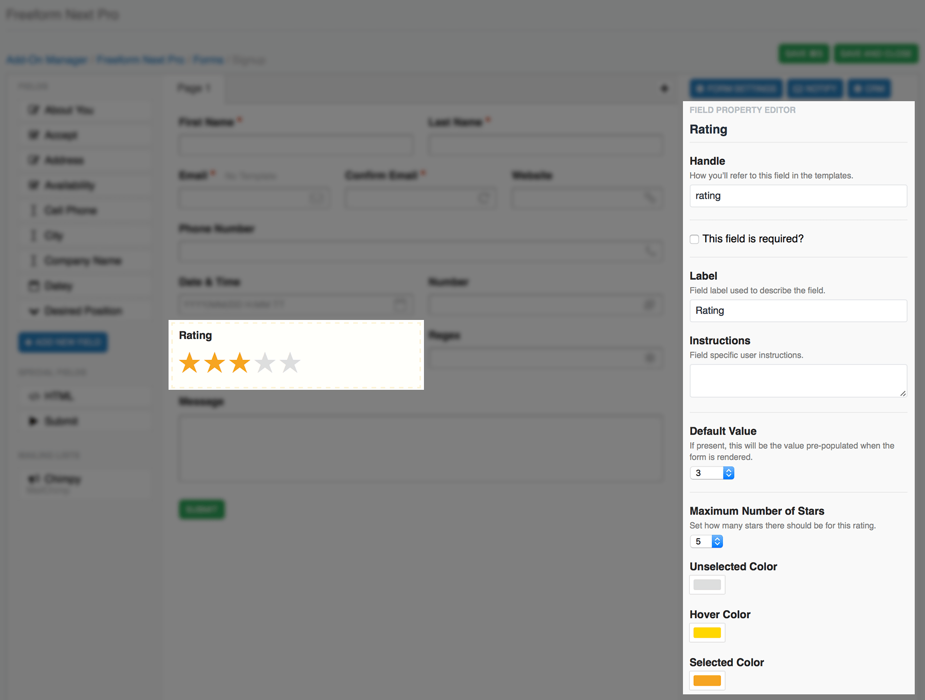
- Rating #
- A special field that allows for star ratings using Freeform's built in CSS and JS.
- Set a default star rating value (based on Maximum Number of Stars configuration option)
- Set the maximum number of stars allowed.
- Select an "Unselected" display color.
- Select a "Hover" display color.
- Select a "Selected" display color.
- Can be marked as required.
- A special field that allows for star ratings using Freeform's built in CSS and JS.
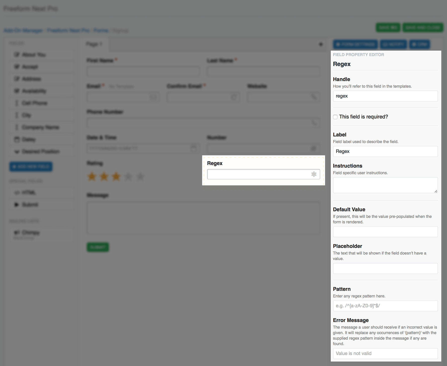
- Regex #
- An input field that is validated based on the specified regex pattern (e.g.
/^[a-zA-Z0-9]*$/).- Set error message a user will see if an incorrect value is supplied.
- Any occurrences of
will be replaced with specified regex pattern inside the error message, if any are found.
- Any occurrences of
- Can be marked as required.
- Can contain default text and/or placeholder.
- Set error message a user will see if an incorrect value is supplied.
- An input field that is validated based on the specified regex pattern (e.g.
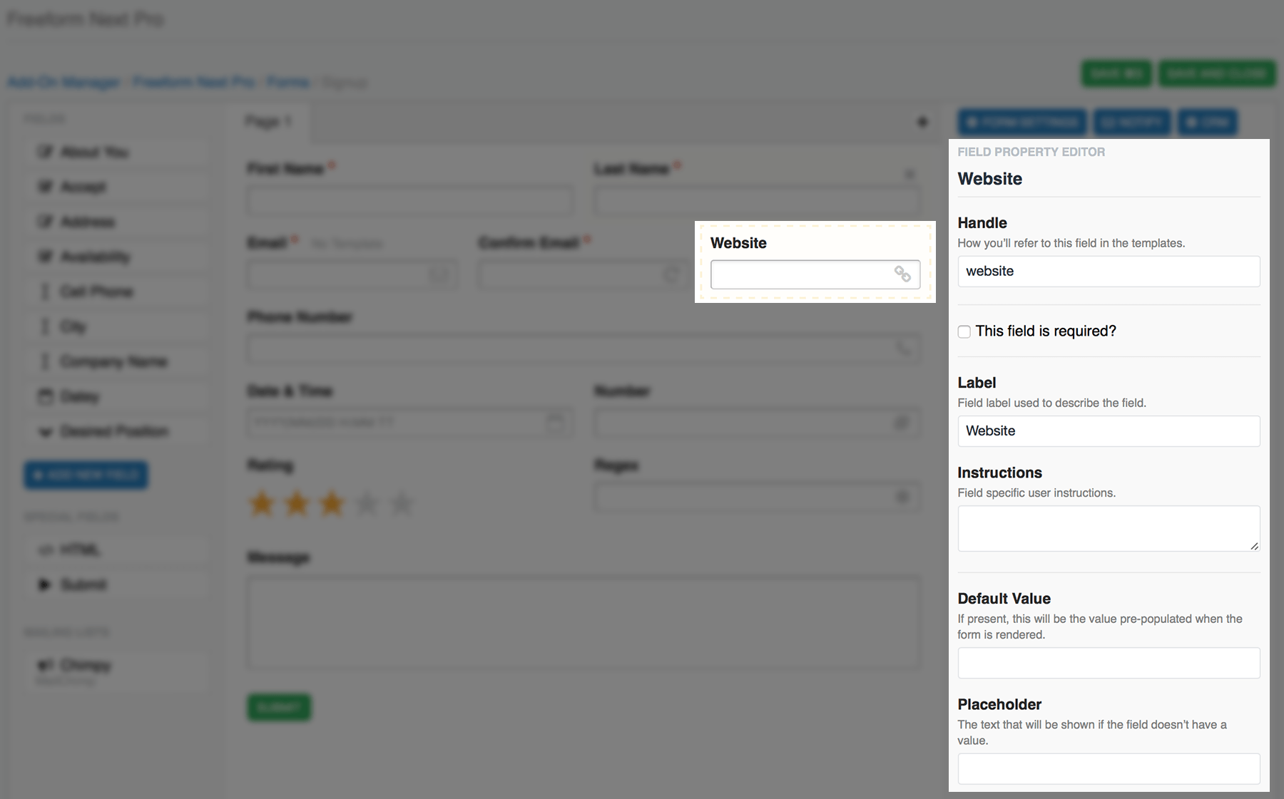
- Website #
- A simple input field that checks to see if the URL specified has valid syntax (
http://,https://,ftp://, etc).- Can be marked as required.
- Can contain default text and/or placeholder.
- A simple input field that checks to see if the URL specified has valid syntax (
Special Fields
Special fields are ones that either every form needs (such as Submit button) and ones that aid in the layout and content of forms (such as the HTML block). None of these fields store any submission data in the database. The following special fields are available to use:
- Submit #
- Settings allow you to edit the button label.
- You may adjust the positioning of the submit button:
- Aligned to Left
- Aligned to Center
- Aligned to Right
- When using with multi-page forms, Freeform will detect when you're on a page after first page, and provide you with additional options:
- It will include a Previous button by default, allowing the user to go back to previous pages in the form.
- Previous button can be disabled.
- Positioning options now include:
- Apart at Left and Right
- Together at Left
- Together at Center
- Together at Right
- It will include a Previous button by default, allowing the user to go back to previous pages in the form.
- You may include 1 per page in your form.
- HTML #
- Property Editor will load an HTML area for you to type or paste your code into.
- Layout column will live parse your HTML.
- All HTML is allowed here.
- You can include as many of these in your form as you wish.
- reCAPTCHA (Pro) #
- Built in support for reCAPTCHA.
- See reCAPTCHA documentation for more information.
- reCAPTCHA fields will render automatically like the rest of your fields in your form, but if you're building a form manually, you'd call it like this (using the Hash value for reCAPTCHA field in Property Editor of Composer):
{field:grecaptcha_MD1KzPw68:render}
Field Specific Properties
The following are field specific properties for the basic and Pro field types:
checkbox#- Has a default value of Yes, which can be overwritten with any value you want. The front end however, will always display the value as
1, but upon submission, the value will be switched to the one you have set. {field:checked}- will display whether the field is checked by default.
- Has a default value of Yes, which can be overwritten with any value you want. The front end however, will always display the value as
dynamic_recipients#{field:show_as_radio}- A boolean value. If
truethe dynamic recipients field should be rendered as radio buttons instead of a select field.
- A boolean value. If
datetime#{field:date_time_type}(e.g.both){field:generate_placeholder}(e.g.true){field:date_order}(e.g.ymd){field:date_4_digit_year}(e.g.true){field:date_leading_zero}(e.g.true){field:date_separator}(e.g./){field:clock_24h}(e.g.false){field:lowercase_ampm}(e.g.true){field:clock_separator}(e.g.:){field:clock_ampm_separate}(e.g.true){field:use_datepicker}(e.g.true)
number#{field:min_length}{field:max_length}{field:min_value}{field:max_value}{field:decimal_count}{field:decimal_separator}(e.g..){field:thousands_separator}(e.g.,){field:allow_negative}(e.g.false)
phone#{field:pattern}
rating#{field:max_value}(e.g.5){field:color_idle}(e.g.#dddddd){field:color_hover}(e.g.#ffd700){field:color_selected}(e.g.#77ff00)
regex#{field:pattern}
submit#{field:label_next}- A label for the Next button.
Submitby default.
- A label for the Next button.
{field:label_prev}- A label for the Previous button.
Previousby default.
- A label for the Previous button.
{field:disable_prev}- A boolean value. If
truethe Previous button should not be rendered.
- A boolean value. If
Populating Fields with EE Data & Predefined Options
Inside Composer (only), basic field types with options have the ability to be automatically fed options from EE Data or Predefined Options. This allows you to quickly build forms by having fields auto-generated.
Available Fields
The following field types can be auto-populated:
- Select
- Optional Empty Option Label to have first option be something like
Please select...
- Optional Empty Option Label to have first option be something like
- Multiple Select
- Checkbox Group
- Radio Group
Available EE Data types
The following EE Data types can be fed to the above field types:
- EE Entries
- Target channel or all channels.
- Option Label and Option Value choices:
- ID
- Title
- URL Title
- Fields (simple values)
- EE Members
- Target member group or all groups.
- Option Label and Option Value choices:
- ID
- Username
- Screen Name
- Fields (simple values)
- EE Categories
- Target category groups or all groups.
- Option Label and Option Value choices:
- ID
- Title
- URL Title
- Fields (simple values)
Available Predefined Options
The following Freeform predefined options can be fed to the above field types:
- States
- Official USA States
- Option Label and Option Value choices:
- Full
- Abbreviated (upper case 2 letters)
- States & Territories
- Official USA States and territories
- Option Label and Option Value choices:
- Full
- Abbreviated (upper case 2 letters)
- Provinces
- Canadian Provinces and territories
- Option Label and Option Value choices:
- Full
- Abbreviated (upper case 2 letters)
- Countries
- All world countries
- Option Label and Option Value choices:
- Full
- Abbreviated (upper case 2 letters)
- Languages
- All world languages
- Option Label and Option Value choices:
- Full
- Abbreviated (lower case 2 letters)
- Numbers (range)
- A custom range of numbers
- Range Start and Range End
- E.g.
60-65would return list:60, 61, 62, 63, 64, 65
- E.g.
- Years (range)
- A custom range of years
- Range Start - number of years in PAST from current year
- Range End - number of years in FUTURE from current year
- E.g.
5(start) -0(end) would return list:2018, 2017, 2016, 2015, 2014, 2013
- E.g.
- Sort Direction:
- Ascending
- Descending
- Months
- All 12 months of the year.
- Option Label and Option Value choices:
- Full, e.g.
September - Abbreviated (Capitalized 3 letters), e.g.
Sep - Single Number, e.g.
9 - 2-digit Number, e.g.
09
- Full, e.g.
- Days
- List of days
1to31. - Option Label and Option Value choices:
- Single Number, e.g.
3 - 2-digit Number, e.g.
03
- Single Number, e.g.
- List of days
- Days of Week
- List of all days of week.
- Option Label and Option Value choices:
- Full, e.g.
Thursday - Abbreviated (Capitalized 3 letters), e.g.
Thu - Single Number, e.g.
4
- Full, e.g.


