Toggle Switch on Checkbox field
If you'd like to display a lightswitch/toggle field instead of a regular checkbox for your Checkbox fields, this can be done with a bit of manipulating a formatting template.
Instructions
Step 1
A basic code example to display a checkbox as a lightswitch relies heavily on CSS and looks something like this:
<style>
  .freeform-checkbox {
    cursor: pointer;
    display: inline-block;
  }
  .freeform-checkbox .switch {
    display: inline-block;
    background: #8c8c8c;
    border-radius: 16px;
    width: 50px;
    height: 28px;
    position: relative;
    vertical-align: middle;
    transition: all 0.25s;
  }
  .freeform-checkbox .switch:before,
  .switch:after {
    content: '';
  }
  .freeform-checkbox .switch:before {
    display: block;
    background: #fafafa;
    border-radius: 50%;
    width: 24px;
    height: 24px;
    position: absolute;
    top: 2px;
    left: 2px;
    transition: left 0.25s;
  }
  .freeform-checkbox:hover .switch:before {
    background: #ffffff;
  }
  .freeform-checkbox input[type='checkbox']:checked + .switch {
    background: #52cd00;
  }
  .freeform-checkbox input[type='checkbox']:checked + .switch:before {
    left: 24px;
  }
  .freeform-checkbox input[type='checkbox'] {
    position: absolute;
    visibility: hidden;
  }
  .freeform-checkbox span {
    margin-left: 5px;
    position: relative;
    top: 2px;
  }
</style>

<label class="freeform-checkbox">
  <input type="checkbox" />
  <div class="switch"></div>
  <span>This is a Checkbox Label</span>
</label>
This will output the following (go ahead and play with it!):
Step 2
To replace any checkbox fields with the new lightswitch toggle styles, your basic formatting template code would look something like this:
<label for="form-input-{{ field.handle }}" class="freeform-checkbox">
    {{ field.renderInput() }}
    <div class="switch"></div>
    <span class="freeform-label{% if field.required %} freeform-required{% endif %}">{{ field.label }}</span>
</label>
Step 3
Then add the following CSS:
.freeform-checkbox {
  cursor: pointer;
  display: inline-block;
}
.freeform-checkbox .switch {
  display: inline-block;
  background: #8c8c8c;
  border-radius: 16px;
  width: 50px;
  height: 28px;
  position: relative;
  vertical-align: middle;
  transition: all 0.25s;
}
.freeform-checkbox .switch:before,
.switch:after {
  content: '';
}
.freeform-checkbox .switch:before {
  display: block;
  background: #fafafa;
  border-radius: 50%;
  width: 24px;
  height: 24px;
  position: absolute;
  top: 2px;
  left: 2px;
  transition: left 0.25s;
}
.freeform-checkbox:hover .switch:before {
  background: #ffffff;
}
.freeform-checkbox input[type='checkbox']:checked + .switch {
  background: #52cd00;
}
.freeform-checkbox input[type='checkbox']:checked + .switch:before {
  left: 24px;
}
.freeform-checkbox input[type='checkbox'] {
  position: absolute;
  visibility: hidden;
}
.freeform-checkbox span {
  margin-left: 5px;
  position: relative;
  top: 2px;
}
There is no javascript necessary for this to work.
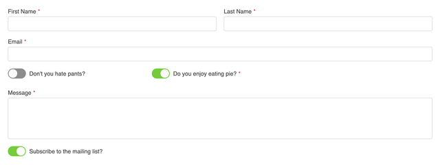
The result should look something like this:

Step 4
In order for this to automatically happen inside a formatting template for all single Checkboxes (and Email Marketing Checkboxes), you'll want to create a new one if you haven't already. If you using the Basic Light formatting template as a starting point, your code might look something like this:
{# Shortened for Example #}
...
    <div class="freeform-fieldtype-{{ field.type }}">
        {% if field.type == "checkbox" %}
            <label for="form-input-{{ field.handle }}" class="freeform-checkbox">
                {{ field.renderInput() -}}
                <div class="switch"></div>
                <span class="freeform-label{% if field.required %} freeform-required{% endif %}">{{ field.label }}</span>
            </label>
            {{ field.renderErrors() }}
        {% else %}
            {{ field.render() }}
...
{# Shortened for Example #}
Don't forget to include the custom CSS mentioned in Step 3.
The result might look something like this: