Fields
Freeform features its own set of robust field types. The form builder displays a list of available field types which can then be added to forms indefinitely. Fields are specific to each form, but can also be saved or searched upon to be reused in other forms.
 Overview
  Field Types
  Special Field Types
  Populating Field Options
Overview
Important Notes
- Only Freeform's field types may be used in forms. Craft fields or custom field types are not supported at this time.
- Fields can be created and managed in the main field creation area (Freeform > Fields > New Field) and can also be created directly within the form builder interface as well. Fields created here are available globally as well (they do not just exist for that form).
- When the fields are edited at global level (in main Fields area of Freeform control panel), your customizations per form will NOT be lost.
- Once a field is created, you cannot change the field type after.
- All field properties can be overwritten at form level inside the form builder, including the field Handle.
- All fieldtypes conveniently include the ability to set attributes for their labels, inputs, errors and instructions directly inside the form builder property editor.
- This allows you to keep your hands clean of being inside formatting templates and specify one-off exceptions for fields such as
readonlyandautocomplete="off", etc. - To use single attributes like
novalidate, just enter the attribute in the Attribute column and leave the Value column empty. - You can use anything inside the Form and Field objects as well, e.g.:
field.idto access Field ID.form.handleto access form handle.
- This allows you to keep your hands clean of being inside formatting templates and specify one-off exceptions for fields such as
Standard Settings
There is a standard number of settings available to all forms (with some exceptions). Every form field has the ability for you to do the following:
| Setting | Description |
|---|---|
| Reset (button) | Pressing this will reset the field settings and values back to what is set in the defaults (Freeform > Fields > New Field). |
| Handle | How the field may be called in templates, if necessary. You may also override this value per form if you wish. Non-fields like HTML blocks will have a hash value that behaves the same as field handles. |
| Label | The label for the field. This can be changed per form if you wish. |
| Required | Mark if the field requires a value to submit the form successfully. |
| Instructions | Specify intructions for the field if you wish. |
| Default Value | For applicable fields, you can set a default value or selected option for the field. |
| Placeholder | Specify placeholder text for the field, if applicable. |
| Maximum Length | The maximum number of characters for the field's value. |
| Attribute Editor | Apply any kind of attribute on the input, label, error, instruction in Freeform's automated rendering of the form. |
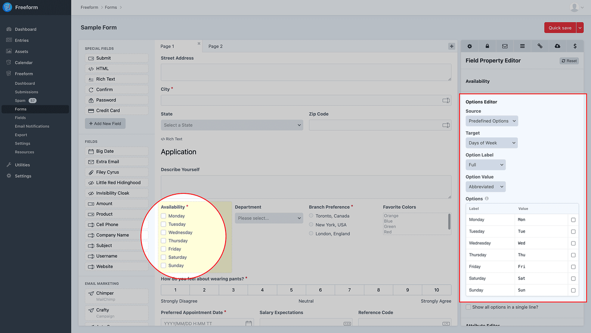
Populating Field Options
All multi-option field types (such as Dropdown, Checkboxes, etc) can have their option labels and values automatically populated with Craft Elements or Pre-defined list options.
Field Types
Freeform contains a rich set of field types to handle just about every possible scenario you might get yourself into.
| Field Type | Description | Lite | Pro |
|---|---|---|---|
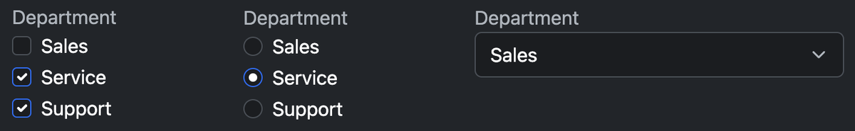
| Checkbox | A single checkbox field | ✓ | ✓ |
| Checkbox Group | A group of checkboxes | ✓ | ✓ |
| Date & Time | A complex date and/or time field | ✓ | |
| Dynamic Recipients | A select/radio/checkbox field that allows the form submitter to choose from a list of available protected email addresses | ✓ | ✓ |
| A text input field that includes additional email validation and possibility for attaching an email notification to it. | ✓ | ✓ | |
| File Upload | A regular file upload field | ✓ | ✓ |
| File Upload Drag & Drop | An advanced premium javascript-based file uploading field | ✓ | |
| Hidden | A single-line hidden input field | ✓ | ✓ |
| Invisible | A field that allows you to collect hidden data in form submissions without a hidden field being present in the template source code | ✓ | |
| Multiple Select | A multiple-select field | ✓ | ✓ |
| Number | A single-line number type input field that is validated to contain certain numbers only | ✓ | ✓ |
| Opinion Scale | A special field that allows for flexible opinion scoring | ✓ | |
| Phone | A tel type input field that is validated to contain phone numbers only, based on a configured pattern | ✓ | |
| Radio Group | A group of radio options | ✓ | ✓ |
| Rating | A special field that allows for star ratings | ✓ | |
| Regex | An input field that is validated based on the specified regex pattern (e.g. /^[a-zA-Z0-9]*$/) | ✓ | |
| Select | A select dropdown menu field | ✓ | ✓ |
| Signature | A field that allows users to handwrite signatures inside your form | ✓ | |
| Table | A field that allows you to collect and handle repeating data | ✓ | |
| Text | A single-line text input field | ✓ | ✓ |
| Textarea | A multi-line text input field | ✓ | ✓ |
| Website | A url type input field that checks to see if the URL specified has valid syntax | ✓ |
Special Field Types
Special fields are ones that are not created, but serve a special purpose for your forms. Some of them may be reused as many times in the same form as you like.
| Field Type | Description | Usage | Lite | Pro |
|---|---|---|---|---|
| Confirm | A text input field that targets another similar field and ensures the values match | Unlimited | ✓ | |
| Credit Card | A set of input fields to allow the validation of credit cards for Stripe Payment implementations | 1 per form | ✓ | |
| HTML | A block that allows you to insert HTML into areas of your form | Unlimited | ✓ | ✓ |
| Email Marketing | A special checkbox to handle subcription to mailing lists when using Email Marketing integrations | Unlimited | ✓ | |
| Password | A text input field that collects sensitive passwords but does not store them | Unlimited | ✓ | |
| Captcha | A special field to handle spam verification when using the reCAPTCHA v2 Checkbox or hCaptcha Checkbox implementation | 1 per form | ✓ | ✓ |
| Rich Text | A block that allows you to insert rich text into areas of your form (headings, descriptions, etc) | Unlimited | ✓ | |
| Save & Continue Later | A special button that allows the user to save form progress and return later | 1 per page | ✓ | |
| Submit | A regular submit button for the form | 1 per page | ✓ | ✓ |
Checkbox
A single checkbox field. The field.type property value is checkbox (for conditionals).

Settings
- Specify a value (e.g.
yoryes, etc).- Has a default value of Yes, which can be overwritten with any value you want. No matter what value is set manually on the front end, Freeform will interpret it as checked and record the value specified in the form builder.
- May be checked by default.
Templating
options(an array of option objects withlabelandvalueproperties)
Checkbox Group
A group of checkboxes. The field.type property value is checkbox_group (for conditionals).
Settings
- Can specify labels (with values assumed) or labels and values (that differ).
- Can be automatically populated with select Craft Elements or Pre-defined list options.
- Can be rendered vertically or horizontally.
Templating
options(an array of option objects withlabelandvalueproperties)
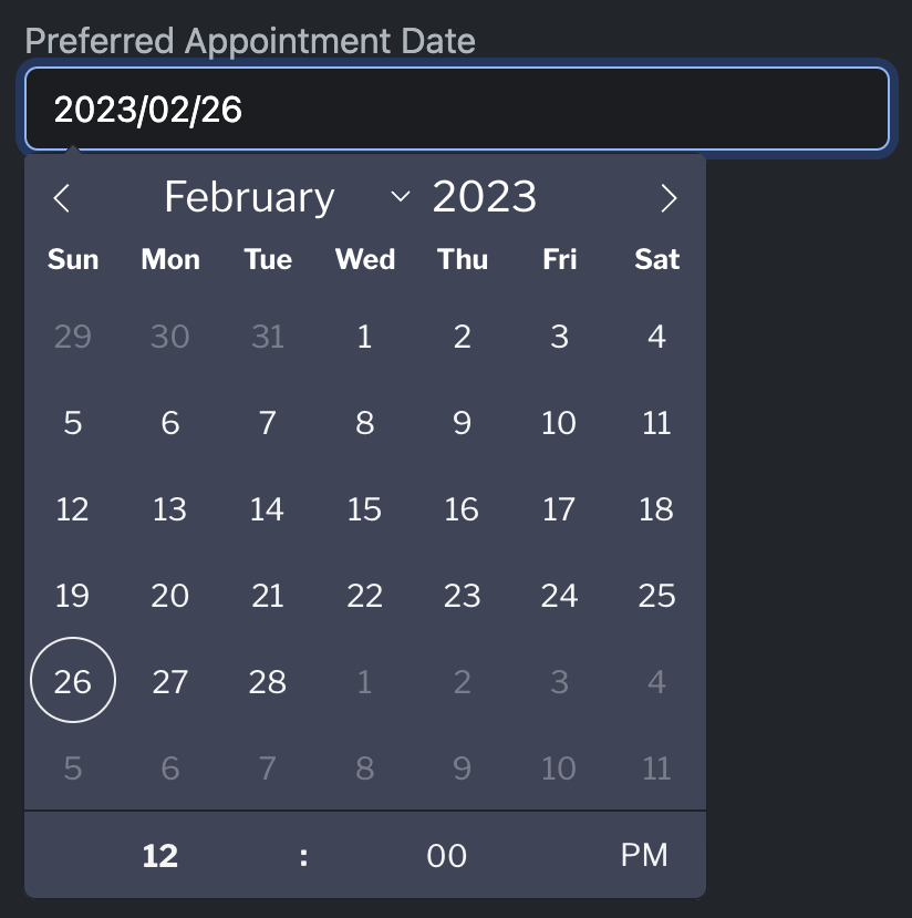
Date & TimePro
A complex date and/or time field. Can be used as Date only, Time only, or both. Many configuration and validation options available as well. The field.type property value is datetime (for conditionals).
Settings
- May contain a default value.
- You may use
now,today,5 days ago,2017-01-01 20:00:00, etc, which will format the default value according to the chosen format as a localized value.
- You may use
- The default Freeform datepicker can be disabled and you can load your own manually in the template if you wish.
- Freeform will automatically insert javascript in the footer/inside form (depending on settings) of the page for this fieldtype.
- Choose to have your own placeholder or have Freeform generate a placeholder based on the settings below.
- Set the date order formatting you'd like:
- year month day
- month day year
- day month year
- Select if the year should be displayed/validated as 4 digits.
- Select if the day and month numbers should have a leading
0for single digit values (e.g. August will display as08instead of8). - Choose the date separator character used between each year, month, day value:
- None
- Space (
/-.
- Select if time and datepicker should use 24 hour clock.
- Choose the clock separator character used to separate hours and minutes:
- None
- Space (
:-.
- Choose if placeholder should separate AM/PM with a space (for 12hr clock).
- Select the Min and Max dates for the date picker and validation (optional). Use static dates (e.g.
2018-11-01,2018-11-30) or relative date strings (e.g.-10 days,+3 months).
Notes
- For localization reference:
- The Flatpickr date picker will automatically localize according to the locale set for your site. Locales available are only 2-letter codes like
fr,de, etc. In the event you're using a locale likefr-CAores-US, etc, Freeform will just look at the first 2 letters and use that as the locale. - To translate the formatting syntax error message, be sure to translate the following strings:
"{value}" does not conform to "{format}" format.- To translate the
{format}rendered value to match the current locale, be sure to also translate whatever the rendered string is in the error message. For example, if you're usingfrlocale, and wish to have the default EnglishDD/MM/YYYYshow up asJJ/MM/AAAA, create a static translation for this manually.
- The Flatpickr date picker will automatically localize according to the locale set for your site. Locales available are only 2-letter codes like
- To customize the date picker appearance and behavior, please see Date Picker Events documentation.
Templating
initialValuedateTimeType(e.g.both)generatePlaceholder(e.g.true)dateOrder(e.g.ymd)date4DigitYear(e.g.true)dateLeadingZero(e.g.true)dateSeparator(e.g./)clock24h(e.g.false)clockSeparator(e.g.:)clockAMPMSeparate(e.g.true)useDatepicker(e.g.true)minDate(e.g.five weeks ago)maxDate(e.g.2024-12-31)
Dynamic Recipients
A special field, displayable as a Select, Radio or Checkbox Group that contains protected email addresses and labels for each. The field.type property value is dynamic_recipients (for conditionals).
Settings
- Can specify labels and email address values.
- Multiple email addresses can be specified for each option, separated by commas.
- Emails are never parsed in source code (they're replaced with 0, 1, 2, etc).
- When parsing this field semi-manually, be sure to use
loop.index0to generate numeric values of options instead offieldName.value.
- When parsing this field semi-manually, be sure to use
- To make the first option empty (when displaying as Select), set the first option having something like Please select... for the label, and leave option blank.
- Can be automatically populated with select Craft Elements or Pre-defined list options.
- Can be switched to display as Radio or Checkbox options at form level inside the form builder.
- Can be rendered vertically or horizontally.
- Choose an email notification template to be used to send to the option(s) chosen.
- Users can specify 1 or more recipient options at a time (when using as Checkboxes).
- Users/groups need to have permissions access for Email Notifications to create new formatting templates inside the form builder.
Notes
- Can include more than 1 of this field type in your forms, allowing for multiple sets of recipients to be notified.
- When parsing this field semi-manually, be sure to use
loop.index0to generate numeric values of options instead offieldName.value.
Make sure that each option value is unique.
If you're receiving duplicate or multiple email notifications from the Dynamic Recipients field, it's likely because you've specified more than one option with the same email address. This is a current limitation of Freeform, as it will perceive the user submitting all of the matching options at once, sending off emails as many times as there are duplicate options.
The only workarounds for this would be to either:
- Create an email address alias for each option so that each option in the Dynamic Recipients field type settings will be unique.
- Add sub-address tags to the affected email addresses so their values are unique. For example:
joe+whatever@example.com,joe+somethingelse@example.com.
Templating
showAsRadio- A boolean value. If
truethe dynamic recipients field should be rendered as radio buttons instead of a select field.
- A boolean value. If
showAsCheckboxes- A boolean value. If
truethe dynamic recipients field should be rendered as checkboxes instead of a select field.
- A boolean value. If
notificationId- The database ID of the assigned Email Notification Template.
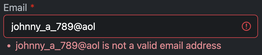
A single-line text input field that includes additional validation to expect a valid email address as well as the possibility of attaching an email notification to it. Pair this with the Confirm special field type if you wish to have the user enter their email address twice. The field.type property value is email (for conditionals).
It is required to use the Email field type if you wish for your users to receive an email notification when submitting the form and/or you're using an Email Marketing API integration.
Settings
- Optionally choose an email notification template to be used to send to the submitter of the form (or the email address entered in this field).
- Users/groups need to have permissions access for Email Notifications to create new formatting templates inside the form builder.
Templating
placeholdernotificationId(the ID of the assigned email notification template)
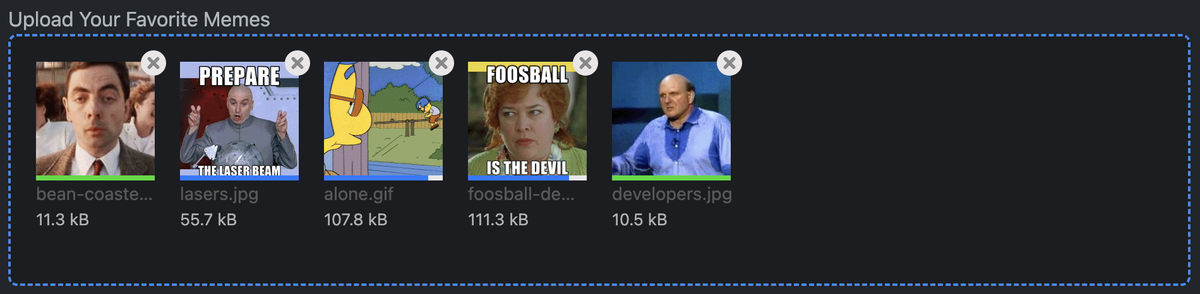
File Upload
A regular file upload field, using Craft Assets. The field.type property value is file (for conditionals).

Settings
- Must have a Craft Asset Source location where the file will be uploaded to.
- Does NOT work with Image Transforms.
- Upload Location Subfolder (optional) - the subfolder path that files should be uploaded to. May contain
form.handleorform.idvariables or something likecurrentUser.idfor folders based on user ID's or"now"|date("Y/m")to dynamically generate folders based on dates as well.
- Define maximum file size (in KB). Default is 2048 KB (2MB). Is subject to:
- Craft's maxUploadFileSize setting
- PHP memory_limit
- PHP post_max_size
- PHP upload_max_filesize
- Can allow a single file or multiple files to be uploaded.
- Specify a number larger than
1in the File Count setting to allow multiple files to be uploaded at the same time. - When collecting multiple files, a single input is still displayed, but allows multiple files to be uploaded (applies
multipleattribute to the single file upload input).
- Specify a number larger than
- Select which file types can be uploaded.
- Leaving all options unchecked will allow ALL file types.
Notes
- In multi-page forms, if an earlier page contains file upload field(s), files will actually be uploaded before the form is officially submitted.
- If the form is never completed, incomplete submissions are stored for 3hrs, and then are removed (along with the files) after that.
- If you're handling sensitive files, you may wish to choose an Asset volume without public URL's (Assets in this volume have public URLs toggle is off).
Templating
fileKinds- An array of allowed file kinds, e.g.
image,document,audio, etc.
- An array of allowed file kinds, e.g.
maxFileSizeKB- The numeric representation of the upload limit in kilobytes.
fileCount- The maximum number of allowed files to be uploaded.
- A number larger than
1will allow multiple files to be uploaded at the same time.
File Upload Drag & DropPro
An advanced premium javascript-based file uploading field, using Craft Assets. The field.type property value is file-dnd (for conditionals).
Settings
- Can control the placeholder wording, e.g.
Drag and drop files here, or click to upload. - Choose a default style/theme, e.g.
LightorDark. - Choose an accent color (this affects the default color for the field border and delete button).
- Must have a Craft Asset Source location where the file will be uploaded to.
- Does NOT work with Image Transforms.
- Upload Location Subfolder (optional) - the subfolder path that files should be uploaded to. May contain
form.handleorform.idvariables or something likecurrentUser.idfor folders based on user ID's or"now"|date("Y/m")to dynamically generate folders based on dates as well.
- Specify the number of files allowed to upload.
- Define maximum file size per file (in KB). Default is 2048 KB (2MB). Is subject to:
- Craft's maxUploadFileSize setting
- PHP memory_limit
- PHP post_max_size
- PHP upload_max_filesize
- Select which file types can be uploaded.
- Leaving all options unchecked will allow ALL file types.
Notes
- Unlike the regular File Upload field, the File Upload Drag & Drop field will remember files that have been uploaded to it regardless of the context: errors upon submission, multi-page forms, returning to edit the submission later.
- If the form is never completed, incomplete submissions are stored for 3hrs, and then are removed (along with the files) after that.
- While files are uploading, Freeform will disable the Submit button so that the form has time to finish uploading the files. If the form is submitted while files are still uploading, any that are incomplete will not be saved.
- If you're handling sensitive files, you may wish to choose an Asset volume without public URL's (Assets in this volume have public URLs toggle is off). However, please note that image file thumbnails will only be present directly after initial upload. Afterward (error when submitting, multi-page forms, returning to edit) the image thumbnails will no longer be accessible to Freeform.
Templating
fileKinds- An array of allowed file kinds, e.g.
image,document,audio, etc.
- An array of allowed file kinds, e.g.
maxFileSizeKB- The numeric representation of the upload limit in kilobytes.
fileCount- The maximum number of allowed files to be uploaded.
- A number larger than
1will allow multiple files to be uploaded at the same time.
Customizing the Appearance
The form builder includes some options for controlling basic styling, but you can also customize the appearance of the Drag and Drop File Upload field by using your own CSS. To avoid name collision and have maximum flexibility, the CSS class names use BEM methodology. You will also likely need to specify !important for each override to ensure it takes effect.
CLASS NAMESRenamed in 5.0+
Below is a list of all class names listed in SCSS:
.freeform-file-dnd__input {
  &__placeholder {
  }
  &__messages {
  }
  &__preview-zone {
    &__file-preview {
      &__filename {
      }
      &__filesize {
      }
      &__thumbnail {
        &__extension-label {
        }
        &__remove-button {
        }
        &__errors {
        }
        &__progress {
        }
      }
    }
  }
}
SCSS EXAMPLE
Below is an example with SCSS:
.freeform-file-dnd__input {
  background: blue;

  &__preview-zone {
    &__file-preview {
      border: 3px solid grey;

      &__thumbnail {
        border: 1px solid black;
        padding: 5px;

        &__remove-button {
          border-radius: 0;
        }
      }
    }
  }
}
CSS EXAMPLE
Below is an example with regular CSS:
.freeform-file-dnd__input {
  background: blue !important;
  border: 1px solid red !important;
}
.freeform-file-dnd__placeholder {
  font-size: 12px !important;
}
.freeform-file-dnd__preview-zone__file-preview__thumbnail {
  border: 3px solid yellow !important;
}
.freeform-file-dnd__preview-zone__file-preview__thumbnail__remove-button {
  border-radius: 0 !important;
}
Hidden
A single-line hidden input field.
Freeform will load fields of this type at the beginning of the form, regardless of where they are placed in the form builder layout.
Form Settings
- Can only include text strings at this time (no variables allowed).
- If you need you pass a value to your hidden field dynamically, you can do so with the
valuesparameter. E.g.values: { myFieldName: "myvalue" }
- If you need you pass a value to your hidden field dynamically, you can do so with the
Templating
placeholder
Notes
- To access hidden fields in GraphQL queries you have to loop through the
form > fieldsas they are not added toform > pages > rows > fields.
InvisiblePro
A field that allows you to collect hidden data in form submissions without a hidden field being present in the template source code. You might typically use this in conjunction with the overrideValues parameter to set a dynamic value into the field. It can also be given a hard coded value inside the Property Editor in the CP form builder interface while building your form.
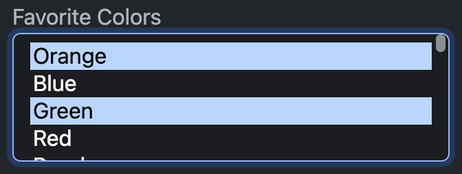
Multiple Select
A multiple-select field. The field.type property value is multiple-select (for conditionals).
Settings
- Can specify labels (with values assumed) or labels and values (that differ).
- Can be automatically populated with select Craft Elements or Pre-defined list options.
Templating
options(an array of option objects withlabelandvalueproperties)
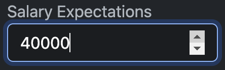
Number
A single-line number type input field that is validated to contain certain numbers only. The field.type property value is number (for conditionals).
Settings
- Choose if validation should allow negative numbers.
- Optionally set Min/Max values.
- Both are optional, you can have both, just one or neither.
- Optionally set Min/Max character length.
- Both are optional, you can have both, just one or neither.
- Optionally set the number of decimals allowed.
- Set the
stepnumber to set default increments when a user uses the browser up/down arrows to increase/decrease the value.
Templating
placeholderminLengthmaxLengthminValuemaxValuedecimalCountallowNegative(e.g.false)step
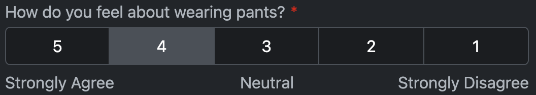
Opinion ScaleProSurveys & Polls
A special field that allows for flexible opinion scoring using Freeform's built in CSS. The field.type property value is opinion_scale (for conditionals). This field type is included automatically with the Pro edition of Freeform or for Lite users with the Surveys & Polls form type add-on.
Settings
- Set the field's option values and optional corresponding labels.
- Optionally add legends to correspond to with choice options (e.g. Less Satisfied, More Satisfied).
Templating
scaleslegends
To manually render an Opinion Scale field to use your own styles, your code might look something like this:
{% set field = form.get("opinionScale") %}

<div style="border: 1px dashed gray; padding: 5px;">
    {% if field.scales %}
        <ul>
            {% for index, scale in field.scales %}
                <li>
                    <input type="radio" name="{{ field.handle }}"
                        value="{{ scale.value }}"
                        id="{{ field.idAttribute }}-{{ index }}"
                        {{ field.value == scale.value ? "checked" }}
                    />
                    <label for="{{ field.idAttribute }}-{{ index }}">
                        {{ scale.label }}
                    </label>
                </li>
            {% endfor %}
        </ul>
    {% endif %}
    {% if field.legends %}
        <ul>
            {% for legend in field.legends %}
                <li>{{ legend.legend }}</li>
            {% endfor %}
        </ul>
    {% endif %}
</div>
PhonePro
A tel type input field that is validated to contain phone numbers only, based on a configured pattern. The field.type property value is phone (for conditionals).

Settings
- Set pattern to desired format, where
0is a digit between0and9, e.g:(000) 000-0000+0 0000 000000- Check off Use JS validation checkbox to have Freeform include JS in the form that validates the format and auto-inserts the extra characters like
(,-,+etc).
Templating
placeholderpattern
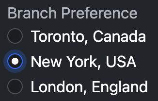
Radio Group
A group of radio options. The field.type property value is radios (for conditionals).
Settings
- Can specify labels (with values assumed) or labels and values (that differ).
- Can be automatically populated with select Craft Elements or Pre-defined list options.
- Can be used as a User Select email notification.
- Can be rendered vertically or horizontally.
Settings
- Can specify labels (with values assumed) or labels and values (that differ).
- Can be automatically populated with select Craft Elements or Pre-defined list options.
- Can be rendered vertically or horizontally.
Templating
options(an array of option objects withlabelandvalueproperties)
RatingProSurveys & Polls
A special field that allows for star ratings using Freeform's built-in CSS. The field.type property value is rating (for conditionals).
This field type is included automatically with the Pro edition of Freeform.

Settings
- Set the field's number of stars (
3-10). - Style the color of the stars for the unselected, hover and selected states.
Templating
colorIdle(e.g.#ddd)colorHover(e.g.gold)colorSelected(e.g.#f70)maxValue(e.g.5)
To manually render a Rating field using your own styles, your code might look something like this:
{% for i in 1..field.maxValue %}
	<label for="rating-{{ i }}">whatever {{ i }}</label>
	<input type="radio" id="rating-{{ i }}" value="{{ i }}" name="{{ field.handle }}">
{% endfor %}
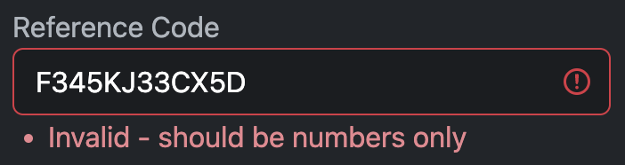
RegexPro
An input field that is validated based on the specified regex pattern (e.g. /^[a-zA-Z0-9]*$/). The field.type property value is regex (for conditionals).
Settings
- Specify a required pattern for values to match, e.g.
/^[a-zA-Z0-9]*$/. - Set the error message a user will see if an incorrect value is supplied.
- Any occurrences of
{pattern}will be replaced with specified regex pattern inside the error message, if any are found.
- Any occurrences of
Notes
- When needing to use
{}for attributes in Regex fields (such aspattern), you will need to specify them differently, as Freeform is built to allow Twig rendering and it'll choke. So for example, if you need to use[0-9]{4,5}, change it to:
[0-9]{{ '{' }}4,5{{ '}' }}
Templating
placeholderpatternmessage
Select
A select dropdown menu field. The field.type property value is dropdown (for conditionals).
Settings
- Can specify labels (with values assumed) or labels and values (that differ).
- To make the first option empty, use labels and values approach with the first option having something like Please select... for the label, and leave option blank.
- Can be automatically populated with select Craft Elements or Pre-defined list options.
Templating
options(an array of option objects withlabelandvalueproperties)
SignaturePro
A field that allows users to handwrite signatures with their mouse inside your form. The field.type property value is signature (for conditionals).
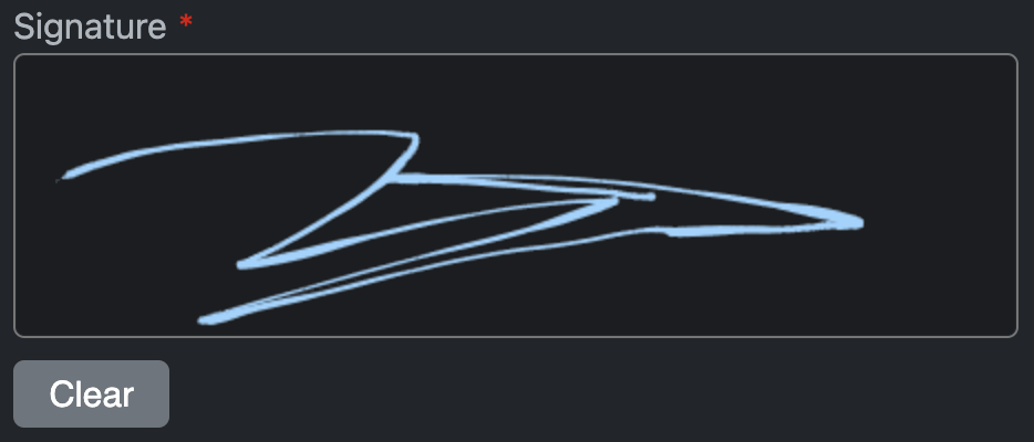
Settings
- Set the dimensions of the field writing/drawing area.
- Set the border and background colors.
- Set the pen dot size (in pixels) and the color.
- To include ability for a user to click a button to erase their signature and start over, check off the Show 'Clear' button? checkbox.
Notes
- Signatures are stored as an image datapoint value.
- Signatures can be downloaded as JPG or PNG files (from control panel).
- Signatures are excluded from regular exports and the
allFieldsloop in email notification templates (since it would just hold an image datapoint value string). - Signatures can be edited when the form is in edit mode.
- The Clear button can be styled inside the form builder with Input attributes area inside the property editor.
- The Signature field, due to it's complexness, cannot easily be manually generated in a form, and is best done with render helpers, e.g.
field.render. - There's currently no way to make the signature pad area "responsive" (like setting it to 100% width), as this would be quite difficult to account for with the need to display the signature image in various places, etc.
TablePro
A field that allows you to collect and handle repeating data. The field.type property value is table (for conditionals).
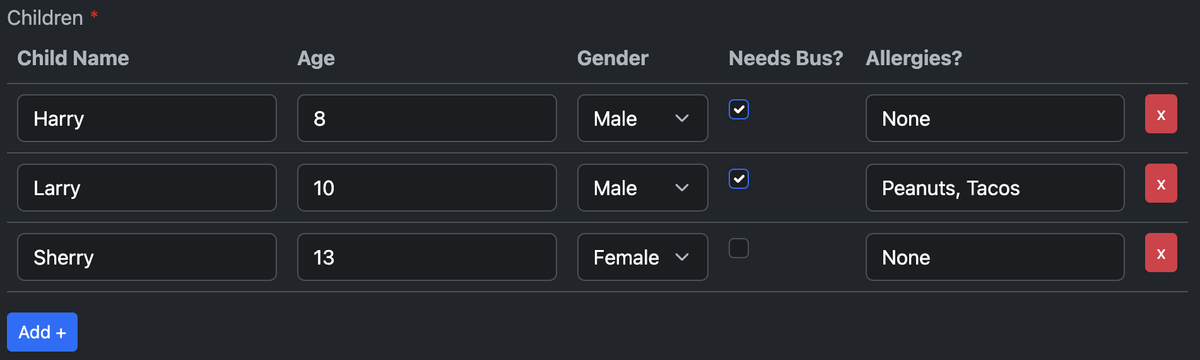
Settings
- Use the Table Layout area to create columns for the table. Options are:
- Text
- Checkbox
- When using Checkbox, specify a value you'd like to represent that checkbox when checked.
- Select
- When using Select, specify multiples separated by the
;character, e.g.apples;oranges:cherries.
- When using Select, specify multiples separated by the
- Check off Use built-in Table JS? checkbox to have Freeform include JS in the form that validates the format and auto-inserts the extra characters like
(,-,+etc).
Form Rendering
Here's how you can use field.render for an automated approach to render your Table field inside your formatting templates:
{{ field.render({
   class: "table",
   addButtonLabel: "Add +",
   addButtonClass: "btn btn-sm btn-primary",
   removeButtonLabel: "x",
   removeButtonClass: "btn btn-sm btn-danger",
   tableTextInputClass: "form-control",
   tableSelectInputClass: "form-control",
   tableCheckboxInputClass: "form-check-input"
}) }}
For manual rendering of the Table field inside your form for full customizability, your code might look something like this:
<table class="table">
    <thead>
    <tr>
    {% for column in field.tableLayout %}
        <th>{{ column.label }}</th>
    {% endfor %}
    </tr>
    </thead>
    <tbody>
    {% if field.value is empty %}
        <tr>
		{% for index, column in field.tableLayout %}
			{% set colName = field.handle ~ "[0][" ~ index ~ "]" %}
			<td>
			{% switch column.type|default("text") %}
				{% case "select" %}
					<select name="{{ colName }}">
					{% for option in column.value|default("")|split(";") %}
						<option value="{{ option }}">{{ option }}</option>
					{% endfor %}
					</select>
				{% case "checkbox" %}
					<input type="checkbox" name="{{ colName }}" value="{{ column.value|default("Yes") }}" />
				{% default %}
					<input type="text" name="{{ colName }}" value="{{ column.value|default("") }}" />
			{% endswitch %}
			</td>
		{% endfor %}
        </tr>
    {% else %}
        {% for rowIndex, row in field.value %}
            <tr>
			{% for index, column in field.tableLayout %}
				{% set colName = field.handle ~ "[" ~ rowIndex ~ "][" ~ index ~ "]" %}
				{% set colValue = row[index]|default("") %}
				<td>
					{% switch column.type|default("text") %}
					{% case "select" %}
						<select name="{{ colName }}">
						{% for option in colValue|default("")|split(";") %}
							<option value="{{ option }}"{{ option == colValue ? " selected" }}>{{ option }}</option>
						{% endfor %}
						</select>
					{% case "checkbox" %}
						<input type="checkbox" name="{{ colName }}" value="{{ column.value|default("Yes") }}" {{ colValue ? "checked" }} />
					{% default %}
						<input type="text" name="{{ colName }}" value="{{ colValue }}" />
					{% endswitch %}
				</td>
			{% endfor %}
            </tr>
        {% endfor %}
    {% endif %}
    </tbody>
</table>
Submission Data
Here's how to render a Table field's data inside the Submission object:
<table class="table">
    <thead>
        <tr>
        {% for column in field.tableLayout %}
            <th>{{ column.label|default("-") }}</th>
        {% endfor %}
        </tr>
    </thead>
    <tbody>
    {% for row in submission[field.handle].value %}
        <tr>
        {% for index, column in field.tableLayout %}
            <td>{{ row[index] }}</td>
        {% endfor %}
        </tr>
    {% endfor %}
    </tbody>
</table>
A complete example might look like:
{% for field in submission %}
    <td>
	{% if field.type == "table" %}
		<table class="table">
			<thead>
				<tr>
				{% for column in field.tableLayout %}
					<th>{{ column.label|default("-") }}</th>
				{% endfor %}
				</tr>
			</thead>
			<tbody>
			{% for row in submission[field.handle].value %}
				<tr>
				{% for index, column in field.tableLayout %}
					<td>{{ row[index] }}</td>
				{% endfor %}
				</tr>
			{% endfor %}
			</tbody>
		</table>
	{% else %}
		{{ submission[field.handle] }}
	{% endif %}
    </td>
{% endfor %}
Text
A single-line text input field. The field.type property value is text (for conditionals).

Templating
placeholder
Textarea
A multi-line text input field. The field.type property value is textarea (for conditionals).
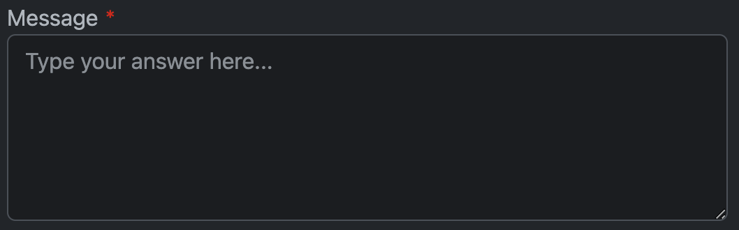
Settings
- Can specify the number of rows the textarea should have.
Templating
placeholder
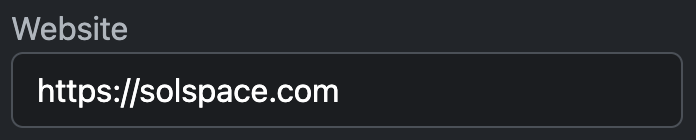
WebsitePro
A url type input field that checks to see if the URL specified has valid syntax (http://, https://, ftp://, etc). The field.type property value is website (for conditionals).
Templating
placeholder
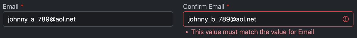
ConfirmPro
A field that allows you to force a user to re-enter a matching value for another text input field, including Password fields (e.g. "Confirm Email Address", "Confirm Password"). It runs through additional validation to make sure field values match. If not, it'll show an error. This field stores the data as well, in case that is important for your site's needs. The field.type property value is confirm (for conditionals).
Settings
- Choose a target field to validate against, e.g. Email field.
Templating
placeholder
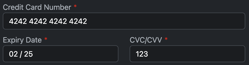
Credit CardPro
When a Stripe Payments integration is configured, a credit card special field type will become available. This is required for Payments-enabled forms to collect (but not store) credit card information. The field.type property value is cc_details (for conditionals).
Settings
- Choose a target field to validate against, e.g. Email field.
Templating
placeholder
HTML
A special field type that allows you include HTML and Twig inside your form layout in the form builder. The field.type property value is html (for conditionals).
Notes
- The Property Editor will load an HTML area for you to type or paste your code into.
- The Layout column in the form builder will live parse your HTML (Twig will not be parse inside the form builder).
- All HTML is allowed here.
- To enable Twig inside this field, turn on the Allow Twig to be Enabled for each HTML block? setting (and decide if you need to enable to the Render HTML block Twig in isolated mode? setting as well). Then, you will see an Allow Twig checkbox in the property editor column. Check that to allow this HTML block to parse Twig code.
- You can include as many of these in your form as you wish.
Displaying Submission Data from Previous Pages
If you'd like to display submission data from previous pages, you can do this by using an HTML block field with Twig code that might look something like this:
<ul>
    <li>Name: {{ form.get('firstName').value }} {{ form.get('lastName').value }}</li>
    <li>Email: {{ form.get('email').valueAsString }}</li>
    <li>Home Phone: {{ form.get('homePhone').value }}</li>
    <li>My Radio Field: {{ form.get('myRadioField').value }}</li>
</ul>
Email MarketingPro

Settings
- Email Marketing / Mailing list integrations appear as a checkbox that can be drag and dropped into the form builder interface (from the bottom left corner):
- Can be displayed as a single checkbox, or set to be a hidden field (as an automatic opt-in when using specifically for mailing list signups).
- If you want more than 1 mailing list, you can drag and drop another Mailing List field into your layout (but the checkboxes cannot be displayed as a group, unless you made some manual adjustments to the formatting template to simulate it).
- Label of the checkbox is customizable per form.
- Checkbox can be checked by default.
- You can specify the mailing list to be used for the mailing list integration.
- Your form must include an Email field type, which must then be assigned to the Target Email Field setting.
- When available, the Field Mapping setting allows you to map Freeform fields to available mailing list integration fields.
Notes
- Email Marketing / Mailing list integrations are globally available to all forms, but are configured per form inside the form builder interface.
- Most - if not all - integrations attempt to map all available fields and custom fields, but some may have limitations if the API is too complex or doesn't allow it.
While data is passed along to the Email Marketing provider, Freeform does not store whether or not Email Marketing fields were opted in, so CP submission views will not display whether or not the user subscribed.
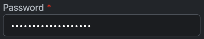
PasswordPro
A special field type that allows you to securely collect a password from a submitter but NOT store the value in the Freeform database (typically used for User Registration forms with the Elements integration). Pair this with the Confirm special field type if you wish to have the user enter their password twice. The field.type property value is password (for conditionals).
Notes
- Collected data is not stored in Freeform anywhere, nor is it included in the Submission object or
allFieldsvariable in email notifications. - When using with the Users Element integration, the password will be passed off to Craft's Users member account feature.
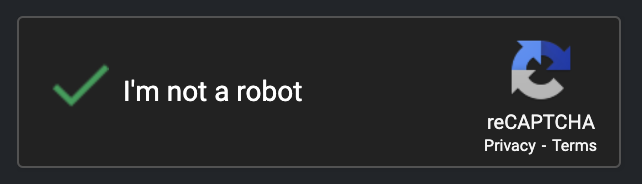
Captcha
A special field type that displays and handles the reCAPTCHA or hCaptcha interaction with the user when the Checkbox option is enabled and configured for the website. Please note that reCAPTCHA v2 Invisible, reCAPTCHA v3 and hCaptcha Invisble do not require any addition of a special field to the form layout. Freeform will automatically apply that validation and take care of it. The field.type property value is recaptcha (for conditionals).
Notes
- See Captchas documentation for more information.
Templating
- When a reCAPTCHA v2 Checkbox or hCaptcha Checkbox field is placed into a form layout in the Freeform form builder, it will render automatically like the rest of your fields. However, if you're building a form manually, you'd call it like this:
{% set captcha = form.get('recaptcha') %}
{{ captcha.renderInput }}- If using an earlier version of Freeform (pre 3.10.4), you'll need to use the Hash value for the Captcha field in the Property Editor of the form builder, like this:
{% set captcha = form.get("JDGnlp8vB") %}
{{ captcha.renderInput }}
- If using an earlier version of Freeform (pre 3.10.4), you'll need to use the Hash value for the Captcha field in the Property Editor of the form builder, like this:
- If you're loading an entire form into a remote website page via AJAX, you'll need to load the reCAPTCHA JS yourself, since it's considered insecure otherwise and the browser blocks it. You should add this script tag anywhere on your page, preferably the footer:
<script type="text/javascript" src="https://www.google.com/recaptcha/api.js?render=explicit"></script>
Rich TextPro
A special field type that allows you include rich text inside your form layout in the form builder. The field.type property value is rich-text (for conditionals).
Notes
- The Property Editor will load a Rich Text area for you to type into and style as necessary. You can also expand the editor into full mode.
- The Layout column in the form builder will live parse your content.
- You can include as many of these in your form as you wish.
Save & Continue LaterPro
A special field type that lets you place "save" button(s) inside your form layout in the form builder, allowing users to save their form progress and continue/complete the form later. For more information about this feature, please see the Save & Continue Later documentation. The field.type property value is save (for conditionals).

Settings
- Settings allow you to edit the button label.
- You may adjust the positioning of the submit button:
- Aligned to Left
- Aligned to Center
- Aligned to Right
- A return URL must be configured. This is where the user should be returned to if they click the button.
- Special
tokenandkeyvariables are available to include in the return path. - The return URL would be wherever you like, and fully customizable. This is where you'd include instructions to the user including a URL for where to return to complete the form later.
- Special
- You may optionally specify that an email notification be sent to the user if they click the Save button.
- Choose a special Freeform email notification template.
- The message of this email notification is completely customizable, but be sure to include instructions to the user including a URL for where to return to complete the form later.
- Requires targeting of a Email field that will contain the user's email address in order to send the email notification.
- If the user hasn't yet filled out an email address, the email notification attempt will be suppressed (as there is no field validation to ensure the Email field is fillout out). A good way around this would be to have the first page include basic info like name and email but no option to save the form until the second page.
- You may include 1 per page in your form.
Templating
labelNext- A label for the Next button.
Submitby default.
- A label for the Next button.
labelPrev- A label for the Previous button.
Previousby default.
- A label for the Previous button.
disablePrev- A boolean value. If
truethe Previous button should not be rendered.
- A boolean value. If
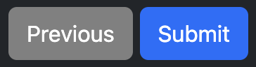
Submit
A special field type that lets you place submit button(s) inside your form layout in the form builder. The field.type property value is submit (for conditionals).
Settings
- Settings allow you to edit the button label(s).
- You may adjust the positioning of the submit button:
- Aligned to Left
- Aligned to Center
- Aligned to Right
- When using with multi-page forms, Freeform will detect when you're on a page after first page, and provide you with additional options:
- It will include a Previous button by default, allowing the user to go back to previous pages in the form.
- The Previous button can be disabled.
- Positioning options now include:
- Apart at Left and Right
- Together at Left
- Together at Center
- Together at Right
- It will include a Previous button by default, allowing the user to go back to previous pages in the form.
- You may include 1 per page in your form.
Notes
When manually building submit buttons in forms, be sure to include a data-freeform-action attribute to it.
The attribute value differs between various types of submit buttons:
- For the regular submit button which advances forms forward, it's value has to be
submit - For the back buttons in multi-page forms, the value has to be
back - For the Save & Continue Later buttons, the value has to be
save
<button type="submit" data-freeform-action="submit">Submit</button>
<button type="submit" data-freeform-action="back">Go Back</button>
<button type="submit" data-freeform-action="save">Save & Continue Later</button>
Templating
labelNext- A label for the Next button.
Submitby default.
- A label for the Next button.
labelPrev- A label for the Previous button.
Previousby default.
- A label for the Previous button.
disablePrev- A boolean value. If
truethe Previous button should not be rendered.
- A boolean value. If
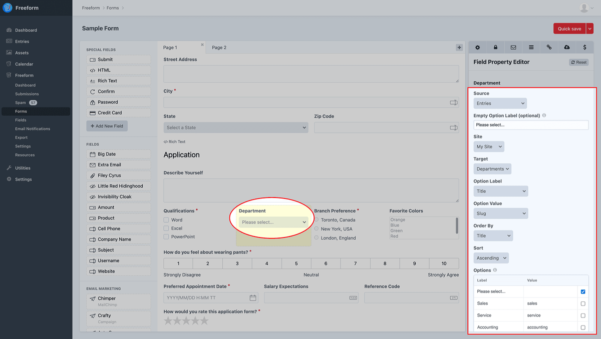
Populating Fields with Elements & Predefined Options
Inside the form builder (only), field types with options (such as Dropdown, Radios, etc) have the ability to be automatically fed options from Craft Elements or Freeform's own predefined options. This allows you to quickly build forms by having fields auto-generated.
Applicable Field Types
The following field types can be auto-populated:
- Select
- Optional Empty Option Label to have first option be something like
Please select...
- Optional Empty Option Label to have first option be something like
- Multiple Select
- Checkboxe Group
- Radio Group
- Dynamic Recipients (Elements only)
Available Craft Elements
The following Craft Elements can be fed to the above field types:
- Craft Entries
- Target sections or all sections.
- Option Label and Option Value choices:
- ID
- Title
- Slug
- URI
- Fields (simple values)
- Craft Users
- Target user groups or all groups.
- Option Label and Option Value choices:
- ID
- Username
- First Name
- Last Name
- Full Name
- Fields (simple values)
- Craft Categories
- Target category groups or all groups.
- Option Label and Option Value choices:
- ID
- Title
- Slug
- URI
- Fields (simple values)
- Craft Tags
- Target tag groups or all groups.
- Option Label and Option Value choices:
- ID
- Title
- Slug
- URI
- Fields (simple values)
- Craft Assets
- Target product type or all product types.
- Option Label and Option Value choices:
- Filename
- ID
- Fields (simple values)
- Craft Commerce Products
- Target asset groups or all groups.
- Option Label and Option Value choices:
- ID
- Title
- Slug
- URI
- SKU
- Price
- Fields (simple values)
Available Predefined Options
The following Freeform predefined options can be fed to the above field types:
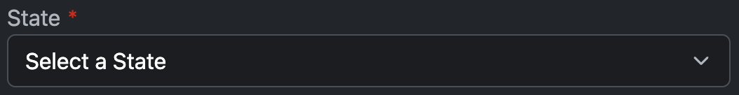
- States
- Official USA States
- Option Label and Option Value choices:
- Full
- Abbreviated (upper case 2 letters)
- States & Territories
- Official USA States and territories
- Option Label and Option Value choices:
- Full
- Abbreviated (upper case 2 letters)
- Canadian Provinces
- Provinces - English
- Canadian Provinces and territories in English
- Provinces - French
- Canadian Provinces and territories in French
- Provinces - Bilingual
- Bilingual list of Canadian Provinces and territories
- Option Label and Option Value choices:
- Full
- Abbreviated (upper case 2 letters)
- Provinces - English
- Countries
- All world countries
- Option Label and Option Value choices:
- Full
- Abbreviated (upper case 2 letters)
- Languages
- All world languages
- Option Label and Option Value choices:
- Full
- Abbreviated (lower case 2 letters)
- Numbers (range)
- A custom range of numbers
- Range Start and Range End
- E.g.
60-65would return list:60, 61, 62, 63, 64, 65
- E.g.
- Years (range)
- A custom range of years
- Range Start - number of years in PAST from current year
- Range End - number of years in FUTURE from current year
- E.g.
5(start) -0(end) would return list:2018, 2017, 2016, 2015, 2014, 2013
- E.g.
- Sort Direction:
- Ascending
- Descending
- Months
- All 12 months of the year.
- Option Label and Option Value choices:
- Full, e.g.
September - Abbreviated (Capitalized 3 letters), e.g.
Sep - Single Number, e.g.
9 - 2-digit Number, e.g.
09
- Full, e.g.
- Days
- List of days
1to31. - Option Label and Option Value choices:
- Single Number, e.g.
3 - 2-digit Number, e.g.
03
- Single Number, e.g.
- List of days
- Days of Week
- List of all days of week.
- Option Label and Option Value choices:
- Full, e.g.
Thursday - Abbreviated (Capitalized 3 letters), e.g.
Thu - Single Number, e.g.
4
- Full, e.g.