Freeform Freeform for Craft

Formatting Templates

Bootstrap 5 Dark Mode Improved in 5.0+

The following example assumes you're including necessary Bootstrap 5.3 JS and CSS as well as the data-bs-theme="dark" attribute to a parent element (such as html or an outer div tag). You can place the additional CSS and JS inside the formatting template or add to your site's CSS / JS files.

WARNING

Dark Mode relies on features newly available in the Bootstrap 5.3 version in order to work.
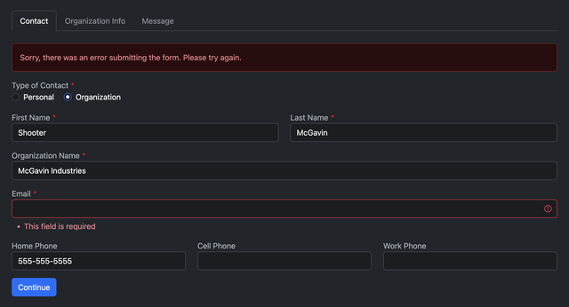
Preview

Bootstrap 5 Dark Mode Example

Video: Preview of Formatting Template Examples

Templates

TIP

Please note that you will need to include the data-bs-theme="dark" attribute to a parent element, such as <html> or an outer <div> tag.

/bootstrap-5-dark/
{# Pull in CSS and field rendering #}
<style>
{% include "freeform/_templates/formatting/bootstrap-5-dark/_main.css" %}
</style>
{% import "freeform/_templates/formatting/bootstrap-5-dark/_row.twig" as rowMacro %}

{# Render the opening form tag #}
{{ form.renderTag({
    attributes: {
        row: { class: "row" },
        success: { class: "alert alert-success" },
        errors: { class: "alert alert-danger" },
    },
    buttons: {
        attributes: {
            submit: { class: "btn btn-primary" },
            back: { class: "btn btn-secondary" },
            save: { class: "btn btn-primary" },
        },
    },
    fields: {
        "@global": {
            attributes: {
                container: { class: "mb-3 col-12" },
                input: {
                    novalidate: true,
                    class: "form-control bg-dark-subtle text-white"
                },
                label: { class: "mb-1" },
                instructions: { class: "form-text text-muted mt-n1 mb-1" },
                error: { class: "list-unstyled m-0 fst-italic text-danger" },
            },
        },
        ":required": {
            attributes: {
                label: { "+class": "required" },
            },
        },
        ":errors": {
            attributes: {
                input: { "+class": "is-invalid" },
            },
        },
        "@group": {
            attributes: {
                label: { "+class": "group-label" },
            },
        },
        "@checkbox" : {
            attributes: {
                input: { "=class": "form-check-input checkbox bg-dark-subtle" },
                label: { "+class": "form-check-label text-white" },
            },
        },
        "@dropdown" : {
            attributes: {
                input: { "+class": "form-select bg-dark-subtle text-white" },
            },
        },
        "@file" : {
            attributes: {
                input: { "+class": "form-control-file" },
            },
        },
        "@signature": {
            attributes: {
                input: {
                    "-class": "form-control",
                    "+class": "btn btn-light"
                },
            },
        },
        "@stripe": {
            attributes: {
                input: {
                    "-class": "form-control bg-dark-subtle",
                },
            },
        },
    },
}) }}

{# Pull in JS overrides #}
<script>
{% include "freeform/_templates/formatting/bootstrap-5-dark/_main.js" %}
</script>

{# Success and error message handling for non-AJAX forms #}
{% if not form.settings.ajax %}
    {% if form.submittedSuccessfully %}
        <div{{ form.attributes.success }}>
            <p>{{ form.settings.successMessage | t('freeform') }}</p>
        </div>
    {% endif %}
    {% if form.hasErrors %}
        <div{{ form.attributes.errors }}>
            <p>{{ form.settings.errorMessage | t('freeform') }}</p>

            {% if form.errors|length %}
                <ul class="mb-0">
                    {% for error in form.errors %}
                        <li>{{ error }}</li>
                    {% endfor %}
                </ul>
            {% endif %}
        </div>
    {% endif %}
{% endif %}

{# Render page tabs if multi-page #}
{% if form.pages|length > 1 %}
    <ul class="nav nav-tabs mb-4">
        {% for page in form.pages %}
            <li class="nav-item">
                <span class="nav-link{{ form.currentPage.index == page.index ? ' fw-bold active' : ' disabled' }}">
                    {{ page.label }}
                </span>
            </li>
        {% endfor %}
    </ul>
{% endif %}

{# Display form field rows and columns #}
{{ rowMacro.render(form.rows, form) }}

{# Render the closing form tag #}
{{ form.renderClosingTag }}
1
2
3
4
5
6
7
8
9
10
11
12
13
14
15
16
17
18
19
20
21
22
23
24
25
26
27
28
29
30
31
32
33
34
35
36
37
38
39
40
41
42
43
44
45
46
47
48
49
50
51
52
53
54
55
56
57
58
59
60
61
62
63
64
65
66
67
68
69
70
71
72
73
74
75
76
77
78
79
80
81
82
83
84
85
86
87
88
89
90
91
92
93
94
95
96
97
98
99
100
101
102
103
104
105
106
107
108
109
110
111
112
113
114
115
116
117
118
119
120
121
122
123
124
125
126
127
{% macro getFieldTemplate(type) -%}
    {% set fieldTemplatePath = "freeform/_templates/formatting/bootstrap-5-dark/fields/" -%}
    {{- fieldTemplatePath ~ type ~ ".twig" -}}
{%- endmacro %}

{% macro render(rows, form) %}
    {% import _self as self %}

    {% for row in rows %}

        {% set width = (12 / (row|length)) %}

        <div{{ form.attributes.row }}>
            {% for field in row %}

                {% do field.setParameters({
                    attributes: {
                        container: {
                            class: [
                                "col-sm-" ~ width,
                                "freeform-fieldtype-" ~ field.type,
                            ],
                        },
                    }
                }) %}

                {% include [self.getFieldTemplate(field.type), self.getFieldTemplate("_default")] %}

            {% endfor %}
        </div>

    {% endfor %}

{% endmacro %}
1
2
3
4
5
6
7
8
9
10
11
12
13
14
15
16
17
18
19
20
21
22
23
24
25
26
27
28
29
30
31
32
33
34
button[type=submit].freeform-processing {
    display: inline-flex;
    flex-wrap: nowrap;
    align-items: center;
}
button[type=submit].freeform-processing:before {
    content: "";
    display: block;
    flex: 1 0 11px;
    width: 11px;
    height: 11px;
    margin-right: 10px;
    border-style: solid;
    border-width: 2px;
    border-color: transparent transparent #fff #fff;
    border-radius: 50%;
    animation: freeform-processing .5s linear infinite;
}
@keyframes freeform-processing {
    0% {
        transform: rotate(0);
    }
    100% {
        transform: rotate(1turn);
    }
}
label.required:after {
    content: "*";
    color: #d00;
    margin-left: 3px;
}
input::placeholder {
    color: #454749 !important;
}
.alert p:last-of-type {
    margin-bottom: 0;
}
.mt-n1 {
    margin-top: -0.5rem !important;
}

/* DARK MODE SPECIFIC STYLES */
.opinion-scale .opinion-scale-scales>: first-child>label {
    border-top-left-radius: 5px;
    border-bottom-left-radius: 5px;
}
.opinion-scale .opinion-scale-scales>:last-child>label {
    border-top-right-radius: 5px;
    border-bottom-right-radius: 5px;
}
.opinion-scale .opinion-scale-scales li label {
    color: #fff !important;
    border-color: #495057 !important;
    background: #1a1d20 !important;
}
.opinion-scale .opinion-scale-scales>* input:checked~label {
    color: #fff !important;
    background: #495057 !important;
}
1
2
3
4
5
6
7
8
9
10
11
12
13
14
15
16
17
18
19
20
21
22
23
24
25
26
27
28
29
30
31
32
33
34
35
36
37
38
39
40
41
42
43
44
45
46
47
48
49
50
51
52
53
54
55
56
57
58
59
var form = document.querySelector('[data-id="{{ form.anchor }}"]');
if (form) {
    // Styling for AJAX responses
    form.addEventListener("freeform-ready", function (event) {
        var freeform = event.freeform;

        freeform.setOption("errorClassBanner", ["alert", "alert-danger"]);
        freeform.setOption("errorClassList", ["list-unstyled", "m-0", "fst-italic", "text-danger"]);
        freeform.setOption("errorClassField", ["is-invalid"]);
        freeform.setOption("successClassBanner", ["alert", "alert-success"]);
    })
    // Styling for Stripe Payments field
    form.addEventListener("freeform-stripe-appearance", function (event) {
        event.elementOptions.appearance = Object.assign(
            event.elementOptions.appearance,
            {
                variables: {
                    colorPrimary: "#0d6efd",
                    fontFamily: "-apple-system,BlinkMacSystemFont,\"Segoe UI\",Roboto,\"Helvetica Neue\",Arial,sans-serif,\"Apple Color Emoji\",\"Segoe UI Emoji\",\"Segoe UI Symbol\",\"Noto Color Emoji\"",
                    fontSizeBase: "1rem",
                    spacingUnit: "0.2em",
                    tabSpacing: "10px",
                    gridColumnSpacing: "20px",
                    gridRowSpacing: "20px",
                    colorText: "#ffffff",
                    colorBackground: "#1d1f23",
                    colorDanger: "#dc3545",
                    borderRadius: "0.375rem",
                },
                rules: {
                    '.Tab, .Input': {
                        border: '1px solid #495057',
                        boxShadow: 'none',
                    },
                    '.Tab:focus, .Input:focus': {
                        border: '1px solid #0b5ed7',
                        boxShadow: 'none',
                        outline: '0',
                        transition: 'border-color .15s ease-in-out',
                    },
                    '.Label': {
                        fontSize: '1rem',
                        fontWeight: '400',
                    },
                },
            }
        );
    });
}
1
2
3
4
5
6
7
8
9
10
11
12
13
14
15
16
17
18
19
20
21
22
23
24
25
26
27
28
29
30
31
32
33
34
35
36
37
38
39
40
41
42
43
44
45
46
47
48
49
fields/
/bootstrap-5-dark/fields/
{{ field.render }}
1
<div{{ field.attributes.container }}>
    <div class="form-check">
        {{ field.renderInput }}
        {{ field.renderLabel }}
        {{ field.renderInstructions }}
        {{ field.renderErrors }}
    </div>
</div>
1
2
3
4
5
6
7
8
<div{{ field.attributes.container }}>

    {{ field.renderLabel }}
    {{ field.renderInstructions }}

    {% if field.oneLine %}<div>{% endif %}

    {% for index, option in field.options %}
        <div class="form-check{{ field.oneLine ? " form-check-inline" }}">
            <input type="checkbox"
                   name="{{ field.handle }}[]"
                   value="{{ option.value }}"
                   id="{{ field.idAttribute }}-{{ index }}"
                   class="form-check-input bg-dark-subtle{{ field.hasErrors ? " is-invalid" }}"
                    {{ option.value in field.value ? "checked" }}
            />

            <label class="form-check-label text-white" for="{{ field.idAttribute }}-{{ index }}">
                {{ option.label|t('freeform')|raw }}
            </label>
        </div>
    {% endfor %}

    {% if field.oneLine %}</div>{% endif %}

    {{ field.renderErrors }}

</div>
1
2
3
4
5
6
7
8
9
10
11
12
13
14
15
16
17
18
19
20
21
22
23
24
25
26
27
28
<div{{ field.attributes.container }}>

    {{ field.renderLabel }}
    {{ field.renderInstructions }}

    {% if field.oneLine %}<div>{% endif %}

    {% for index, option in field.options %}
        <div class="form-check{{ field.oneLine ? " form-check-inline" }}">
            <input type="radio"
                   name="{{ field.handle }}"
                   value="{{ option.value }}"
                   id="{{ field.idAttribute }}-{{ index }}"
                   class="form-check-input bg-dark-subtle{{ field.hasErrors ? " is-invalid" }}"
                    {{ option.value == field.value ? "checked" }}
            />
            <label class="form-check-label text-white" for="{{ field.idAttribute }}-{{ index }}">
                {{ option.label|t('freeform')|raw }}
            </label>
        </div>
    {% endfor %}

    {% if field.oneLine %}</div>{% endif %}

    {{ field.renderErrors }}

</div>
1
2
3
4
5
6
7
8
9
10
11
12
13
14
15
16
17
18
19
20
21
22
23
24
25
26
27
{% import "freeform/_templates/formatting/bootstrap-5-dark/_row.twig" as rowMacro %}

<div{{ field.attributes.container }}>
    <div class="card">
        <div class="card-header">
            {{ field.renderLabel }}
            {{ field.renderInstructions }}
        </div>
        <div class="card-body pb-0">
            {{ rowMacro.render(field.layout, form) }}
        </div>
    </div>
</div>
1
2
3
4
5
6
7
8
9
10
11
12
13
{{ field.render({
    addButtonLabel: "Add +",
    removeButtonLabel: "x",
    tableAttributes: {
        table: { class: "table table-sm table-borderless" },
        input: { class: "form-control bg-dark-subtle text-white" },
        dropdown: { class: "form-control form-select bg-dark-subtle text-white" },
        checkbox: { class: "form-check-input bg-dark-subtle" },
        removeButton: { class: "btn btn-sm btn-danger" },
        addButton: { class: "btn btn-sm btn-success" },
    },
}) }}
1
2
3
4
5
6
7
8
9
10
11
12

The following CDN links for Bootstrap 5 are for v5.3.1, which may no longer be the latest version. Please see official Bootstrap 5 documentation for latest versions and CDN links.

<!-- Latest compiled and minified CSS -->
<link href="https://cdn.jsdelivr.net/npm/bootstrap@5.3.1/dist/css/bootstrap.min.css" rel="stylesheet" integrity="sha384-4bw+/aepP/YC94hEpVNVgiZdgIC5+VKNBQNGCHeKRQN+PtmoHDEXuppvnDJzQIu9" crossorigin="anonymous">

<!-- Latest compiled and minified JavaScript -->
<script src="https://cdn.jsdelivr.net/npm/bootstrap@5.3.1/dist/js/bootstrap.bundle.min.js" integrity="sha384-HwwvtgBNo3bZJJLYd8oVXjrBZt8cqVSpeBNS5n7C8IVInixGAoxmnlMuBnhbgrkm" crossorigin="anonymous"></script>
1
2
3
4
5

Live Demo

The demo below is a live demo site that shows most of what the Demo Templates include (some sections and data has been limited).