Freeform_Next:Form tag
The Freeform_Next:Form template tag displays your form contents. You can either loop through automated rendering of form pages/rows/columns/fields (based on what is in Composer), or manually enter each field if you need full control for complex forms.
If you're wanting to simply render a complete form based on Composer layout and the assigned formatting template, you can just use the Freeform_Next:Render template tag (all of the same parameters below are available for it).
Parameters
form
Specify the handle of the form you'd like to be displayed.
form_id
Specify the ID of the form you'd like to be displayed.
submission_tokenPro
Specify the token of the submission you'd like to be edited. You can feed the submission token into the URL with the {submission:token} variable from a template that includes the Freeform_Next:Submissions template tag, or in email notification templates, etc.
input_class
Overrides the class name of all input elements.
submit_class
Overrides the class name of all submit elements.
row_class
Overrides the class name of all row <div> elements.
column_class
Overrides the class name of all field column <div> elements.
label_class
Overrides the class name of all <label> elements.
error_class
Overrides the class name of all error <ul> elements.
instructions_class
Overrides the class name of all instruction <div> elements.
instructions_below_field
If set to yes - will render field instructions below the <input> element.
class
Overrides the <form> class name.
id
Overrides the <form> ID attribute.
return_url or return
Overrides the return URL (set inside Composer) for the form.
- Use
SUBMISSION_IDto generate the future submission ID in the return URL. - Use
SUBMISSION_TOKENto generate the future submission token in the return URL (great for more securely displaying submission details on return page).
method
Overrides the <form> method attribute. POST by default.
name
Overrides the <form> name attribute.
action
Overrides the <form> action attribute.
use_action_url="yes"
Available as a workaround when loading a form with AJAX and submitting normally, etc.
override_values
Allows overriding the default values for any field:
- Specify the field
handleand provide the custom value override as its value. - E.g.
override_values:location="{segment_3}". - If a field uses an
override_valueattribute, it will take precedence over the value specified in this attribute.
form_attributes
Attributes which will be added to the form. E.g. form_attributes:novalidate="true", form_attributes:data-form-id="test"
To achieve something like <form novalidate>, just specify form_attributes:novalidate instead of form_attributes:novalidate="true".
input_attributes
Attributes which will be added to all input fields. E.g. input_attributes:readonly="true", input_attributes:data-field-id="test"
use_required_attribute="yes"
Adds required attribute to input fields that have been set to be required in Composer.
field_id_prefix="myform-"
Adds a prefix value on field outputs. Helpful if you have more than 1 form on the same template and are sharing fields.
dynamic_notification_recipients
Allows using a dynamic template level notification for a more fine-grained control. Hard code values or pass a value from a channel entry, etc, e.g. dynamic_notification_recipients="admin@example.com|support@example.com"
REQUIRED: Use with dynamic_notification_template="test.html" parameter to specify the notification template to be used.
- For Database entry based templates, specify the handle name.
- For HTML file based templates, specify the full file name including .html.
no_form_tags
Specify a value of yes to prevent the <form> tags from rendering. Helpful in some scenarios where you might be using the Freeform_Next:Form template tag to render some field data, such as a table header for Submissions list (see demo templates).
Variables
{form:name}
Outputs the name of the form.
{form:handle}
Outputs the handle of the form.
{form:id}
Outputs the unique ID of the form.
{form:description}
Outputs the description of the form.
{form:return_url}
Outputs the return URL of the form.
{current_page:label}
Returns the current page label.
{current_page:index}
Returns the current page index, e.g. 0, 1, etc.
Custom Attributes
The following variables are available to help with formatting, based on what you have specified in Composer or the corresponding parameters:
{form:id_attribute}- the ID attribute of the HTML form tag.{form:class}- the CLASS attribute of the HTML form tag.{form:method}- the METHOD attribute for the form tag.{form:action}- the ACTION attribute for the form tag.{form:row_class}- the CLASS attribute of all HTML row tags.{form:column_class}- the CLASS attribute of all HTML column tags.
{column:grid_width}
Outputs the grid width (out of 12) for the column that contains the field. Aids with setting up responsive template.
{column:count}
Outputs the total number of columns (fields) for the row.
{column:index}
Outputs the column number for specific column (field) of that row, e.g. 0, 1, 2, 3.
Manual Fields
You can manually construct forms with any Freeform field variable, using the proper syntax:
{field:field_name:label}- displays the label (name) of the field.{field:field_name:value}- displays the option label(s) submitted (for form reloading upon submit error).{field:field_name:handle}- displays the handle of the field.{field:field_name:placeholder}- displays the placeholder of the field (when applicable).{field:field_name:options}{/field:field_name:options}- variable pair that helps render fields with multiple options like select fields, etc.{option:value}- the option value for the field option.{option:label}- the option label for the field option.{if option:checked}selected{/if}- check if the field option is selected/checked.- Example code would look something like this:
<select name="{field:state:handle}">{field:state:options}<option value="{option:value}" {if option:checked}selected{/if}>{option:label}</option>{/field:state:options}</select>
Individual Rendering of Fields
You can also render entire fields individually:
{field:field_name:render}- renders complete field (label, input, etc). The following override parameters are available:id- overrides ID for input(s)class- overrides class for input(s)label_class- overrides class for labelerror_class- adds class toulgenerated for error(s)instructions_class- adds class todivgenerated for instructionsinstructions_below_field="yes"- loads instructions below input rather than aboveinput_attributes- Attributes to be added to the input field, e.g.
input_attributes:readonly="true",input_attributes:data-field-id="test"
- Attributes to be added to the input field, e.g.
override_value- Override the value for the input field, e.g.
override_value="test"
- Override the value for the input field, e.g.
- Manually rendering reCAPTCHA fields need to be called like this (using the Hash value for reCAPTCHA field in Property Editor of Composer, e.g.
MD1KzPw68):{field:grecaptcha_MD1KzPw68:render}
{field:field_name:render_label}- renders the complete label. The following override parameters are available: -label_class{field:field_name:render_input}- renders the complete input. The following override parameters are available: -class-input_attributes- Attributes to be added to the input field, e.g.input_attributes:readonly="true",input_attributes:data-field-id="test"-override_value- Override the value for the input field, e.g.override_value="test"{field:field_name:render_instructions}- renders the instructions. The following override parameters are available:instructions_class{field:field_name:render_errors}- renders the errors. The following override parameters are available:errors_class
For a more robust automated rendering of fields, see the {fields}{/fields} variable pair.
Variable Pairs
{pages}{/pages}
Handles formatting options for displaying list of pages for multi-page forms.
{page:index}- page number{page:label}- name of the page (set in Composer){current_page:index}- page number of currently viewed page{form:page_count}- total number of pages for the form
Typical usage looks something like this:
{if form:page_count > 1}
<ul class="nav nav-tabs">
{pages}
<li class="{if page:index == current_page:index}active{if:else}disabled{/if}">
<a href="javascript:;">{page:label}</a>
</li>
{/pages}
</ul>
{/if}
{rows}{/rows}
Handles formatting options for displaying rows of fields in layout (set by Composer).
{fields}{/fields}
Handles formatting options for displaying columns of fields in layout (set by Composer). Not required if rendering a form manually.
The following variables and variable pairs are available for use when rendering your form:
{field:label}- label of field, e.g.First Name{field:handle}- handle for field, e.g.first_name{field:instructions}- instructions for field, e.g.Please select from the following{field:placeholder}- placeholder for field (where applicable), e.g.you@yourdomain.com{field:type}- type of field:texttextareahiddenselectcheckboxcheckbox_groupradio_groupemaildynamic_recipientsfilemailing_listhtmlsubmitconfirmationdatetimephoneratingregexwebsite
{field:required}- renders as1if field is set to be required. Used as a conditional.{field:options}{/field:options}- variable pair for formatting options for multi-option fields.{option:label}- label of option, e.g.California{option:value}- value of the option, e.g.CA{option:checked}- renders as1if the option should be checked. Used as a conditional.{option:index}- the order number of the option, e.g.4
{field:show_as_radio}- specific to Dynamic Recipients fieldtype.{field:position}- positioning of field (submit fields), e.g.submit-align-left
Also available are automated rendering options:
{field:render}- renders complete field (label, input, etc). The following override parameters are available:idclasslabel_classerror_classinstructions_classinstructions_below_field="yes"input_attributes- Attributes to be added to the input field, e.g.
input_attributes:readonly="true",input_attributes:data-field-id="test"
- Attributes to be added to the input field, e.g.
override_value- Override the value for the input field, e.g.
override_value="test"
- Override the value for the input field, e.g.
{field:render_label}- renders the complete label. The following override parameters are available:label_class
{field:render_input}- renders the complete input. The following override parameters are available:input_classinput_attributes- Attributes to be added to the input field, e.g.
input_attributes:readonly="true",input_attributes:data-field-id="test"
- Attributes to be added to the input field, e.g.
override_value- Override the value for the input field, e.g.
override_value="test"
- Override the value for the input field, e.g.
{field:render_instructions}- renders the instructions. The following override parameters are available:instructions_class
{field:render_errors}- renders the errors. The following override parameters are available:errors_class
Conditionals
{if form:no_results}{/if}
Displays its contents when there are no results found for this template tag with the given set of parameters.
{if form:has_errors}{/if}
Displays its contents when there are errors after attempting to submit the form.
{if form:is_submitted_successfully}{/if}
Session success flash message. Displays only once after a form is successfully submitted.
Examples
Below shows a variety of approaches available to render your forms. For more complete examples for use with front-end frameworks like Bootstrap, see the Formatting Template Examples documentation.
Basic Form Render
Render the form using its formatting template with the Render template tag:
{exp:freeform_next:render form="contact_form"}
Form Render with Overrides
Render the form using its formatting template, but overriding some classes with the Render template tag:
{exp:freeform_next:render
form="contact_form"
label_class="form-label"
input_class="form-control"
instructions_below_field="yes"
submit_class="btn btn-success"
override_values:location="{segment_3}"
}
{if form:no_results}Sorry, no form was found.{/if}
{/exp:freeform_next:render}
Form Render Inside a Regular Template
Render a form automatically with some control on formatting:
{exp:freeform_next:form
form="contact_form"
return_url="{path='about/contact'}"
id="myform"
class="form-class"
row_class="sample-row-class"
submit_class="button"
}
{if form:page_count > 1}
<ul class="freeform-pages">
{pages}
<li>
{if page:index == current_page:index}
<a href="javascript:;">{page:label}</a>
{if:else}
{page:label}
{/if}
</li>
{/pages}
</ul>
{/if}
{if form:has_errors}
<div class="freeform-form-has-errors">
There was an error submitting this form
</div>
{/if}
{rows}
<div class="freeform-row {form:row_class}">
{fields}
<div class="freeform-column {form:column_class}{if field:type == 'submit'} freeform-column-content-align-{field:position}{/if}">
{field:render
class="{if field:type != 'submit'}freeform-input{/if}"
label_class="freeform-label{if field:required} freeform-required{/if}{if field:input_only} freeform-input-only-label{/if}"
error_class="freeform-errors"
instructions_class="freeform-instructions"
}
</div>
{/fields}
</div>
{/rows}
{/exp:freeform_next:form}
Complex Form Render with Bootstrap
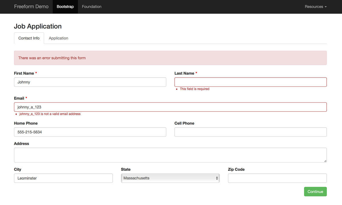
Here is a more complex form (made to work with Bootstrap):
<style>label.required:after {content:"\*";color:#d00;margin-left:5px;}.submit-align-left{text-align:left}.submit-align-right{text-align:right}.submit-align-center{text-align:center}.submit-align-center button:not(:first-of-type),.submit-align-left button:not(:first-of-type),.submit-align-right button:not(:first-of-type){margin-left:5px}.submit-align-spread button:first-child{float:left}.submit-align-spread button:last-child{float:right}</style>
{exp:freeform_next:form
form="contact_form"
return_url="{path='about/contact'}"
}
{if form:page_count > 1}
<ul class="nav nav-tabs">
{pages}
<li class="{if page:index == current_page:index}active{if:else}disabled{/if}">
<a href="javascript:;">{page:label}</a>
</li>
{/pages}
</ul>
{/if}
{if form:has_errors}
<div class="alert alert-danger">
There was an error submitting this form
</div>
{/if}
{rows}
<div class="row {form:row_class}">
{fields}
<div class="{form:column_class} col-xs-12 col-lg-{column:grid_width} {if field:type == 'checkbox' OR field:type == 'mailing_list'}checkbox{if:else}form-group{/if}{if field:has_errors} has-error{/if}{if field:type == 'submit'} submit-align-{field:position}{/if}">
{if field:type == 'checkbox_group'}
{field:render_label label_class="{if field:required}required{/if}"}
{field:options}
<div class="checkbox">
<label>
<input type="checkbox"
name="{field:handle}[]"
value="{option:value}"
{if option:checked}checked{/if}
/>
{option:label}
</label>
</div>
{/field:options}
{field:render_instructions instructions_class="help-block"}
{field:render_errors error_class="help-block"}
{if:elseif field:type == 'radio_group' OR (field:type == 'dynamic_recipients' AND field:show_as_radio)}
{field:render_label label_class="{if field:required}required{/if}"}
{field:options}
<div class="radio">
<label>
<input type="radio"
name="{field:handle}"
value="{option:value}"
{if option:checked}checked{/if}
/>
{option:label}
</label>
</div>
{/field:options}
{field:render_instructions instructions_class="help-block"}
{field:render_errors error_class="help-block"}
{if:elseif field:type == 'submit'}
{field:render}
{if:else}
{field:render
class="{if field:type == 'checkbox' OR field:type == 'mailing_list'}checkbox{if:else}form-control{/if}"
label_class="{if field:required}required{/if}"
error_class="help-block"
instructions_class="help-block"
instructions_below_field="yes"
}
{/if}
</div>
{/fields}
</div>
{/rows}
{/exp:freeform_next:form}
Manual Forms
Form formatting can also be very manual or semi manual, if that is something you prefer. Here's an example of different levels of manual you can use:
{exp:freeform_next:form
form="contact_form"
return_url="{path='about/contact'}"
}
{if form:is_submitted_successfully}
{!-- Session success flash message - displays only once after a form is successfully submitted --}
<div class="success">Form submitted successfully!</div>
{/if}
{if form:has_errors}
<div class="error">There was an error submitting this form.</div>
{/if}
<h3>{form:name}</h3>
<ul>
<li>
<label for="first_name">Name (required)</label>
<input type="text" name="first_name" value="{field:first_name:value}" />
<input type="text" name="last_name" value="{field:last_name:value}" />
{field:first_name:render_errors error_class="field-error"}
{field:last_name:render_errors error_class="field-error"}
</li>
<li>
{field:email:render
class="email-field"
placeholder="you@youremail.com"
}
</li>
<li>
<label for="city">City</label>
<input type="text" name="city" value="{field:city:value}" />
{if field:city:render_errors}
<div class="field-error">This field is required!</div>
{/if}
</li>
<li>
{field:state:label}
{field:last_name:render_instructions instructions_class="field-instructions"}
<select name="{field:state:handle}">
    {field:state:options}
    <option value="{option:value}" {if option:checked}selected{/if}>
        {option:label}
    </option>
    {/field:state:options}
</select>
{field:last_name:render_errors error_class="field-error"}
</li>
<li>
{field:how_you_found_us:render}
</li>
<li>
{field:department:label}
<select name="{field:department:handle}" type="dynamic_recipients">
{field:department:options}
<option value="{option:index}" {if option:checked}selected{/if}>
{option:label}
</option>
{/field:department:options}
</select>
</li>
<li>
<button type="submit">Submit</button>
</li>
</ul>
{if form:no_results}
<div class="error">This form does not exist.</div>
{/if}
{/exp:freeform_next:form}
Manual Multi-page Forms
Building multi-page forms manually can get a bit tricky. For this, we do recommend using the automated flow for multi-page forms. However, if you must, what you need to do is perform a conditional check on {current_page:index}, where page one is 0, page two is 1, page three is 2, etc, and place your fields within those conditionals. If you wish to include a Previous page button, be sure that it is given a name of form_previous_page_button and Freeform will take care of the rest. So something like this:
{exp:freeform_next:form
	form="my-multipage-form"
	return_url="{path='freeform_next_demo/manual_multipage'}"
}

	{if form:is_submitted_successfully}
		{!-- Session success flash message - displays only once after a form is successfully submitted --}
		<div class="success">Form submitted successfully!</div>
	{/if}

	{if form:has_errors}
		<div class="error">There was an error submitting this form.</div>
	{/if}

	<h3>{form:name}</h3>

	<ul class="page-tabs">
	{pages}
		<li class="{if page:index == current_page:index}active{if:else}disabled{/if}">
			{page:label}
		</li>
	{/pages}
	</ul>

	<ul>
	{if current_page:index == 0} {!-- SHOW PAGE 1 --}
		<li>
			<label for="first_name">Name (required)</label>
			<input type="text" name="first_name" value="{field:first_name:value}" />
			<input type="text" name="last_name" value="{field:last_name:value}" />
			{field:first_name:render_errors error_class="field-error"}
			{field:last_name:render_errors error_class="field-error"}
		</li>
		<li>
			{field:email:render
				class="email-field"
				placeholder="you@youremail.com"
			}
		</li>
		<li>
			<button type="submit" name="form_page_submit">Continue</button>
		</li>
	{/if}
	{if current_page:index == 1} {!-- SHOW PAGE 2 --}
		<li>
			<label for="city">City</label>
			<input type="text" name="city" value="{field:city:value}" />
			{if field:city:render_errors}
				<div class="field-error">This field is required!</div>
			{/if}
		</li>
		<li>
			{field:state:label}
			{field:last_name:render_instructions instructions_class="field-instructions"}
	 		<select name="{field:state:handle}">
				{field:state:options}
				<option value="{option:value}" {if option:checked}selected{/if}>
					{option:label}
				</option>
				{/field:state:options}
			</select>
			{field:last_name:render_errors error_class="field-error"}
		</li>
		<li>
			<button type="submit" name="form_previous_page_button">Previous</button>
			<button type="submit" name="form_page_submit">Continue</button>
		</li>
	{/if}
	{if current_page:index == 2} {!-- SHOW PAGE 3 --}
		<li>
			{field:how_you_found_us:render}
		</li>
		<li>
			{field:department:label}
			<select name="{field:department:handle}" type="dynamic_recipients">
			{field:department:options}
				<option value="{option:index}" {if option:checked}selected{/if}>
					{option:label}
				</option>
			{/field:department:options}
			</select>
		</li>
		<li>
			<button type="submit" name="form_previous_page_button">Previous</button>
			<button type="submit" name="form_page_submit">Finish</button>
		</li>
	{/if}
	</ul>

	{if form:no_results}
		<div class="error">This form does not exist.</div>
	{/if}

{/exp:freeform_next:form}