Template Overrides
Overrides customize a form instance while retaining its formatting template. Pass them to a Form query, form.render(), or form.renderTag() when rendering your own markup.
For the complete hierarchy with aligned explanations, see the annotated full example.
Override Namespaces
| Namespace | Controls |
|---|---|
attributes | The form tag, rows, and success/error banners. |
fields | Field properties and attributes, selected by handle, type, state, or interface. |
buttons | Submit, Back, and Save labels and attributes. |
captchas | Attributes on automatically inserted captcha wrappers. |
{{ freeform.form('contact').render({
  attributes: { class: 'contact-form' },
  fields: {
    '@global': {
      attributes: { input: { class: 'form-control' } }
    },
    email: {
      instructions: 'We will reply to this address.'
    }
  },
  buttons: { submitLabel: 'Send message' }
}) }}
Field Selectors
| Selector | Targets |
|---|---|
@global | All fields. |
email | A field with that handle. |
@dropdown | All fields of that type. Prefix the field type with @. |
:required | Fields marked required. |
:errors | Fields with validation errors. |
:options | Fields implementing the options interface. |
:fileUpload | File upload fields. |
:multiValue | Fields with multiple values. |
:noStorage | Fields whose values are not stored, such as HTML, Rich Text, and Password. |
:placeholder | Fields supporting placeholders. |
Combine selectors with commas, such as '@checkboxes, @radios' or '@text, firstName'. A field matches when any listed selector matches. Multiple matching entries are applied in the order supplied, so place shared defaults before more specific overrides.
In Freeform 5.17+, the default AJAX renderer also mirrors supported :errors classes from the formatting template onto field containers, labels, and inputs.
Attribute Locations
Form Attributes
| Path | Applied to |
|---|---|
attributes.class, attributes.id, or other attributes | The opening form tag. |
attributes.row | Row wrappers rendered by the formatting template. |
attributes.success | Success banner wrapper. |
attributes.errors | Form error banner wrapper. |
Custom formatting templates need to output the corresponding attribute collections. In Freeform 5.17+, the default AJAX renderer also uses the success and error banner settings.
Field Attributes
Inside a selector, use attributes with these keys:
| Key | Applied to |
|---|---|
container | Field wrapper. |
input | Input, select, textarea, or other control. |
label | Field label or question. |
instructions | Instruction block. |
error | Field validation error block. |
optionLabel | Individual option labels in supported choice fields. |
option | Options in Dropdown and Multiple Select fields. |
Use singular error for field errors and plural errors for the form banner. Field selectors can also override value, label, and instructions; values for option fields must match their configured option values.
Button Attributes
Use buttons.attributes with container, column, buttonWrapper, submit, back, and save. Set submitLabel, backLabel, and saveLabel directly inside buttons.
To change placement or supply your own button markup, see Submit Button Customization.
Captcha Attributes
Use captchas to add attributes to the automatically inserted wrapper, for example class or a data-* attribute. See the captcha wrapper recipe and captcha placement.
Behavior Syntax
Without a prefix, an attribute uses append behavior. Quote attribute names that begin with a modifier:
| Syntax | Behavior |
|---|---|
class: 'field' or '+class': 'field' | Add to existing values. |
'-class': 'field' | Remove from existing values. |
'=class': 'field' | Replace existing values. |
The modifiers also work with custom attribute names.
- Template Code
- Output
{{ form.render({
  fields: {
    '@global': {
      attributes: { input: { class: 'form-input form-text' } }
    },
    '@dropdown': {
      attributes: {
        input: { '-class': 'form-text', '+class': 'form-select' }
      }
    },
    '@checkbox': {
      attributes: { input: { '=class': 'form-check' } }
    }
  }
}) }}
With no other input classes configured, the relevant class attributes are:
<!-- Text field: shared defaults -->
<input class="form-input form-text" />

<!-- Dropdown: remove form-text, add form-select -->
<select class="form-input form-select"></select>

<!-- Checkbox: replace all shared classes -->
<input type="checkbox" class="form-check" />
Relative to these shared defaults, Dropdown inputs keep form-input, remove form-text, and add form-select. Checkbox inputs replace the shared classes with form-check.
Overriding HTML TagsNew in 5.10+
The reserved tag key changes the wrapper tag for attributes.row and for a field's container, label, optionLabel, or instructions. It does not replace the input control's tag.
For accessible choice groups, use a fieldset and legend:
- Template Code
- Output
{{ form.render({
  fields: {
    '@checkboxes, @radios': {
      attributes: {
        container: { tag: 'fieldset' },
        label: { tag: 'legend' },
        optionLabel: { tag: 'label', class: 'option-label' }
      }
    }
  }
}) }}
For a Checkboxes field named “Interests”, the relevant wrapper and label structure is shown below. Other generated attributes are omitted.
<fieldset>
  <legend>Interests</legend>
  <label class="option-label">
    <input type="checkbox" name="interests[]" value="news" />
    News
  </label>
  <label class="option-label">
    <input type="checkbox" name="interests[]" value="events" />
    Events
  </label>
</fieldset>
Newer bundled templates already use this structure for supported fields. See Accessibility before changing labels or containers.
How to Set Attributes
At form level, use selectors under fields. At field level, supply the attribute locations directly:
{{ field.renderInput({
  attributes: { input: { class: 'custom-input' } }
}) }}
To set parameters before rendering:
{% do field.setParameters({
  attributes: { container: { class: 'custom-container' } }
}) %}
{{ field.render() }}
Field Attributes Editor
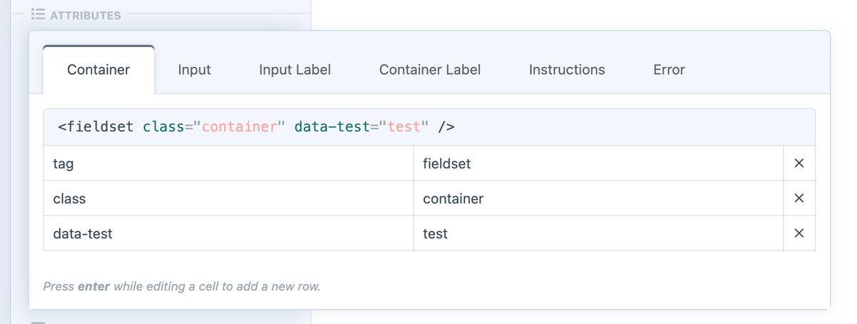
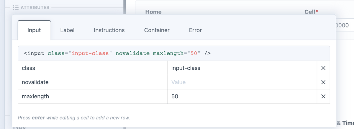
Set attributes on an individual field inside the form builder's Field Attributes editor. These are combined with template overrides using the same add/remove/replace behavior. Use @global for shared form-level defaults.
Accessing Attribute Properties
Render a collection of generated attributes with raw, or retrieve one value with get():
- Template Code
- Output
<div{{ form.attributes.success|raw }} role="status">
  {{ form.successMessage|t('freeform') }}
</div>
With form-success configured and a success message of “Thank you!”, the collection expands into HTML attributes:
<div class="form-success" role="status">
  Thank you!
</div>
- Template Code
- Output
{{ form.attributes.success.get('class') }}
{{ field.attributes.input.get('class') }}
Using the classes from the full example below, get() returns only the attribute values:
form-success
form-field-input
The collection outputs attributes such as class="form-success"; get('class') returns only their value. Use raw for Freeform's generated attribute collections, and keep user-supplied content escaped.
Full Example
The complete breakdown below shows the override hierarchy in one place, with explanations aligned to the relevant lines. It includes form attributes, button controls, shared field defaults, interface selectors, field types, individual handles, and captcha attributes.
The empty {} maps are valid optional selector slots; add properties or attributes to the ones you need. Replace handles and example classes with your own. This assumes form is already available.
Scroll horizontally to compare the template code and annotations on narrower screens. The recipes show individual changes with their resulting output.
{{ form.render({
  attributes: {
    novalidate: true,
    "data-form": true,
    id: "my-form-id",
    class: "my-form-class",
    row: {
      tag: 'section',
      "data-row": true,
      class: "form-row",
    },
    success: {
      class: "form-success",
    },
    errors: {
      class: "form-error",
    },
  },
  buttons: {
    attributes: {
      container: { class: "button-container" },
      column: { class: "button-column" },
      buttonWrapper: { class: "button-wrapper" },
      submit: { class: "form-field-button blue" },
      back: { class: "form-field-button gray" },
      save: { class: "form-field-button blue" },
    },
    submitLabel: "Send",
    backLabel: "Previous",
    saveLabel: "Save",
  },
  fields: {
    "@global": {
      attributes: {
        container: {
          "data-container": true,
          class: "form-field-wrapper",
        },
        input: {
          "data-field": true,
          class: "form-field-input",
        },
        label: {
          class: "form-field-label",
        },
        instructions: {
          class: "form-field-instructions",
        },
        error: {
          class: "form-field-errors",
        },
      },
    },
    ":required": {
      attributes: {
        label: { "+class": "form-field-required" },
      },
    },
    ":errors": {
      attributes: {
        input: { "+class": "form-field-is-invalid" },
      },
    },
    ":options": {},
    ":fileUpload": {},
    ":multiValue": {},
    ":noStorage": {},
    ":placeholder": {},
    "@dropdown": {
      attributes: {
        container: {
          "data-select-container": true,
        },
        input: {
          "+class": "form-field-select fullwidth",
        },
        option: {
          "data-option": true,
        },
      },
    },
    "@checkbox" : {
      attributes: {
        input: {
          "=class": "form-field-check-input",
        },
        label: {
          "=class": "form-field-check-label",
        },
      },
    },
    "@signature": {
      attributes: {
        input: {
          "-class": "form-field-input",
          "+class": "form-field-button",
        },
      },
    },
    "@checkboxes, @radios" : {
      attributes: {
        input: {
          "+class": "form-field-options",
        },
        optionLabel: {
          tag: "label",
          class: "checkbox-option-label",
        },
      },
    },
    "myFieldHandle": {
      value: "John Doe",
      label: "First Name",
      instructions: "This is a test",
      attributes: {
        container: {
          "data-my-input-container": true,
        },
        input: {
          "data-custom-input": true,
          "+class": "my-special-class",
        },
      },
    },
    "@website, @regex, myFieldHandle" : {
      attributes: {
        input: {
          "+class": "my-special-class",
        },
      },
    },
  },
  captchas: {
    class: ["custom-class", "another-class"],
    "data-test": true,
  }
}) }}
← Attributes on the opening <form> tag.


← Attributes on each rendered row wrapper.
← Override the row wrapper tag.


← Success banner attributes.


← Form error banner attributes (plural errors).


← Button wrappers, controls, and labels.

← Wrapper around the complete set of buttons.
← Column wrapper for each button.
← Wrapper immediately around each button.
← Submit button attributes.
← Back button attributes.
← Save & Continue Later button attributes.

← Override the Submit label.
← Override the Back label.
← Override the Save label.

← Field properties and attribute overrides.
← Shared defaults for every field.


← Attributes on the field container.


← Attributes on the input control.


← Attributes on the field label.


← Attributes on the instructions block.


← Field error attributes (singular error).


← Fields marked required in the builder.


← Fields with validation errors.

← Supported error classes also apply to AJAX in 5.17+.


← Fields implementing the options interface.
← File and drag-and-drop upload fields.
← Fields supporting multiple values.
← Fields that do not store their values.
← Fields supporting placeholders.
← All Dropdown fields; prefix types with @.


← Custom attribute names belong in quotes.


← + adds to existing attribute values.


← Attributes on individual <option> elements.


← All Checkbox fields.


← = replaces existing attribute values.


← Replace the Checkbox label classes.


← All Signature fields.


← - removes values from an existing attribute.
← Add a replacement class after removing another.


← Match multiple field types with commas.


← Attributes on each option label.
← The reserved tag key controls wrapper markup.


← Target an individual field by handle.
← Override the field value.
← Override the field label.
← Override the field instructions.


← Attributes on this field’s container.


← Attributes on this field’s control.
← Append a class for the matching field(s).


← Combine field types and handles in one selector.


← Append a class for the matching field(s).


← Attributes on the inserted captcha wrapper.
← Arrays are combined into attribute values.
← true produces a standalone attribute.

← Render the form using these options.
Continue to Examples & Recipes for individual patterns, or Rendering Forms Manually for custom markup.