TableProImproved in 5.8+, 5.14+, 5.15+
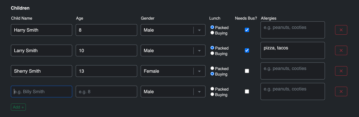
A field that allows you to collect and handle repeating data. The field.type property value is table (for conditionals).

Settings
- Limit Rows - set limits on the number of rows, including minimum, maximum, exact number, or range.New in 5.14.12+
- Minimum number of rows - set the minimum number of rows. At least this many rows will be shown by default; rows cannot be removed below this count.
- Maximum number of rows - set the maximum number of rows that can be added to the table.
- Exact number of rows - set the exact number of rows. This many rows will be shown with no option to add or remove.
- Use the Table Layout area to create columns for the table. Options are:
- Text
- TextareaNew in 5.8+
- NumberNew in 5.15.27+
- Checkbox
- DropdownImproved in 5.8+
- RadiosNew in 5.8+
- File UploadNew in 5.15+
- Enable Use built-in JavaScript for adding and removing rows to let visitors add or remove rows within the configured limits.
Styling & Customization
For manual rendering of the Table field inside your form for full customizability, your code might look something like this:
<table class="table">
    <thead>
        <tr>
        {% for column in field.tableLayout %}
            <th>{{ column.label }}</th>
        {% endfor %}
        </tr>
    </thead>
    <tbody>
    {% if field.value is empty %}
        <tr>
        {% for index, column in field.tableLayout %}
            {% set colName = field.handle ~ "[0][" ~ index ~ "]" %}
            <td>
            {% switch column.type|default("text") %}
                {% case "dropdown" %}
                    <select name="{{ colName }}">
                    {% for option in column.value|default("")|split(";") %}
                        <option value="{{ option }}">{{ option }}</option>
                    {% endfor %}
                    </select>
                {% case "checkbox" %}
                    <input type="checkbox" name="{{ colName }}" value="{{ column.value|default("Yes") }}" />
                {% default %}
                    <input type="text" name="{{ colName }}" value="{{ column.value|default("") }}" />
            {% endswitch %}
            </td>
        {% endfor %}
        </tr>
    {% else %}
        {% for rowIndex, row in field.value %}
            <tr>
            {% for index, column in field.tableLayout %}
                {% set colName = field.handle ~ "[" ~ rowIndex ~ "][" ~ index ~ "]" %}
                {% set colValue = row[index]|default("") %}
                <td>
                    {% switch column.type|default("text") %}
                    {% case "dropdown" %}
                        <select name="{{ colName }}">
                        {% for option in colValue|default("")|split(";") %}
                            <option value="{{ option }}"{{ option == colValue ? " selected" }}>{{ option }}</option>
                        {% endfor %}
                        </select>
                    {% case "checkbox" %}
                        <input type="checkbox" name="{{ colName }}" value="{{ column.value|default("Yes") }}" {{ colValue ? "checked" }} />
                    {% default %}
                        <input type="text" name="{{ colName }}" value="{{ colValue }}" />
                    {% endswitch %}
                </td>
            {% endfor %}
            </tr>
        {% endfor %}
    {% endif %}
    </tbody>
</table>
Templating
The Table field type includes various parameter options to override labels and finer control of classes and attributes on each part of the Table field.
Here's how you can use field.render for an automated approach to render your Table field inside your formatting templates:
- Bootstrap 5
- Tailwind 3
{{ field.render({
    addButtonLabel: "Add +",
    removeButtonLabel: "X",
    tableAttributes: {
        table: { class: "table table-sm table-borderless" },
        input: { class: "form-control" },
        textarea: { class: "form-control" },
        dropdown: { class: "form-control form-select" },
        radios: { class: "form-check-input" },
        checkbox: { class: "form-check-input" },
        fileUpload: { class: "form-control" },
        removeButton: { class: "btn btn-sm btn-danger" },
        addButton: { class: "btn btn-sm btn-success" },
    },
}) }}
{% set tableColumnCount = field.tableLayout|length %}

{{ field.render({
    tableAttributes: {
        table: { class: "table" },
        row: { class: "table-row" },
        column: {
            class: [
                tableColumnCount in [2, 3, 4, 5, 6, 7, 8, 9, 10, 11, 12] ? "w-1/" ~ tableColumnCount,
                tableColumnCount == 1 ? "w-full",
                "table-col pb-1"
            ]
        },
        label: { class: "text-left" },
        input: {
            class: [
                field.attributes.input.get("class"),
                "mr-5 w-11/12 block"
            ]
        },
        textarea: {
            class: [
                field.attributes.input.get("class"),
                "mr-5"
            ]
        },
        dropdown: {
            class: [
                field.attributes.input.get("class"),
                "mr-5 w-11/12 block"
            ]
        },
        radios: {
            class: [
                field.attributes.input.get("class"),
                "w-4 h-4 text-blue-600 bg-slate-100 border-slate-300 rounded mr-2 font-normal text-slate-600",
                "freeform-table-radios"
            ]
        },
        checkbox: {
            class: [
                field.attributes.input.get("class"),
                "w-4 h-4 text-blue-600 bg-slate-100 border-slate-300 rounded"
            ]
        },
        removeButton: { class: "bg-red-500 hover:bg-red-700 text-white font-normal py-1 px-3 rounded" },
        addButton: { class: "bg-green-500 hover:bg-green-700 text-white font-normal py-1 px-3 rounded mt-2" },
    },
}) }}
Examples
Submission Data
- Basic Example
- Complete Example
Here's how to render a Table field's data inside the Submission object:
<table class="table">
    <thead>
        <tr>
        {% for column in field.tableLayout %}
            <th>{{ column.label|default("-") }}</th>
        {% endfor %}
        </tr>
    </thead>
    <tbody>
    {% for row in submission[field.handle].value %}
        <tr>
        {% for index, column in field.tableLayout %}
            <td>
                {% set cell = row[index] ?? null %}
                {% if cell is iterable %}
                    {{ cell|join(', ') }}
                {% else %}
                    {{ cell }}
                {% endif %}
            </td>
        {% endfor %}
        </tr>
    {% endfor %}
    </tbody>
</table>
A complete example might look like:
{% for field in submission %}
    <td>
    {% if field.type == "table" %}
        <table class="table">
            <thead>
                <tr>
                {% for column in field.tableLayout %}
                    <th>{{ column.label|default("-") }}</th>
                {% endfor %}
                </tr>
            </thead>
            <tbody>
            {% for row in submission[field.handle].value %}
                <tr>
                {% for index, column in field.tableLayout %}
                    <td>
                        {% set cell = row[index] ?? null %}
                        {% if cell is iterable %}
                            {{ cell|join(', ') }}
                        {% else %}
                            {{ cell }}
                        {% endif %}
                    </td>
                {% endfor %}
                </tr>
            {% endfor %}
            </tbody>
        </table>
    {% else %}
        {{ submission[field.handle] }}
    {% endif %}
    </td>
{% endfor %}
Email Notification Template
By default, Table field data will be rendered as comma separated values in email notifications, which is not ideal. To account for Table fields in your email notification template, you can use the template code below:
<p>The following submission came in on {{ dateCreated|date('l, F j, Y \\a\\t g:ia') }}.</p>
<p>Here are the details:</p>
<ul>
{% for field in allFields %}
  <li>
    {{ field.label }}:
    {% if field.implements('options') %}
      {{ field.labelsAsString }}
    {% elseif field.type == "table" %}
      <table>
        <thead>
          <tr>
          {% for column in field.tableLayout %}
            <th>{{ column.label|default("-") }}</th>
          {% endfor %}
          </tr>
        </thead>
        <tbody>
        {% for row in field.value %}
          <tr>
          {% for index, column in field.tableLayout %}
            <td>
              {% set cell = row[index] ?? null %}
              {% if cell is iterable %}
                {{ cell|join(', ') }}
              {% else %}
                {{ cell }}
              {% endif %}
            </td>
          {% endfor %}
          </tr>
        {% endfor %}
        </tbody>
      </table>
    {% else %}
      {{ field.valueAsString }}
    {% endif %}
  </li>
{% endfor %}
</ul>