CardsProNew in 5.12+
The Cards field type works like a radios or checkboxes field, but allows you to create a more complex visual display where you can include images or icons, descriptions and unlimited custom metadata.
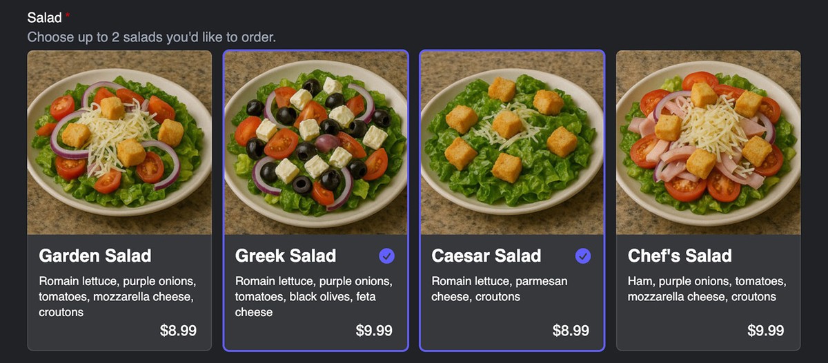
Settings
The following additional settings are available to this field type:
- Max Selected Values
- Limit how many values a user can select. Leave blank or set to
0for no limit.
- Limit how many values a user can select. Leave blank or set to
- Cards Per Row
- Set how many cards should display in each row.
- Image Transform
- Choose an Asset image transform to apply to any images added to the cards.
- Srcset Sizes
- Enter a comma separated list of image size numbers for
srcsetattribute generation, e.g.480, 768, 1024
- Enter a comma separated list of image size numbers for
Cards Layout
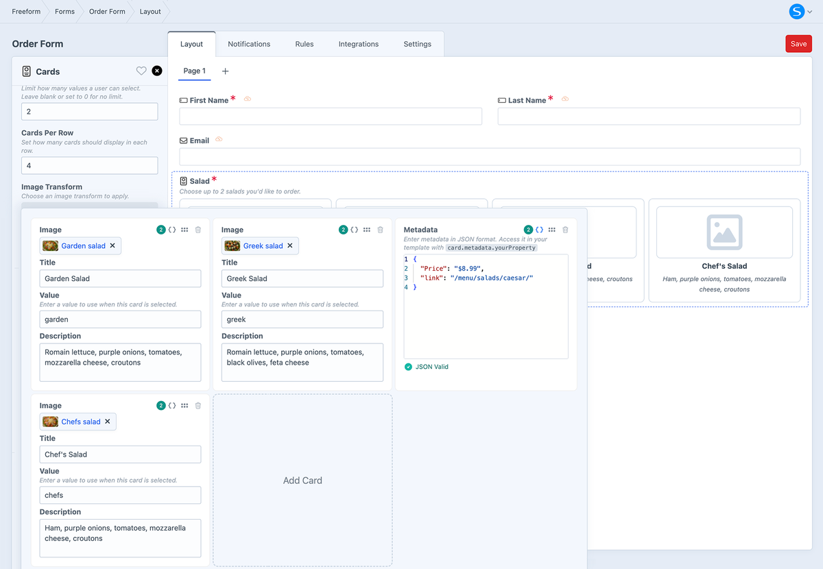
Configure the content and layout of your cards. This opens up into an editor that allows you to add and configure each card.
Cards Metadata
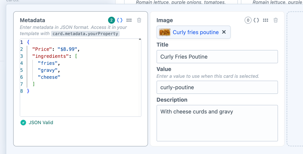
If you want to include additional custom data for each option, you can enter this metadata in JSON format. In your formatting template, you can access it with card.metadata.yourProperty.
Styling & Customization
Below are some examples of how you can customize the appearance of Cards fields in your formatting template:
- Basic
- Controlling Cards Per Row
- Metadata
- Metadata Macro
Below is an example using Tailwind CSS and without controlling cards per row or including any custom metadata:
{{ field.renderContainerOpeningTag }}

  {{ field.renderLabel }}
  {{ field.renderInstructions }}

  <div class="grid gap-3 grid-cols-1">
    {% for card in field.layout %}
      <div {{ field.cardAttributes.card }}>
        <input type="checkbox" name="{{ field.handle }}[]" value="{{ card.value }}" id="{{ field.idAttribute }}-{{ loop.index }}" {{ field.value == card.value ? "checked" }} class="hidden peer" />
        <label for="{{ field.idAttribute }}-{{ loop.index }}" class="{{ field.attributes.optionLabel.get("class") }}">
          {% set asset = craft.assets.id(card.assetId).one %}
          {% if asset %}
            <img src="{{ asset.getUrl(field.transform) }}" alt="{{ card.label }}" {{ field.cardAttributes.image }} />
          {% endif %}
          <div {{ field.cardAttributes.content }}>
            <h5 {{ field.cardAttributes.cardLabel }}>{{ card.label }}</h5>
            <svg class="size-5 text-indigo-500 opacity-0 group-has-checked:opacity-100" viewBox="0 0 20 20" fill="currentColor" aria-hidden="true">
              <path fill-rule="evenodd" d="M10 18a8 8 0 1 0 0-16 8 8 0 0 0 0 16Zm3.857-9.809a.75.75 0 0 0-1.214-.882l-3.483 4.79-1.88-1.88a.75.75 0 1 0-1.06 1.061l2.5 2.5a.75.75 0 0 0 1.137-.089l4-5.5Z" clip-rule="evenodd"></path>
            </svg>
          </div>
          <span {{ field.cardAttributes.cardDescription }}>{{ card.description }}</span>
        </label>
      </div>
    {% endfor %}
  </div>

  {{ field.renderErrors }}

{{ field.renderContainerClosingTag }}
Below is an example using Tailwind CSS with control on the number of cards per row, without including any custom metadata:
{% set perRow = 4 %}
{% if field.cardsPerRow is defined and field.cardsPerRow is not null and field.cardsPerRow is numeric %}
  {% set perRow = field.cardsPerRow + 0 %}
{% endif %}
{% if perRow < 1 %}{% set perRow = 1 %}{% endif %}
{% if perRow > 6 %}{% set perRow = 6 %}{% endif %}

{% set colsClass =
  perRow == 1 ? 'sm:grid-cols-1' :
  perRow == 2 ? 'sm:grid-cols-2' :
  perRow == 3 ? 'sm:grid-cols-3' :
  perRow == 4 ? 'sm:grid-cols-4' :
  perRow == 5 ? 'sm:grid-cols-5' : 'sm:grid-cols-6'
%}

{{ field.renderContainerOpeningTag }}

  {{ field.renderLabel }}
  {{ field.renderInstructions }}

  <div class="grid gap-3 grid-cols-1 {{ colsClass }}">
    {% for card in field.layout %}
      <div {{ field.cardAttributes.card }}>
        <input type="checkbox" name="{{ field.handle }}[]" value="{{ card.value }}" id="{{ field.idAttribute }}-{{ loop.index }}" {{ field.value == card.value ? "checked" }} class="hidden peer" />
        <label for="{{ field.idAttribute }}-{{ loop.index }}" class="{{ field.attributes.optionLabel.get("class") }}">
          {% set asset = craft.assets.id(card.assetId).one %}
          {% if asset %}
            <img src="{{ asset.getUrl(field.transform) }}" alt="{{ card.label }}" {{ field.cardAttributes.image }} />
          {% endif %}
          <div {{ field.cardAttributes.content }}>
            <h5 {{ field.cardAttributes.cardLabel }}>{{ card.label }}</h5>
            <svg class="size-5 text-indigo-500 opacity-0 group-has-checked:opacity-100" viewBox="0 0 20 20" fill="currentColor" aria-hidden="true">
              <path fill-rule="evenodd" d="M10 18a8 8 0 1 0 0-16 8 8 0 0 0 0 16Zm3.857-9.809a.75.75 0 0 0-1.214-.882l-3.483 4.79-1.88-1.88a.75.75 0 1 0-1.06 1.061l2.5 2.5a.75.75 0 0 0 1.137-.089l4-5.5Z" clip-rule="evenodd"></path>
            </svg>
          </div>
          <span {{ field.cardAttributes.cardDescription }}>{{ card.description }}</span>
        </label>
      </div>
    {% endfor %}
  </div>

  {{ field.renderErrors }}

{{ field.renderContainerClosingTag }}
Below is an example using Tailwind CSS with custom metadata.
For the purpose of this example, we're going to assume that you have custom meta data that looks like this:
{
  "price": "8.99",
  "ingredients": [
    "fries",
    "gravy",
    "cheese"
  ]
}
These properties are accessible in your template with card.metadata.yourProperty:
card.metadata.pricecard.metadata.ingredients
{{ field.renderContainerOpeningTag }}

  {{ field.renderLabel }}
  {{ field.renderInstructions }}

  <div class="grid gap-3 grid-cols-1">
    {% for card in field.layout %}
      <div {{ field.cardAttributes.card }}>
        <input type="checkbox" name="{{ field.handle }}[]" value="{{ card.value }}" id="{{ field.idAttribute }}-{{ loop.index }}" {{ field.value == card.value ? "checked" }} class="hidden peer" />
        <label for="{{ field.idAttribute }}-{{ loop.index }}" class="{{ field.attributes.optionLabel.get("class") }}">
          {% set asset = craft.assets.id(card.assetId).one %}
          {% if asset %}
            <img src="{{ asset.getUrl(field.transform) }}" alt="{{ card.label }}" {{ field.cardAttributes.image }} />
          {% endif %}
          <div {{ field.cardAttributes.content }}>
            <h5 {{ field.cardAttributes.cardLabel }}>{{ card.label }}</h5>
            <svg class="size-5 text-indigo-500 opacity-0 group-has-checked:opacity-100" viewBox="0 0 20 20" fill="currentColor" aria-hidden="true">
              <path fill-rule="evenodd" d="M10 18a8 8 0 1 0 0-16 8 8 0 0 0 0 16Zm3.857-9.809a.75.75 0 0 0-1.214-.882l-3.483 4.79-1.88-1.88a.75.75 0 1 0-1.06 1.061l2.5 2.5a.75.75 0 0 0 1.137-.089l4-5.5Z" clip-rule="evenodd"></path>
            </svg>
          </div>
          <span {{ field.cardAttributes.cardDescription }}>{{ card.description }}</span>
          <span>${{ card.metadata.price }}</span>
          <span>
            Ingredients:
            <ul>
            {% for ingredient in card.metadata.ingredients %}
              <li>{{ ingredient }}</li>
            {% endfor %}
            </ul>
          </span>
        </label>
      </div>
    {% endfor %}
  </div>

  {{ field.renderErrors }}

{{ field.renderContainerClosingTag }}
Below is an example using Tailwind CSS and including a macro to handle any custom metadata:
{# Automated handling of metadata if present #}
{% macro renderMeta(value, key = null) %}
  {# Nothing to output #}
  {% if value is empty %}
  {% elseif value is iterable %}
    {# Decide if it's a list (0..n-1) or a map #}
    {% set keys   = value|keys %}
    {% set isList = (keys|length > 0) and (keys|first == 0) and (keys|last == value|length - 1) %}

    {% if isList %}
      {% set cleaned = value|filter(v => v is not empty) %}
      {% if cleaned|length %}
        {# If every item is scalar, join; otherwise recurse per item #}
        {% set hasNested = cleaned|filter(v => v is iterable)|length > 0 %}
        {% if not hasNested %}
          <li>{% if key is not null %}{{ key }}: {% endif %}{{ cleaned|join(', ') }}</li>
        {% else %}
          {% for v in cleaned %}
            {{ _self.renderMeta(v, key) }}
          {% endfor %}
        {% endif %}
      {% endif %}
    {% else %}
      {% for k, v in value %}
        {{ _self.renderMeta(v, k) }}
      {% endfor %}
    {% endif %}
  {% else %}
    <li>{% if key is not null %}{{ key }}: {% endif %}{{ value }}</li>
  {% endif %}
{% endmacro %}

{% import _self as meta %}

{% set perRow = 4 %}
{% if field.cardsPerRow is defined and field.cardsPerRow is not null and field.cardsPerRow is numeric %}
  {% set perRow = field.cardsPerRow + 0 %}
{% endif %}
{% if perRow < 1 %}{% set perRow = 1 %}{% endif %}
{% if perRow > 6 %}{% set perRow = 6 %}{% endif %}

{% set colsClass =
  perRow == 1 ? 'sm:grid-cols-1' :
  perRow == 2 ? 'sm:grid-cols-2' :
  perRow == 3 ? 'sm:grid-cols-3' :
  perRow == 4 ? 'sm:grid-cols-4' :
  perRow == 5 ? 'sm:grid-cols-5' : 'sm:grid-cols-6'
%}

{{ field.renderContainerOpeningTag }}

  {{ field.renderLabel }}
  {{ field.renderInstructions }}

  <div class="grid gap-3 grid-cols-1 {{ colsClass }}">
    {% for card in field.layout %}
      <div {{ field.cardAttributes.card }}>
        <input type="checkbox" name="{{ field.handle }}[]" value="{{ card.value }}" id="{{ field.idAttribute }}-{{ loop.index }}" {{ field.value == card.value ? "checked" }} class="hidden peer" />
        <label for="{{ field.idAttribute }}-{{ loop.index }}" class="{{ field.attributes.optionLabel.get("class") }}">
          {% set asset = craft.assets.id(card.assetId).one %}
          {% if asset %}
            <img src="{{ asset.getUrl(field.transform) }}" alt="{{ card.label }}" {{ field.cardAttributes.image }} />
          {% endif %}
          <div {{ field.cardAttributes.content }}>
            <h5 {{ field.cardAttributes.cardLabel }}>{{ card.label }}</h5>
            <svg class="size-5 text-indigo-500 opacity-0 group-has-checked:opacity-100" viewBox="0 0 20 20" fill="currentColor" aria-hidden="true">
              <path fill-rule="evenodd" d="M10 18a8 8 0 1 0 0-16 8 8 0 0 0 0 16Zm3.857-9.809a.75.75 0 0 0-1.214-.882l-3.483 4.79-1.88-1.88a.75.75 0 1 0-1.06 1.061l2.5 2.5a.75.75 0 0 0 1.137-.089l4-5.5Z" clip-rule="evenodd"></path>
            </svg>
          </div>
          <span {{ field.cardAttributes.cardDescription }}>{{ card.description }}</span>
          {# Metadata if present #}
          {% set metaValue = card.metadata is defined ? card.metadata : null %}
          {# Capture output so we only render <ul> if there's actual <li> content #}
          {% set rendered %}
            {{ meta.renderMeta(metaValue) }}
          {% endset %}
          {% if rendered|trim %}
            <ul {{ field.cardAttributes.cardMetadata }}>
              {{ rendered|raw }}
            </ul>
          {% endif %}
        </label>
      </div>
    {% endfor %}
  </div>

  {{ field.renderErrors }}

{{ field.renderContainerClosingTag }}
Templating
The following additional properties and Template Overrides parameters are available for use in your formatting templates:
Properties
| Property | Description |
|---|---|
field.cardAttributes | Attributes for the card's card, image, content, cardLabel, cardDescription, and cardMetadata elements. |
field.layout | The configured cards, including value, label, assetId, description, and custom metadata properties. |
field.transform | The configured image transform. |
Access a custom metadata property using its name, such as card.metadata.yourProperty.
Parameters
cardAttributescardimagecontentcardLabelcardDescriptioncardMetadata
- At Form-level
- At Field-level
{{ form.renderTag({
  attributes: {
    form: { class: "freeform-form", "data-freeform-tailwind": true },
    row: { class: "flex gap-x-2 -mx-2 mb-4" },
    novalidate: true,
  },
  fields: {
    "@cards": {
      attributes: {
        optionLabel: { "=class": "relative flex flex-col gap-1 h-full items-left justify-start cursor-pointer bg-white/10 pb-3 rounded-md text-base text-white text-sm outline-1 -outline-offset-1 outline-white/10 rounded-md peer-checked:outline-2 peer-checked:outline-indigo-500 hover:bg-white/5" },
        input: { "-class": "appearance-none block w-full" },
      },
      cardAttributes: {
        card: { class: "group min-w-0 mb-2 sm:mb-0" },
        image: { class: "mb-1 rounded-t-md" },
        content: { class: "flex items-center justify-between px-3" },
        cardLabel: { "=class": "text-lg font-bold" },
        cardDescription: { class: "text-xs px-3" },
        cardMetadata: { class: "list-disc list-outside text-xs pl-6 pr-3" },
      }
    },
  },
}) }}
{{ field.render({
  cardAttributes: {
    card: { class: "group min-w-0 mb-2 sm:mb-0" },
    image: { class: "mb-1 rounded-t-md" },
    content: { class: "flex items-center justify-between px-3" },
    cardLabel: { "=class": "text-lg font-bold" },
    cardDescription: { class: "text-xs px-3" },
    cardMetadata: { class: "list-disc list-outside text-xs pl-6 pr-3" },
  }
}) }}